Swim school website design examples
4 homepage concepts our team designed for fictional swim school brands. Each one is a concept, not a client site. Open a card to scroll the whole homepage on desktop and phone.
The 4 concepts
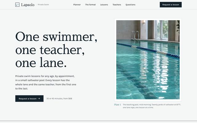
The brief: Nervous adults and young children struggle in crowded group lessons where they wait their turn at the wall. The page must explain the one swimmer, one teacher, one lane format, suggest a lesson pack for a goal and timeline, and take a request.
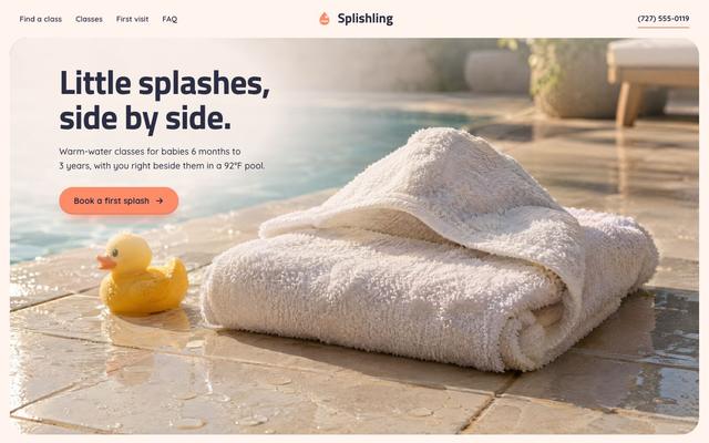
The brief: Parents of babies and toddlers are not sure which class fits their child's age, or what to bring to a first swim. The page must point them to the right class, its open times and a packing list, then book a first splash.
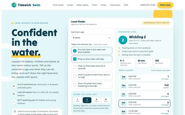
The brief: Parents guess the wrong level from age alone. Ask a few can-do questions, then show the level, what it teaches and classes with space.
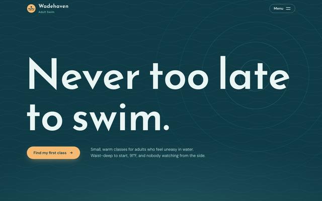
The brief: Adults who never learned to swim feel embarrassed and afraid, and many have avoided the water for decades. The page must make the first step feel safe and help them book a first class or a free poolside visit.
Want a site like these?
30 minutes with our team. We look at your current site and what a rebuild would take.
Book a strategy call How INSIDEA works