Summer camp website design examples
4 homepage concepts our team designed for fictional summer camp brands. Each one is a concept, not a client site. Open a card to scroll the whole homepage on desktop and phone.
The 4 concepts
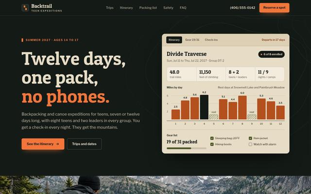
The brief: Parents want to know how hard each day is, who is watching their teen and how they will hear from them with no phones. Show the route, the group size, the packing list and the nightly check-in in the first screen.
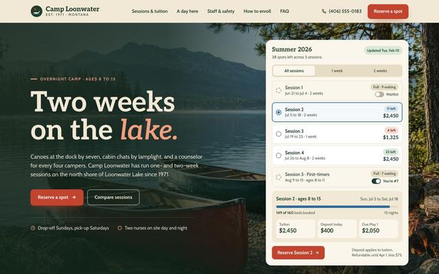
The brief: Sessions fill by spring, and parents often find out a week is full only after they have planned around it. The first screen must show every session with its dates, spots left, tuition and a waitlist for the full ones.
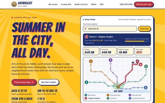
The brief: Working parents can't get a child across town by 9 and back by 5, so the bus is the real question. Show the nearest stop, pickup and drop-off times and the weekly price in the first screen.
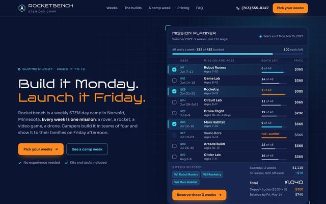
The brief: Parents planning summer need to know which themed weeks suit their child's age, which are filling up and what several weeks will cost. Show every week's theme, ages, seats left and a running total in the first screen.
Want a site like these?
30 minutes with our team. We look at your current site and what a rebuild would take.
Book a strategy call How INSIDEA works