Credit union website design examples
4 homepage concepts our team designed for fictional credit union brands. Each one is a concept, not a client site. Open a card to scroll the whole homepage on desktop and phone.
The 4 concepts
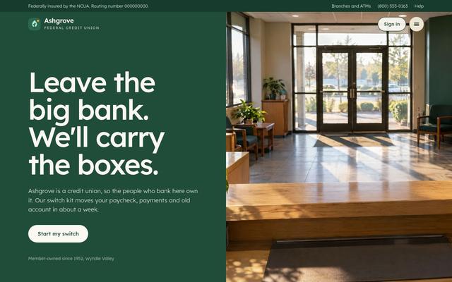
The brief: Younger people stay with big banks because switching feels like work. Make switching look like a short checklist, and show the rates that make it worth it.
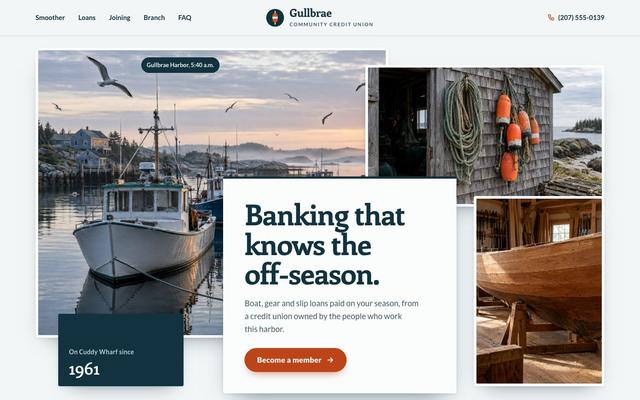
The brief: Fishing families and seasonal businesses earn most of their year in a few months, and standard monthly loan payments ignore that. The page must show the credit union plans around seasonal income and get people to become members.
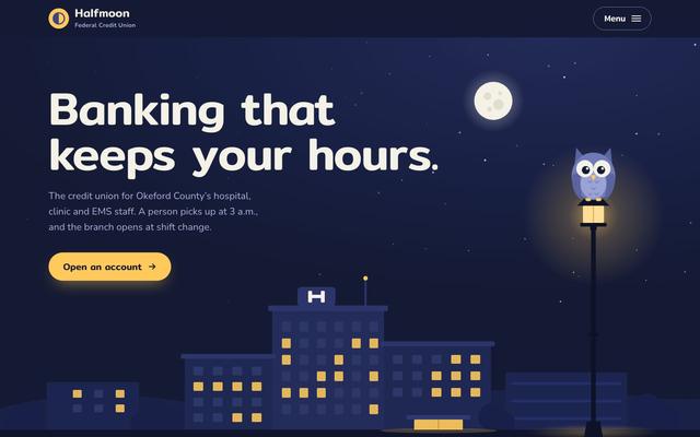
The brief: Nurses and medics on 12-hour night shifts cannot reach a bank that keeps nine to five hours. The page has to show how a paycheck splits into bills, savings and spending and get shift workers to open an account.
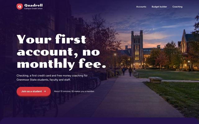
The brief: First-year students juggle an aid refund, part-time pay and rent with no feel for what a week of spending looks like. The page has to turn those numbers into a weekly budget and get students to open their first account.
Want a site like these?
30 minutes with our team. We look at your current site and what a rebuild would take.
Book a strategy callMore website design examples
- All local professionals concepts
- Law firm website design examples
- Accounting firm website design examples
- Real estate brokerage website design examples
- Insurance agency website design examples
- Wealth advisor website design examples
- Mortgage lender website design examples
- Property management website design examples
 How INSIDEA works