Most insurance websites are outdated. Not in style, though many are, but in function. They make it hard for people to understand what’s being offered, harder to compare plans, and nearly impossible to build trust on the first click. That’s a severe weakness in a business built on trust.
70% of insurance customers would switch providers after a poor digital experience. And for many, the website is that experience.
Good design isn’t about decoration. It’s about clarity. It helps people make decisions faster. It makes the complex feel manageable. And in insurance, that’s precisely what your audience needs: straight answers, clean exploration, and a sense that the company behind the site has its act together.
In this blog, I’ll discuss 10+ website design ideas for insurance companies that make information easier to digest, build real credibility, and remove friction at every step.
Each idea is based on what real users actually care about and what keeps them coming back.
Website Design Ideas for Insurance Companies with a Modern, User-Friendly Touch
1. Progressive
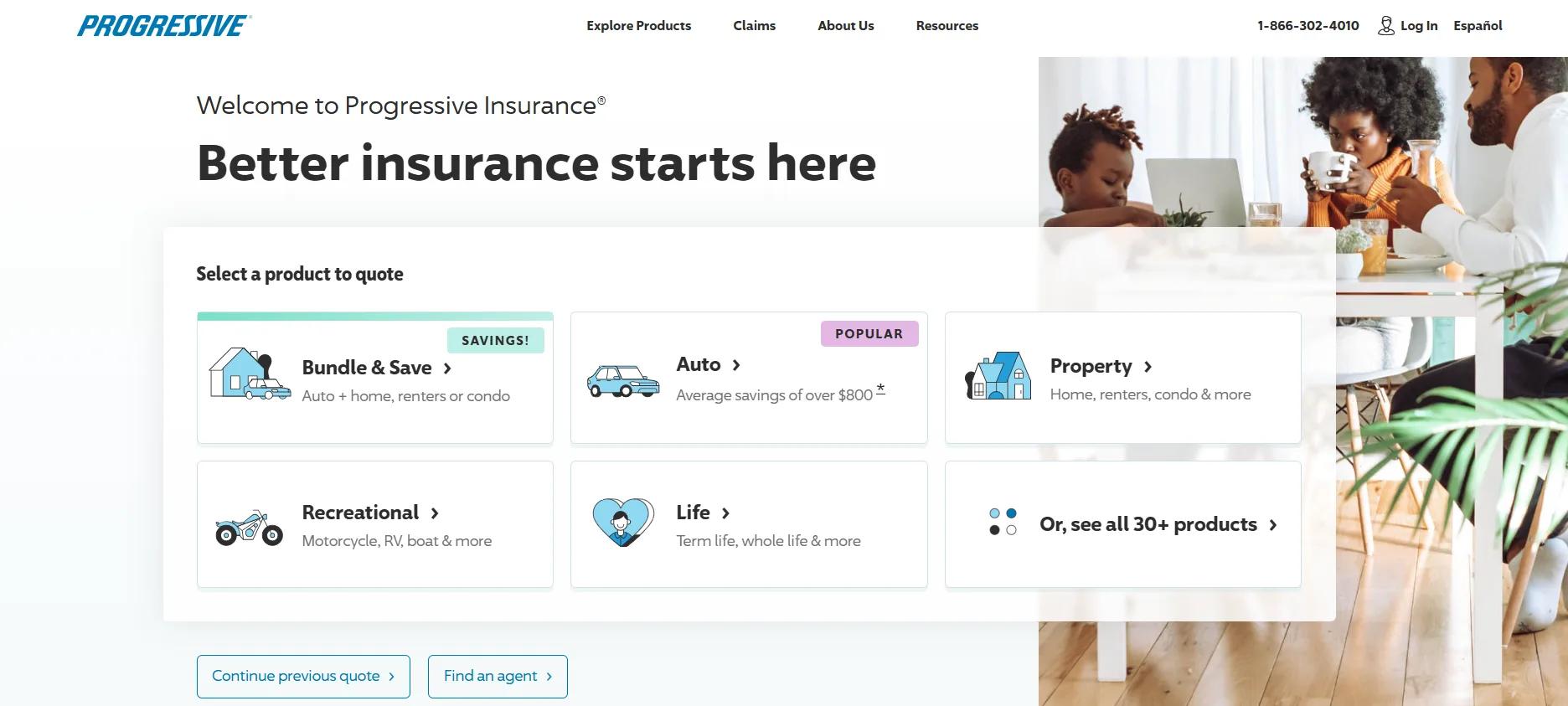
Progressive, founded in 1937, has always been known as a challenger brand. That same spirit shows up on its website, which is built to be fast, functional, and highly intuitive. In fact, according to Keynova Group, after spending time on it, it ranks as the #1 insurance website in the U.S., which checks out.
What makes Progressive’s site stand out is how quickly it adapts to the user’s intent. The homepage doesn’t overwhelm visitors with marketing jargon or endless menus. Instead, it prioritizes action: get a quote, file a claim, or make a payment.
The design is clean, with strong contrast between text and background, and minimal use of colors beyond the familiar Progressive blue, making navigation smooth and focused.
In addition to the aesthetics, Progressive’s real strength lies in user flow. The quote process is streamlined, responsive, and smartly segmented. Tooltips, progress indicators, and contextual help all work in sync to ensure people move forward without hitting dead ends.
And because Progressive offers a wide range of products, from car and home to pet and commercial coverage, the site’s precise categorization keeps it from feeling bloated.
The mobile experience mirrors the desktop one almost perfectly, which is no accident. Progressive’s digital platform is optimized for consistency, and that builds trust across touchpoints. It’s also packed with resources: policy explainers, claims guidance, and cost breakdowns.
This is one of the most polished website design ideas for insurance companies because it focuses on what users need to do and removes everything they don’t. It respects attention spans and clarity, and it delivers on Progressive’s brand promise without distraction.
2. New York Life
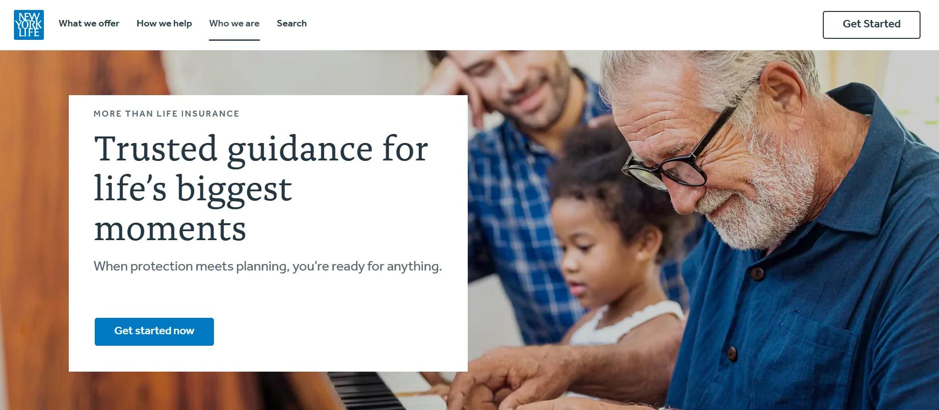
Founded in 1845, New York Life is the largest mutual life insurer in the U.S., with over 12,000 agents and a legacy built on trust, financial strength, and service. Its website reflects that history without feeling dated, a rare balance many insurance companies struggle to achieve.
The site opens with strong human imagery: a multigenerational family gathered around a piano. It’s all about positioning. New York Life immediately puts its purpose front and center: helping families explore life’s major moments with clarity and confidence. The visual tone, clean white backgrounds with navy and light-blue highlights, sets a calm, trustworthy foundation while allowing content to shine.
What makes this one of the strongest website design ideas for insurance companies is how it handles complexity. There’s no chaos of menus, no overloaded product grids. Instead, users are guided to life insurance, investments, or retirement planning categories.
Each section delivers enough information to help visitors understand what they need without getting lost. Plus, for those who want to dig deeper, there are articles, calculators, and explainers right where you need them.
Another standout is the integration of human help. From nearly every page, users can connect with a real agent, not through a buried link but a visible, well-placed option that reinforces the company’s “you’re not alone” promise without saying it outright.
New York Life shows that one of the most effective website design ideas for insurance companies is about removing friction, respecting the user’s time, and staying grounded in what real people want: reassurance.
3. GEICO
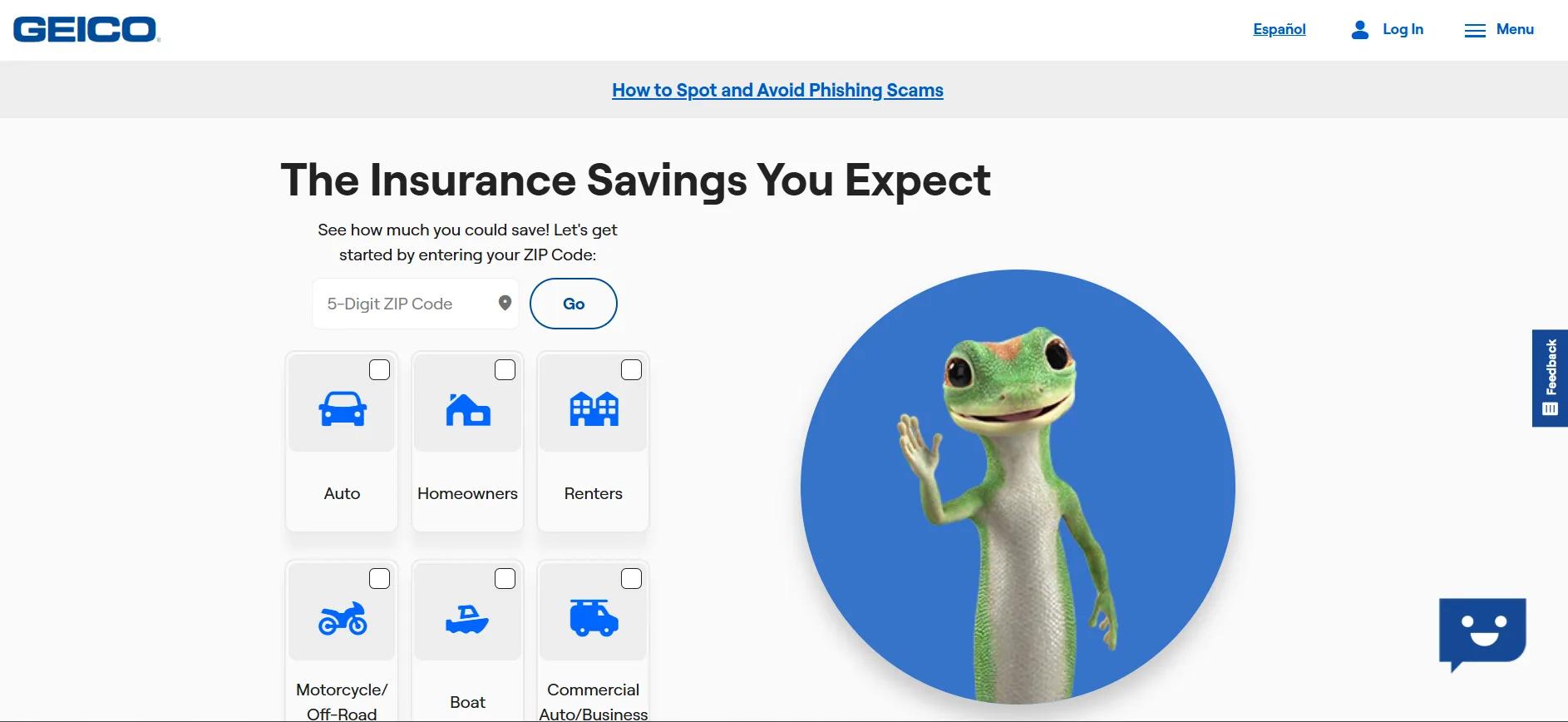
GEICO, founded in 1936 and now a wholly owned subsidiary of Berkshire Hathaway, serves millions of policyholders and is the third-largest private auto insurer in the U.S. What sets its website apart is its efficiency. This site is built to move people from interest to action with as little friction as possible.
Right from the homepage, GEICO gets one thing right: focus. The ZIP code entry box for an auto quote takes center stage, not a generic banner or a company tagline. Everything above the fold is stripped down to action-oriented phrases like get a quote, log in, and manage a policy. Their users come for that, and GEICO doesn’t waste their time.
The site’s design is clean, responsive, and structured around utility. Crisp blue accents on white space guide the eye, and well-labeled menus break down dozens of insurance products into manageable, intuitive sections. Whether you’re shopping for a car, renters, or identity protection insurance, every path is streamlined. There are no dead ends. There is no confusion.
What makes this one of the strongest website design ideas for insurance companies is its ability to balance scale with simplicity. GEICO offers a vast portfolio, everything from pet insurance to cyber liability, but doesn’t overwhelm visitors. The layout anticipates what users want to do next and gives them only the options that make sense in the moment.
Support access is just as thoughtful. Chat, call, and everything is available 24/7 and visible from every screen. Combined with clear product copy, strong CTAs, and a minimal design, GEICO’s site proves that good web design doesn’t mean doing more. It means doing less, better.
Any insurer looking for inspiration should study GEICO closely. It’s one of the most effective website design ideas for insurance companies because it prioritizes usability, respects the customer’s time, and never overcomplicates the path to action.
4. StartFarm
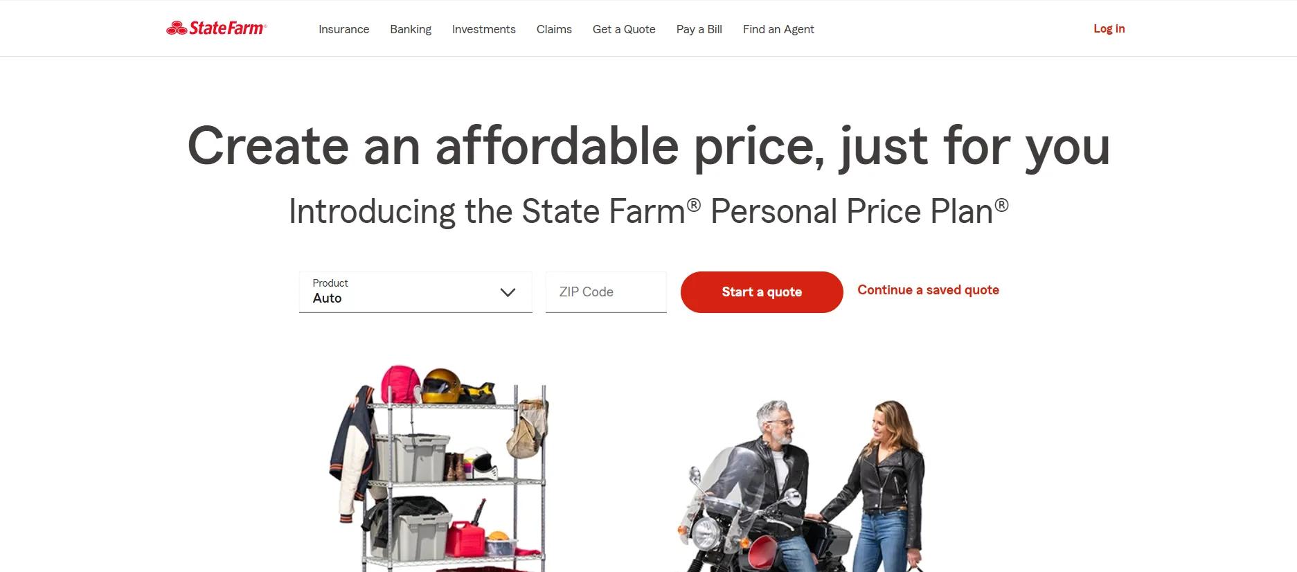
State Farm has been around since 1922, but its website feels like it was built yesterday for all the right reasons. As the largest auto insurer in the U.S., State Farm doesn’t just have brand awareness; it has traffic. And its site is designed to serve that traffic with zero friction.
From the moment the homepage loads, the priorities are obvious: quotes, claims, payments, and account access. It puts tools in the customer’s hands instantly. No waiting, no extra clicks, no clutter. A bold red “Start a Quote” callout paired with a simple ZIP code entry leads the experience, removing any guesswork. That’s innovative design in action.
What elevates State Farm’s site is how it manages scale. The company offers insurance across vehicles, property, health, life, and small businesses, yet every path feels clean. Icon-based navigation, collapsible menus, and a mobile-friendly structure keep things simple without dumbing them down. And wherever you are on the site, help is a click away via agent lookup, live chat, or quick contact.
The company’s use of imagery reinforces its brand tone: real people in relatable momentswatering plants, talking to agents, filing claims. It’s not staged or sales-oriented. It’s grounded and intentional, reflecting the company’s message of being personal and practical.
5. Allstate
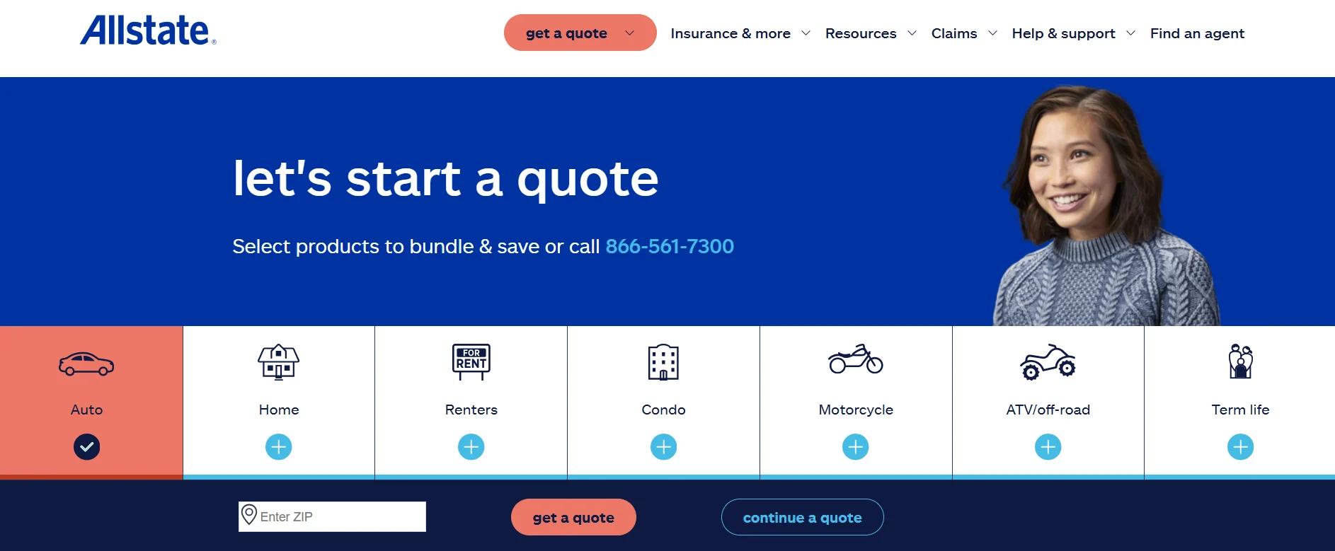
Allstate has been a significant name in insurance since 1931, and its website proves the company knows how to evolve without losing sight of what matters: helping people get what they need, fast. Whether it’s auto, renters, life, or identity protection, Allstate’s digital platform is structured to support action, not just browsing.
The homepage opens with clear, high-contrast CTAs that let users start a quote, file a claim, or log into their account without digging through layers of navigation. Above-the-fold product tiles (Auto, Home, Renters, Life) aren’t flashy but effective. Each one links directly to its own guided flow, keeping the user focused and avoiding unnecessary decisions.
But Allstate’s site really earns its spot among standout website design ideas for insurance companies by blending self-service and human touch. Users can file a claim, track it, download ID cards, adjust coverages, or access billing, all from the same dashboard. The Allstate mobile app extends that convenience even further, with features like crash detection, property risk alerts, and quick access to roadside assistance.
Visually, the site relies on simplicity: crisp fonts, intuitive iconography, and soft gradients that make everything feel breathable. However, the clean layout isn’t just about looks; it helps users complete tasks with minimal effort. That’s not style over substance. Its design is working precisely as it should.
Allstate doesn’t overwhelm. It guides. And that’s what makes it one of the better website design ideas for insurance companies, especially for firms trying to balance digital functionality with real-world service. The company’s “You’re in good hands” message serves as the guiding principle for the entire user experience.
6. Ladder
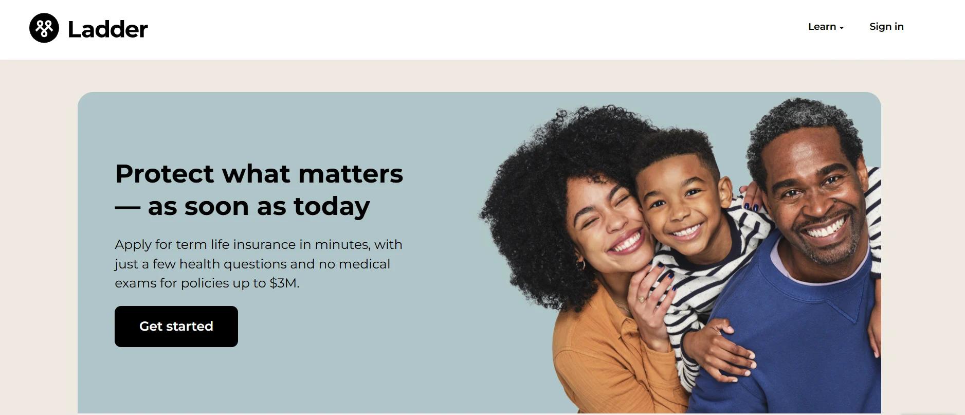
Ladder has one of the cleanest, most efficient insurance websites. Built for speed and transparency, it reflects the company’s digital-first approach to life insurance: apply in minutes, get covered the same day, and control your policy without paperwork, phone calls, or waiting.
The design leans toward minimalism, with plenty of white space, pastel tones, and short, punchy copy. There are no distractions. Just straight answers to the questions people are asking: “How much do I need?” “Will this pay out?” “What if I change my mind?” This is rare in insurance and is precisely why Ladder’s site stands out.
Navigation is stripped down to the essentials. Visitors can get quotes, explore policies, or use the coverage calculator in just a few seconds. The product pages are just as focused: clear explanations of term life vs. whole life, honest disclaimers, and flexible options laid out without jargon. There are no medical exams for policies up to $3 million, just a few health questions and a fully digital process.
Another standout feature is policy control. Users can adjust coverage as their needs change, called “Laddering,” which is explained clearly on the site. There’s also a strong social angle: for every policy sold, Ladder plants a tree, reinforcing its long-view mindset and sense of responsibility.
For any insurance brand that wants to simplify and streamline its digital experience, Ladder offers one of the most forward-thinking website design ideas for insurance companies today.
7. Insurify
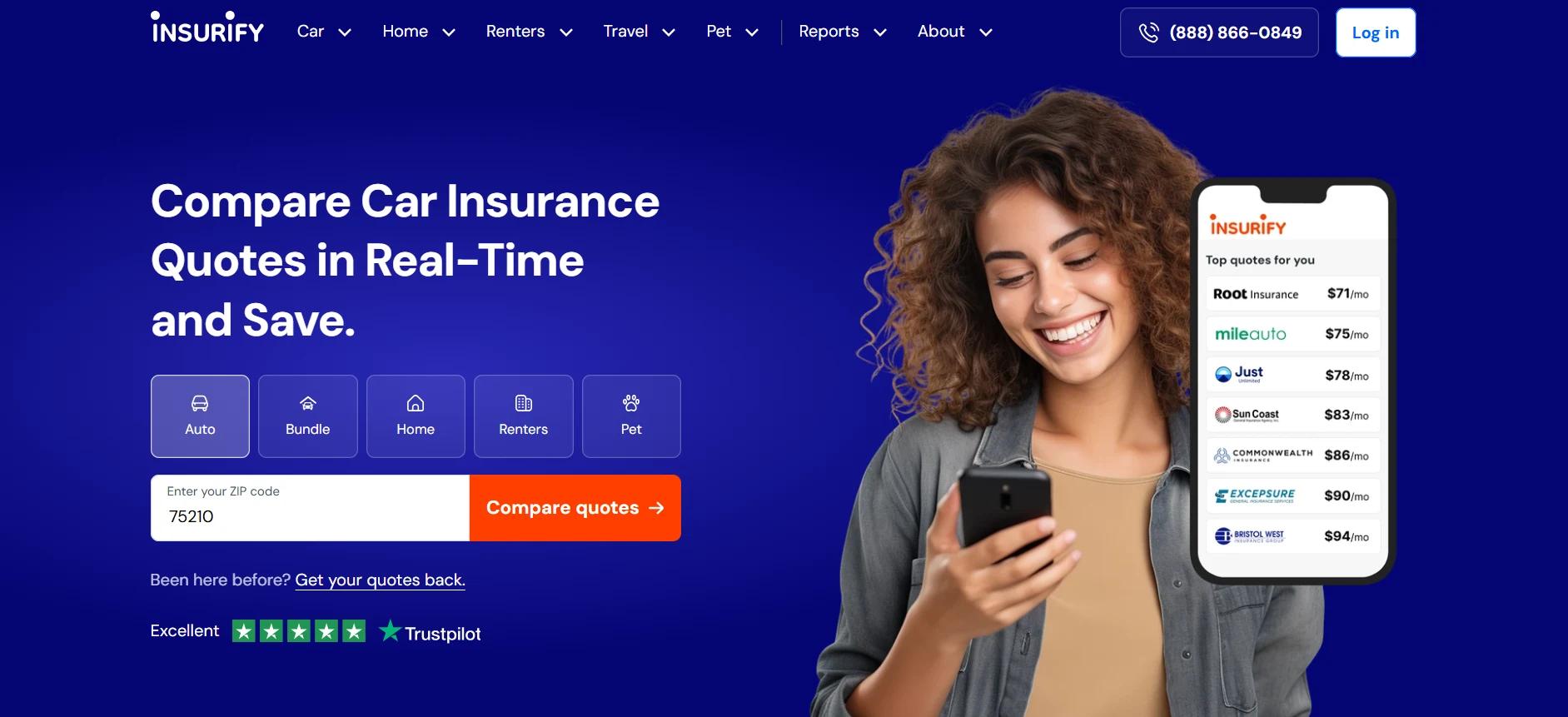
Insurify is a digital comparison engine. Its website is so well executed that it sets a new standard for how insurance platforms should look and function. Fast, clear, and built for decision-making, it’s a perfect case study in simplifying a complex category without dumbing it down.
From the first screen, users know exactly what Insurify does: compare real-time quotes from 120+ top carriers. The layout is minimal, with a focus on user flow over visuals. Clean forms, concise copy, and intuitive steps guide users through the quote process in minutes. Whether someone is shopping for auto, renters, pet, or travel insurance, the paths are separated and easy to follow.
Insurify’s ability to cater to different user types makes it a contender for any list of smart website design ideas for insurance companies. Whether you want to buy a policy on your own, talk to a live agent, or hand over your current coverage for an expert review, Insurify makes it simple to choose your route. That level of flexibility, clearly laid out in a side-by-side comparison, is rare and powerful.
The site’s real strength, though, is trust-building. User reviews are prominently featured, and savings stats are backed by real numbers. Even the FAQs are helpful, covering “what Insurify is,” how insurance works, and what affects your rates. Everything’s written in plain language, with no pushy sales speak. Because users can purchase directly through the platform, unnecessary handoffs or confusing redirects are removed.
In short, Insurify is one of the most user-friendly website design ideas for insurance companies. It proves that transparency, speed, and real options can work together without sacrificing clarity or conversion.
8. The Zebra
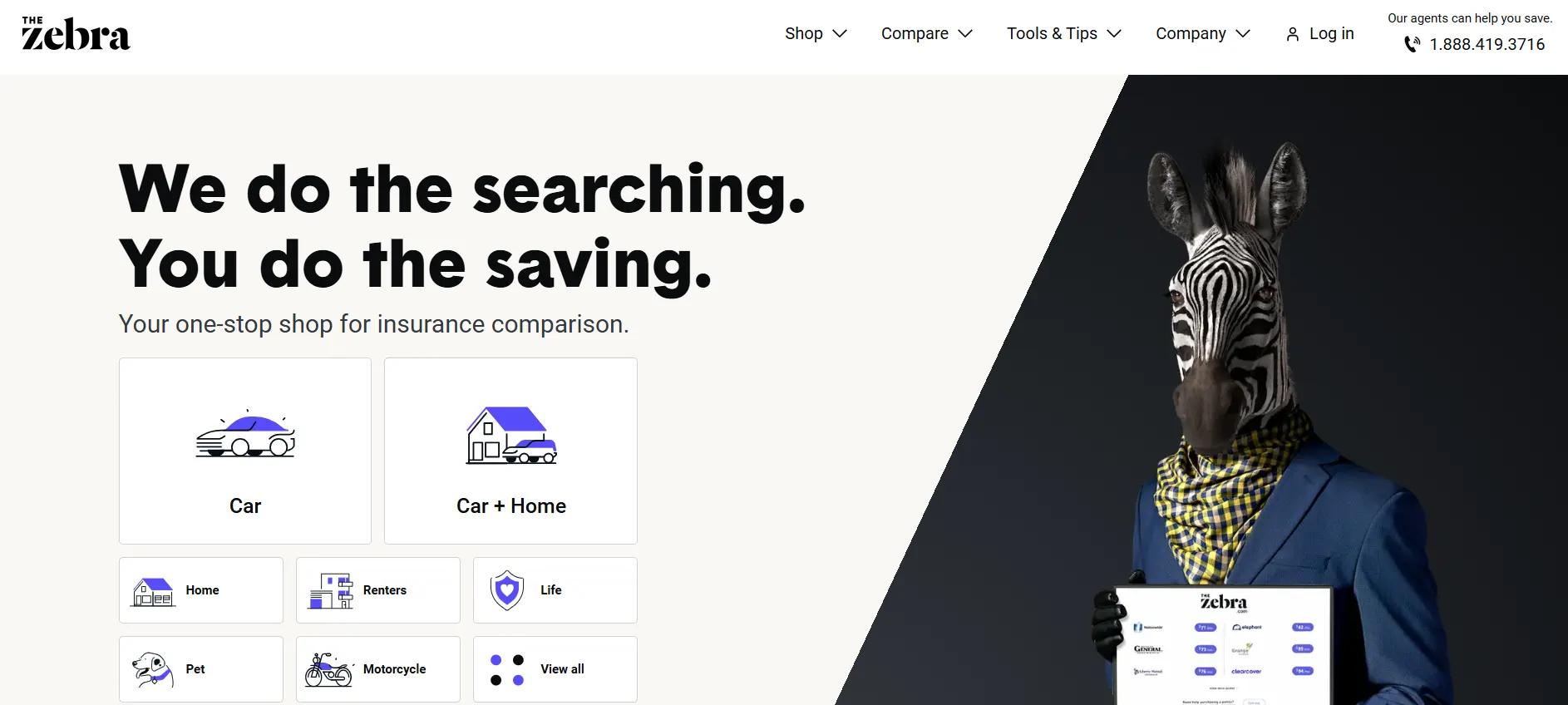
Zebra takes the insurance shopping process that most people avoid, making it feel fast, simple, and even smart. As one of the leading insurance comparison platforms in the U.S., Zebra has built a digital experience that prioritizes speed, clarity, and user control. And it shows from the first click.
The interface opens with a bold promise: “We do the searching. You do the saving.” It immediately puts the user in the driver’s seat, with a short, clean quote form that leads straight into results. Smart UX choices, like clearly labeled fields, step-by-step guidance, and obvious CTA buttons, keep the focus on progress. No filler, no confusion.
The site also uses visual hierarchy well. Bold headers, subtle color coding, and iconography give every section a distinct identity. The flow of information feels light and readable, but it’s dense with value. Users can compare over 100 insurers, explore quote options, and get matched with plans that fit their profile in minutes.
What makes The Zebra one of the more effective website design ideas for insurance companies is its blend of automation and real human support. Users can buy online or call an agent. They can read data-backed guides or jump right into a quote. This dual-mode flexibility respects different buyer types and levels of insurance knowledge.
Its focus on user trust sets it apart from other comparison tools. FAQs are clear, data privacy is explained without fluff, and users aren’t blasted with upsells or forced into annoying follow-up calls. And that kind of digital respect matters when you’re selling financial protection.
For companies looking to improve conversions without sacrificing user comfort, the Zebra is one of the cleanest website design ideas for insurance companies today.
9. Trusted Choice
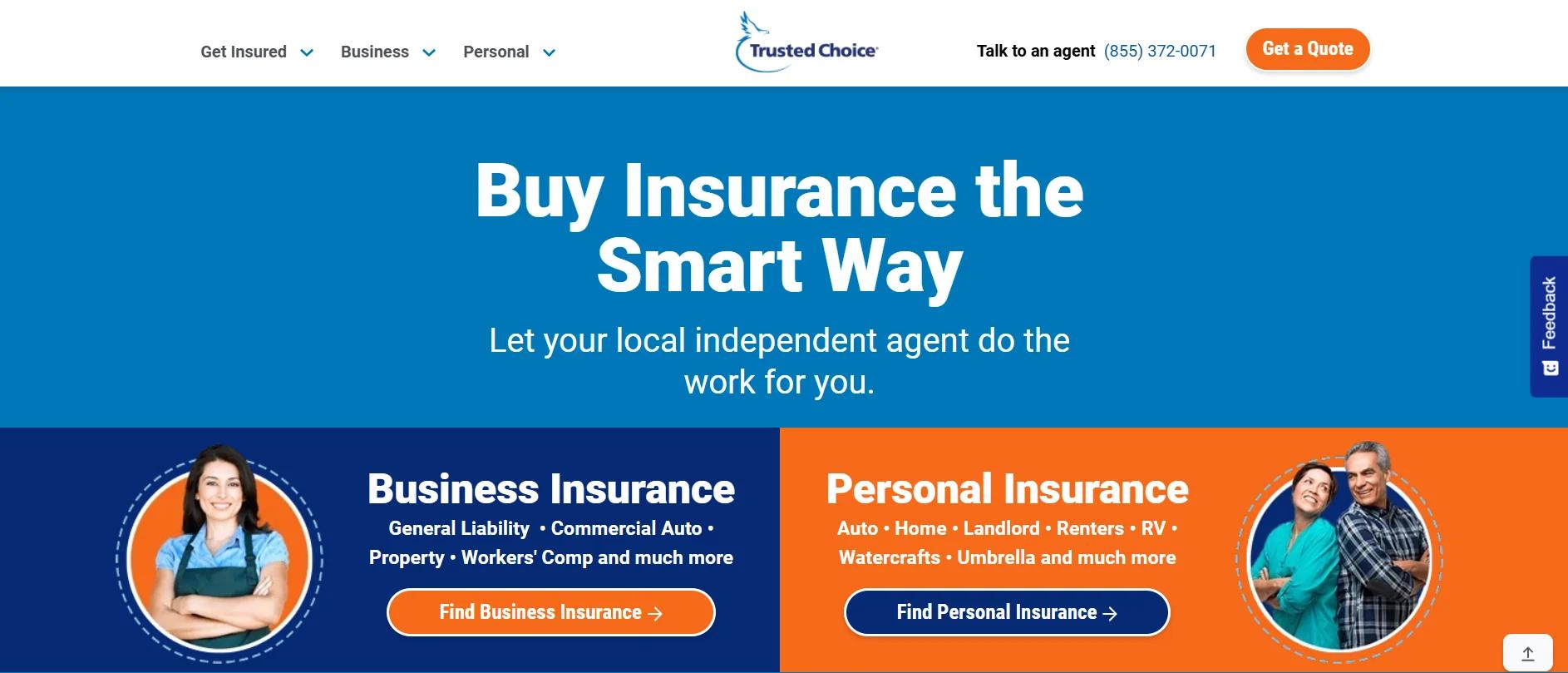
Trusted Choice is a national directory that connects people with independent insurance agents based on their needs. While most aggregator platforms aim to automate everything, Trusted Choice takes a more innovative approach, pairing intuitive digital tools with human expertise. The site’s design perfectly supports that balance.
From the moment you land, the navigation is direct: personal insurance, business coverage, or connecting with an agent. The white-blue-orange theme keeps things visually organized without being overwhelming, and the mobile design is just as sharp. Everything stacks cleanly, tap targets are significant, and content loads quickly.
One of the most effective website design ideas for insurance companies is simplifying decision-making without stripping away detail. Trusted Choice does this well. Users can explore options like car, life, renters, or umbrella insurance, but instead of vague summaries or flashy promos, they’re given direct paths to learn, ask, and act. Quote options, guides, blog posts, and expert FAQs are all just a click away.
The design also uses smart iconography and bold CTA buttons to guide users forward. Everything has intention, no decorative clutter or buried menus. Because this site is built around independent agents, it never feels like it’s pushing one provider. That neutrality makes it feel trustworthy.
Testimonials are placed right where they matter, next to agent profiles, near search results, or in content hubs. These real-user snapshots reinforce why working with a local agent still matters, even in a digital-first world.
Trusted Choice nails one of the most essential website design ideas for insurance companies: helping people take action while still giving them options. It respects the complexity of insurance while making the process feel approachable.
10. Chubb
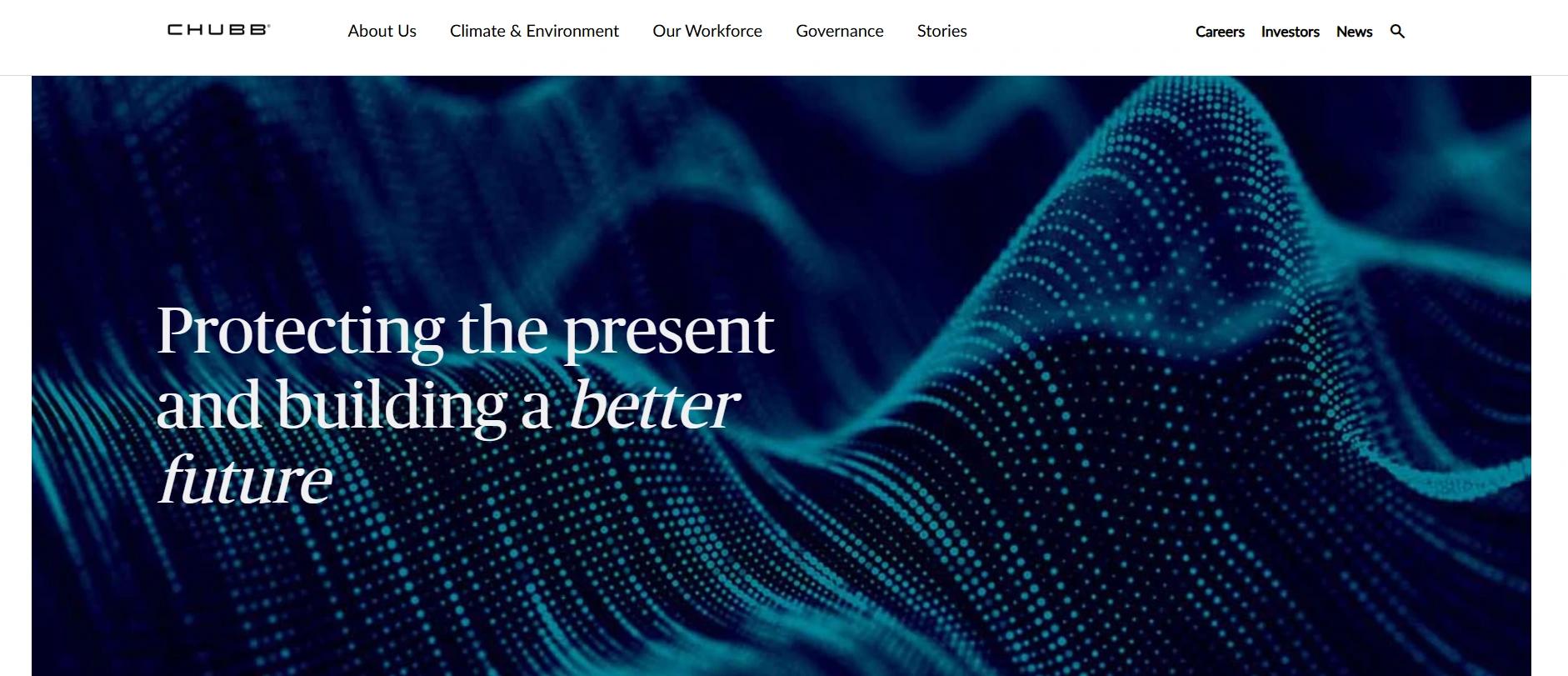
Chubb’s website clarifies one thing from when you land: this isn’t insurance as usual. This is insurance elevated.
Known globally for its elite clientele and extensive risk management capabilities, Chubb smoothly translates that premium positioning into its digital experience. With a crisp, whitespace-rich layout and a highly refined color palette, the site gives off a luxury feel that mirrors the brand’s identity. It’s no surprise that Chubb is regularly highlighted among top UX-focused insurance websites.
What sets Chubb apart among website design ideas for insurance companies is its clear intent. This isn’t a site trying to “wow” with gimmicks. It’s built to guide high-value individuals with complex coverage needs, brokers managing enterprise clients, or businesses seeking embedded insurance solutions, to precisely what they need, fast. Each page is structured with a smart information hierarchy, quick-access CTAs, and minimal friction.
From award-winning claims satisfaction messaging to global investor insights, every touchpoint reinforces credibility and capability. Thanks to intuitive UX and tight copy blocks, even the content-heavy sections (such as corporate governance or ESG commitments) remain readable.
Chubb also demonstrates how you can convey scale without chaos. The navigation is clean, dropdowns are predictable, and every user journey feels composed. Whether you’re looking for a quote, filing a claim, or learning about embedded insurance APIs, the experience is seamless across desktop and mobile.
For brands targeting a premium market or seeking to simplify complex offerings, Chubb is one of the best website design ideas for insurance companies.
11. Aflac
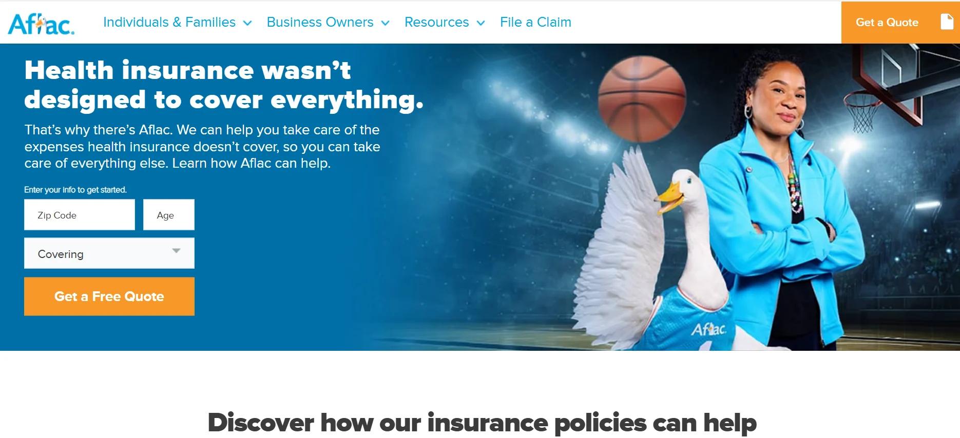
Aflac’s site gets straight to the point with a bold promise: helping you cover what health insurance doesn’t. The homepage puts that front and center, with a strong headline and a simple “Get a Quote” form that prompts users to take action.
The layout is icon-driven and user-first. Each insurance product (accident, cancer, pet, dental, etc.) is visualized with clean, easy-to-understand graphics. Navigation is intuitive, with clear options for individuals, business owners, and brokers. Its high-contrast mode and mobile responsiveness prove Aflac’s commitment to accessibility, and the white-blue-orange palette keeps the tone professional yet friendly.
There is no fluff, no confusion, just a clear path to coverage. That makes Aflac one of the best website design ideas for insurance companies today. It blends clarity, usability, and strong brand identity into a site that works.
Focus on Insurance, Let Experts Handle Your Website
Running an insurance business is demanding enough. Between policy management, client service, compliance, and operations, who has time to optimize user experience or fine-tune button placements?
But a cluttered layout or confusing navigation can cost you trust and clients. Insurance shoppers want clarity, speed, and confidence. Your website should deliver all three before a competitor does.
That’s where marketing and web design experts come in. Instead of wrestling with layouts or second-guessing colors, let pros build a site that speaks trust, converts leads, and showcases your value, while you focus on your business and your clients.
INSIDEA
Ready to put this into practice?
INSIDEA is an Elite HubSpot Partner rated 4.99 across 450+ verified reviews. Let's map it to your goals.