If your website looks like it was built during the fax machine era, we need to talk.
You could be the sharpest advisor in town, but if your site screams “stock template” or takes forever to load, most visitors are already gone. And they’re not coming back.
You’re in the business of trust, numbers, and no surprises. Your website should reflect that. Clean. Clear. Professional. With just enough personality to stand out from the sea of navy-blue suits.
People are quick to judge, especially online.75% of visitors decide how trustworthy you are based on your design. And you’ve got less than a second to make that impression stick.
So I pulled together 30+ website design ideas for financial advisors help create a site that is smart, approachable, and worth sticking around for.
30+ Website Design Ideas for Financial Advisors to Draw Inspiration
Today’s clients expect more than a bio and a contact form. These 30+ website design ideas for financial advisors are here to make your site feel modern, useful, and human’just like the way you run your practice.
And along with this, incorporating smart digital marketing strategies into your website ensures it looks great and also reaches the right audience effectively.
Alright, let’s get started:
1. Facets Financial Advisor
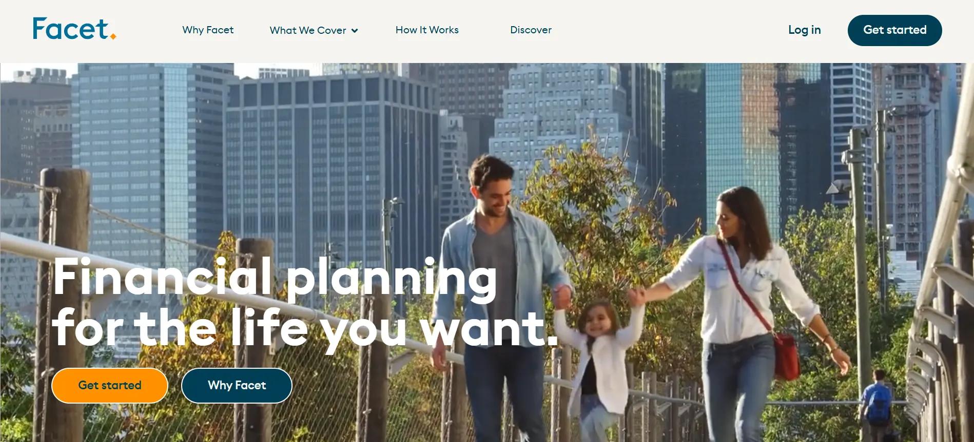
Facet Wealth stands out for its simple, no-frills website design, which reflects its core values of accessibility and transparency in financial planning. The website’s clean, minimalist design removes unnecessary distractions, making it easy for potential clients to focus on understanding their financial options and moving forward with actionable advice.
For financial advisors looking to improve their websites, Facet’s design offers valuable lessons’and fits right into the kind of website design ideas for financial advisors that actually prioritize clarity, trust, and ease of use.
Features of the Website:
Clear, Simple Exploration: Facet’s website features an intuitive layout with clear calls to action, such as “Get Started” and “Log In,” placed in prominent positions. Financial advisors can take inspiration from this by ensuring their website is easy to explore with clear, actionable buttons that lead visitors to main services or contact points without confusion.
Flat Fee Transparency: Facet uses its design to communicate a transparent pricing model that is consistent throughout the site. Financial advisors can benefit from implementing similar pricing clarity on their websites.
By showcasing fees upfront in a non-complex way, advisors can build trust with visitors who may otherwise be hesitant about hidden costs or unexpected charges.
Personalized User Journey: The website offers personalized financial roadmaps and action steps to guide users through their financial planning process. For financial advisors, this can translate to integrating client-specific dashboards or tools where visitors can input information and see an overview of their financial future.
Educational Content with Clear Calls to Action: Facet’s website doesn’t overwhelm visitors with financial jargon; it uses clear, digestible content to explain complex economic topics. Financial advisors can adopt a similar approach by creating easy-to-understand educational resources’such as blog posts or FAQs’that help clients make decisions.
Dynamic, Client-Focused Visuals: The website uses real-life testimonials and videos that connect emotionally with visitors, showcasing personal success stories. Financial advisors can create a more humanized, relatable online presence by incorporating client testimonials, video content, and relatable imagery into their websites.
2. Betterment
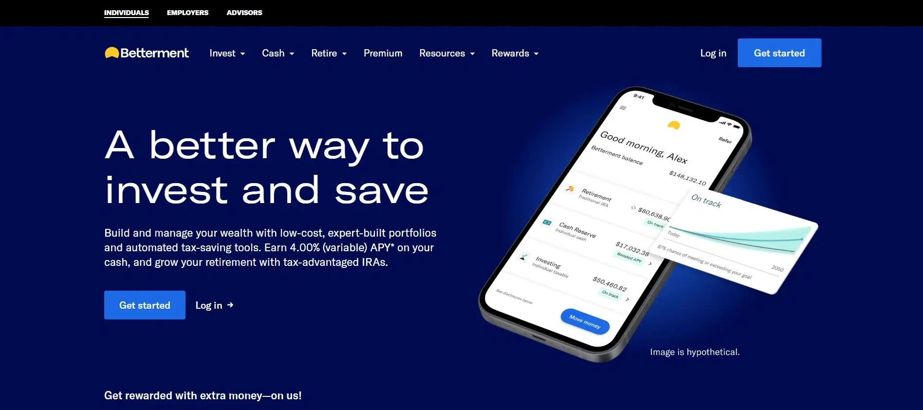
Betterment’s website proves that a modern, simplified approach can be highly effective financially. The combination of minimalist design, strategic spacing, and engaging visuals creates a digital experience that feels trustworthy and approachable.
Features of the Website:
Refreshing and Modern Color Palette: The use of soft blues, white, and subtle gradients creates a sense of calm and reliability. The colors reinforce Betterment’s digital-first approach while maintaining a welcoming feel for users who may be new to investing.
Minimalist Layout with Clear Messaging: The homepage keeps things concise and to the point, highlighting Betterment’s automated investing, high-yield cash accounts, and financial planning services. The ample white space ensures that information is presented in a clean, easy-to-read manner.
Engaging Custom Illustrations: Betterment uses sleek vector graphics that align with its tech-savvy identity instead of stock imagery. These visuals add a playful yet professional touch, making investing feel less intimidating and more accessible.
Smooth User Experience with Well-Placed CTAs: Calls to action like “Get Started” and “Explore Plans” are strategically placed throughout the site. They are noticeable but not intrusive, guiding users toward the next steps.
Simple and Clear Typography: The site uses a modern sans-serif font, ensuring readability and a polished appearance. The text is well-spaced and structured, making financial concepts easy for beginners and experienced investors to understand.
Subtle Interactive Elements: Betterment incorporates hover effects and animations that enhance engagement without causing distractions. These small details make the browsing experience feel dynamic and polished.
Optimized for Mobile and Desktop: The website adapts flawlessly across all devices, ensuring a consistent and responsive experience whether viewed on a desktop, tablet, or smartphone.
3. Wealthfront
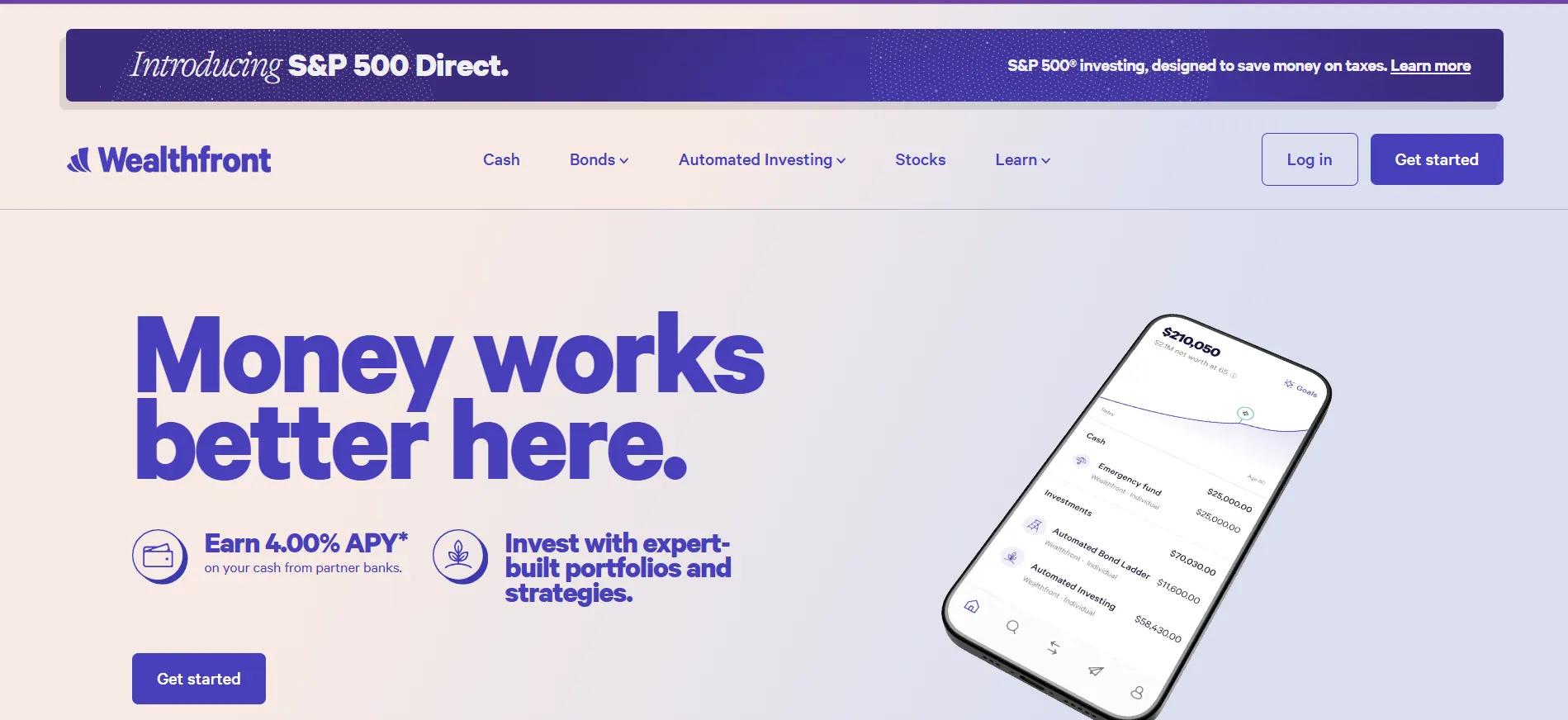
Wealthfront’s website embraces simplicity and innovation, reflecting its tech-driven approach to automated investing and financial planning. The design is modern, clean, and visually appealing, using a soft color palette of blues, purples, and white that creates a sense of calm and trust.
Features of the Website:
Minimalist Aesthetic with a Tech-Savvy Feel: The site’s design is uncluttered, allowing users to focus on Wealthfront’s core offerings’automated investing, high-yield savings, and financial planning tools. The use of ample white space gives it a sleek and contemporary look.
Soft, Refreshing Color Palette: The combination of light blue, purple, and white reinforces the brand’s modern, digital-first identity. These colors convey innovation, trust, and a seamless user experience, making the financial services feel more approachable.
High-Quality Illustrations Instead of Stock Photos: Unlike conventional financial firms that rely on corporate imagery, Wealthfront integrates custom vector illustrations that add personality and a friendly, tech-forward vibe. These visuals complement the firm’s focus on automation and AI-driven investing.
Streamlined User Flow: The homepage presents clear, digestible information, with simple explanations of services and direct CTAs like “Get Started” and “Open an Account.” The layout makes it easy for users to explore options without feeling overwhelmed.
Typography That’s Modern and Easy to Read: The clean, sans-serif font enhances readability while keeping the interface looking polished. The balanced contrast between text and background ensures a smooth reading experience across all devices.
Interactive and Engaging Elements: Wealthfront incorporates subtle animations and hover effects, making the browsing experience dynamic yet distraction-free. These small touches add a layer of sophistication to the website.
4. Stifel
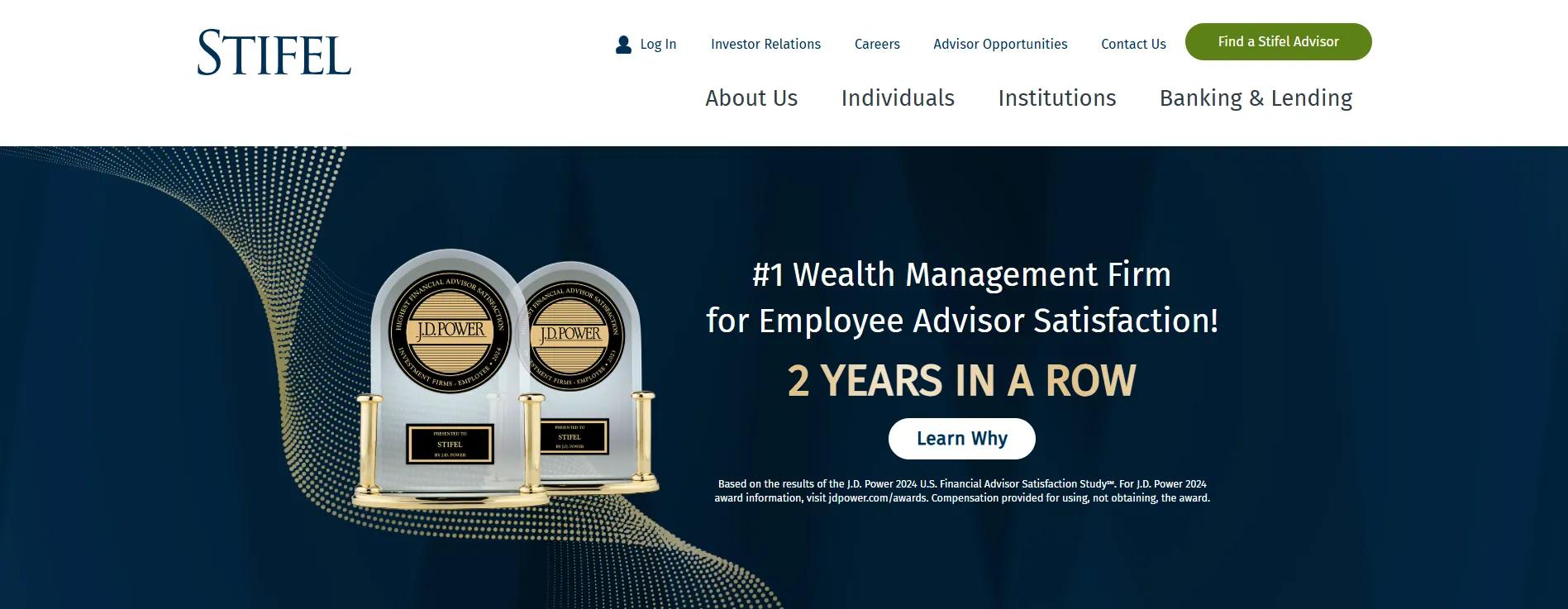
Stifel’s website is a masterclass in blending elegance with functionality. The color choices, clean layout, and professional imagery create a luxurious yet approachable feel, making financial services appear both sophisticated and accessible.
Features of the Website:
Rich Blue and White Theme: The deep blue tones evoke stability and confidence, while the crisp white backgrounds enhance readability and provide a sense of openness. This carefully selected palette ensures visitors feel assured and comfortable while exploring Stifel’s financial services.
Striking High-Resolution Imagery: The website features bold, professional images that showcase dynamic financial markets, corporate professionals, and personalized client interactions. These visuals help convey the firm’s investment banking, wealth management, and institutional services expertise.
Minimalist Yet Effective Design: The clean layout ensures that crucial information is presented to the visitors. The strategic use of white space gives the site a modern and uncluttered feel, allowing users to focus on essential financial insights.
Easy-to-Find Information with Well-Spaced Sections: The homepage is divided into clearly defined sections, guiding visitors through Stifel’s services, investment opportunities, and client resources without excessive scrolling.
Smooth and Modern Typography: The fonts are sleek and refined, enhancing readability while maintaining a high-end, polished look. The contrast between the dark blue headers and white backgrounds makes the text easy on the eyes.
Call-to-Action Buttons That Blend Seamlessly: Stifel’s CTAs’such as “Learn More” and “Find an Advisor”’are subtly integrated without being intrusive. They use understated yet noticeable colors to stand out without disrupting the design flow.
Mobile Optimization for a Flawless Experience: Whether accessed from a desktop, tablet, or mobile device, the site retains its sharp visuals and structured content, ensuring a consistent experience across all platforms.
5. Edward Jones
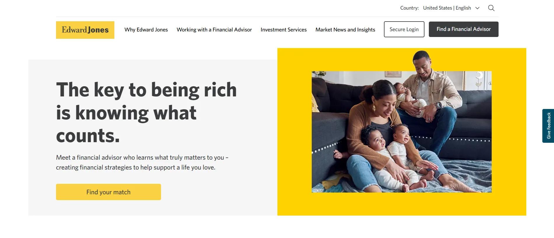
Edward Jones’ website is built to help individual investors build trust and develop long-term relationships. It effectively guides visitors to the right resources, emphasizing personalized service and ethical conduct. The design balances between offering detailed financial information and being easy to navigate.
Features of the Website:
Clear Service Categorization: Edward Jones organizes its services into sections like “Investment Services,” “Market News and Insights,” and “Find a Financial Advisor.” This structure helps users quickly find the information they need. Financial advisors can adopt a similar setup to help visitors find relevant services without confusion.
Personalized Financial Advisor Matching: The site offers tools like the Financial Advisor Search and a Starting Point Quiz to match users with the right advisor based on their goals. This personalization encourages visitors to engage with the site. Financial advisors can use similar tools to guide visitors toward services or advice that suits their needs.
Direct, Informative Content: Edward Jones provides clear headings and concise paragraphs throughout the site, making it easy to understand the services. Financial advisors should focus on simplifying complex financial topics with easy-to-read guides or articles, ensuring that clients can quickly grasp the essential points.
Ethical Standards and Trust: The company’s website clearly outlines its Code of Ethical Conduct, showing its commitment to high ethical standards. Financial advisors can also highlight their professional standards to build client trust and credibility.
Clear Calls to Action: Calls to action like “Get Started with a Financial Advisor” and “Take the Starting Point Quiz” are clearly visible and guide visitors toward action.
Mobile-Friendly Design: The website works well on both desktop and mobile devices. Financial advisors should ensure their websites are responsive, providing a smooth experience for visitors on any device.
6. Vanguard
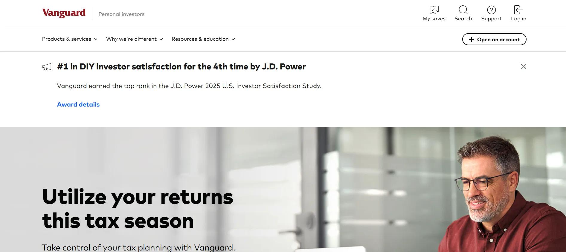
Vanguard’s website offers a simple, user-friendly experience, emphasizing transparency and easy access to various services. The design emphasizes client engagement, offering tools, resources, and personalized advice for new and experienced investors.
Vanguard’s website fosters trust and makes complex financial topics easy to understand.
Features of the Website:
Clear Service Categorization: Vanguard organizes its services into sections like “Investing for Everything”, “Cash Management”, and “529 Savings Plan”. This helps users find relevant services easily, whether saving for retirement or planning for education.
Personalized Financial Advice: Vanguard offers advice from human financial advisors and robo-advisors. Their focus is on creating customized investment strategies for each client.
Interactive Tools and Resources: Vanguard includes tools and calculators, such as a retirement income calculator. These tools help users understand their financial situation and make informed decisions.
Educational Content: Vanguard offers various educational resources, including articles and FAQs, covering topics like taxes, retirement, and investing strategies.
Mobile-Friendly Design: The website is fully optimized for mobile, ensuring users can access all resources smoothly on any device.
Responsive Design: Vanguard’s website adapts to different screen sizes, providing an optimized experience across desktops, tablets, and smartphones. The layout adjusts automatically to ensure content is displayed clearly, making it easy for users to browse on any device.
7. AIG
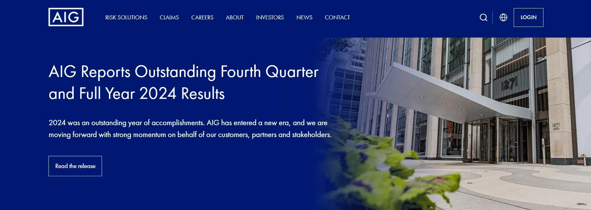
AIG’s website design is focused on simplicity and clarity while offering easy access to a wide range of insurance and financial services. The design ensures visitors can quickly navigate through the site, whether looking for personal insurance, business solutions, or financial planning resources.
The clean layout, intuitive navigation, and well-organized content make it easy for users to find what they need without feeling overwhelmed.
Features of the Website:
Simplified Navigation: AIG uses a simple, top-level navigation bar that breaks down their offerings into clear categories: Personal Insurance, Business Insurance, and Investments and Retirement. This precise categorization helps visitors find the right services based on their needs. Subcategories and relevant links are nested under each section, making it easy for users to dive deeper into specific offerings without getting lost.
Clear Calls to Action: The website prominently displays calls to action like “Get Started” and “Find a Quote”, making it simple for users to engage with the services. These buttons are placed strategically across the site to guide users toward the next step, whether they are exploring personal insurance or business services.
Engaging Visual Design: AIG uses large, high-quality images and banners to support the content, visually enhancing the user experience. The images are placed strategically to highlight key sections, such as personal and business insurance and financial services. This visual layout draws attention to important areas while maintaining a clean, uncluttered design.
Mobile-Responsive Design: The website is optimized for mobile devices, ensuring a smooth and consistent user experience on smartphones or tablets. The content, images, and interactive elements adjust to fit smaller screens, allowing mobile users to access key services and information without difficulty.
Fast Loading Speed: The website loads quickly, ensuring that visitors can access information without delay. Optimized content and quick load times contribute to a positive user experience, particularly for mobile users, where loading speed can impact engagement.
8. T. Rowe Price
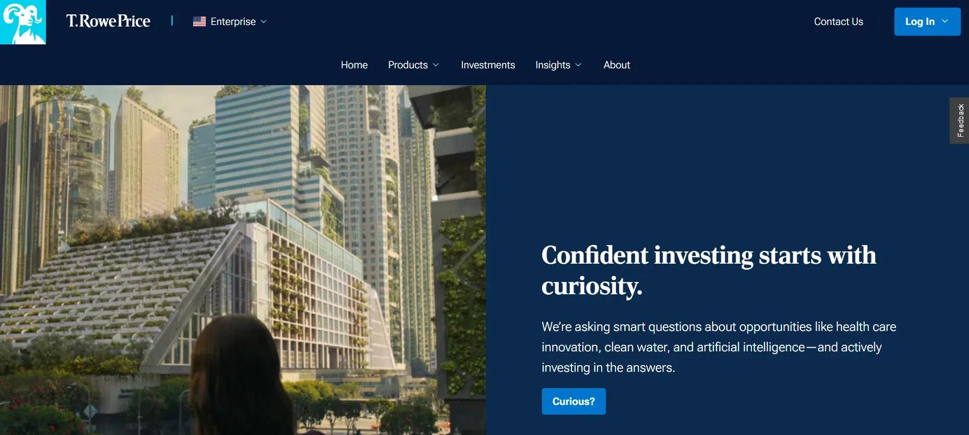
Rowe Price’s website design is focused on providing an organized, easy-to-use experience for investors. It balances detailed financial information with a clean, simple layout that ensures visitors can quickly find what they need.
The design caters to both new investors and experienced users, making it accessible to a wide range of visitors.
Features of the Website:
Clear and Simple Structure: The website features a well-organized menu with clear categories such as Investment Strategies, Retirement Planning, and Resources & Education. Each category includes relevant subcategories and links that allow users to easily explore specific services or topics.
Accessible Financial Tools: T. Rowe Price offers several tools and calculators, such as retirement planners and investment estimators, which are easy to find from the homepage and other important pages. These tools are clearly displayed, making it easy for users to engage with them without feeling overwhelmed by too many options.
Clean, Professional Design: The website uses a minimalist design with plenty of white space, which keeps the focus on the content. High-quality images and simple graphics support the information, enhancing the visual experience without cluttering the layout. The professional design reflects the company’s commitment to providing trusted financial services.
Effective Calls to Action: T. Rowe Price’s site has clearly visible calls to action, such as “Open an Account” and “Get Started with Retirement Planning.” These buttons are strategically placed, ensuring that users can easily take the next step, whether they want to start investing or explore financial planning services.
Mobile-Responsive Design: The website is fully optimized for mobile devices, ensuring a smooth experience for users on smartphones and tablets. All content adjusts automatically to fit different screen sizes, maintaining readability and usability across devices.
9. HLB

HLB’s website is designed to support its global network of independent advisory and accounting firms, reflecting the company’s commitment to innovation, collaboration, and exceptional client service across borders. The website focuses on providing a clear, professional design that emphasizes HLB’s vast global reach while making it easy for visitors to access information on services, locations, and global initiatives.
Features of the Website:
Global Network Structure: HLB’s website is well-structured, highlighting the global nature of its services by clearly presenting key regions and capabilities. Sections like “About HLB”, “Our Network”, and “Global Services” are organized to guide users easily through the company’s vast network, helping clients find the right service or professional from any of the 157 countries where HLB operates.
Professional and Clean Layout: The design uses a professional and minimalistic approach, focusing on clear fonts and a muted color palette to maintain a serious yet inviting tone. With large images and clean lines, the website avoids clutter and focuses on essential content, such as HLB’s services, locations, and global reach.
Service-Oriented Content: HLB’s website is organized around their core services, including advisory, accounting, audit, and consulting. Each service is clearly described with easy-to-understand sections that outline the firm’s expertise and approach.
Financial professionals looking to engage with specific services will find detailed descriptions explaining how HLB can support clients locally and globally.
Global Locations and Member Firms: The website prominently features the firm’s international presence, allowing users to find HLB member firms by region or country. The “Global Offices” section is interactive, letting visitors easily search for professionals in specific countries or cities.
Clear Calls to Action: Throughout the site, HLB strategically places effective calls to action such as “Contact Us,” “Find a Local Member,” and “Explore Our Services.” These are placed to guide users to take action, whether they want to reach out for personalized services or learn more about the firm’s offerings.
Fast and Efficient Load Times: The website is optimized for fast load speeds, ensuring that pages load quickly without delays. This is particularly important for a global audience where varying internet speeds can affect user experience.
10. Penserra
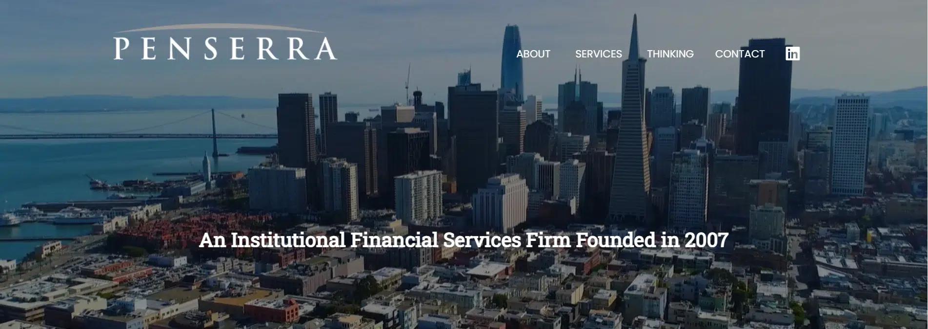
Penserra’s website is designed with a focus on professionalism and user experience. It reflects the firm’s values of precision, innovation, and customer service while maintaining a clean and accessible layout. The website effectively communicates the company’s mission, services, and commitment to diversity, inclusion, and sustainability.
Features of the Website:
Simple and Clean Structure: Penserra’s website features a minimalist design with a direct structure. The primary sections’About, Services, Thinking, and Contact’are easy to find and clearly labeled. This simple structure makes it easy for visitors to understand what Penserra offers and navigate through the site.
Service-Oriented Content: The website strongly emphasizes the firm’s services, such as Global Equity Trading, Fixed Income Trading, and Investment Banking. These are clearly listed and explained, allowing potential clients to learn about Penserra’s expertise quickly.
Clear Branding and Messaging: Penserra uses the “Think. Plan. Act.” slogan alongside its company name to reinforce its financial services approach. This succinct, action-oriented message is integrated across the website, making it clear that the company is focused on providing thoughtful, strategic solutions. Advisors can incorporate clear, concise messaging on their websites to convey their unique value propositions.
Minimalistic and Professional Design: The website uses a clean design with plenty of white space, ensuring that content is easy to read and not cluttered. Simple fonts and a muted color palette create a professional feel reflecting the firm’s focus on trust and precision. This minimalism ensures that the content takes center stage without distractions.
Interactive Features for User Engagement: The website offers several interactive features, including options to learn more about Penserra’s services, read their Sustainability Statement, and access disclosures. These features ensure that users can quickly find the information they need without searching through multiple pages. Clear calls to action, like “Contact Us” or “Learn More,” encourage users to engage with the firm.
Mobile-Responsive Design: The site is optimized for mobile devices, providing a smooth experience for users on smartphones or tablets. Content adjusts automatically to fit smaller screens, ensuring the design remains functional and accessible across different devices.
11. Baker Tilly
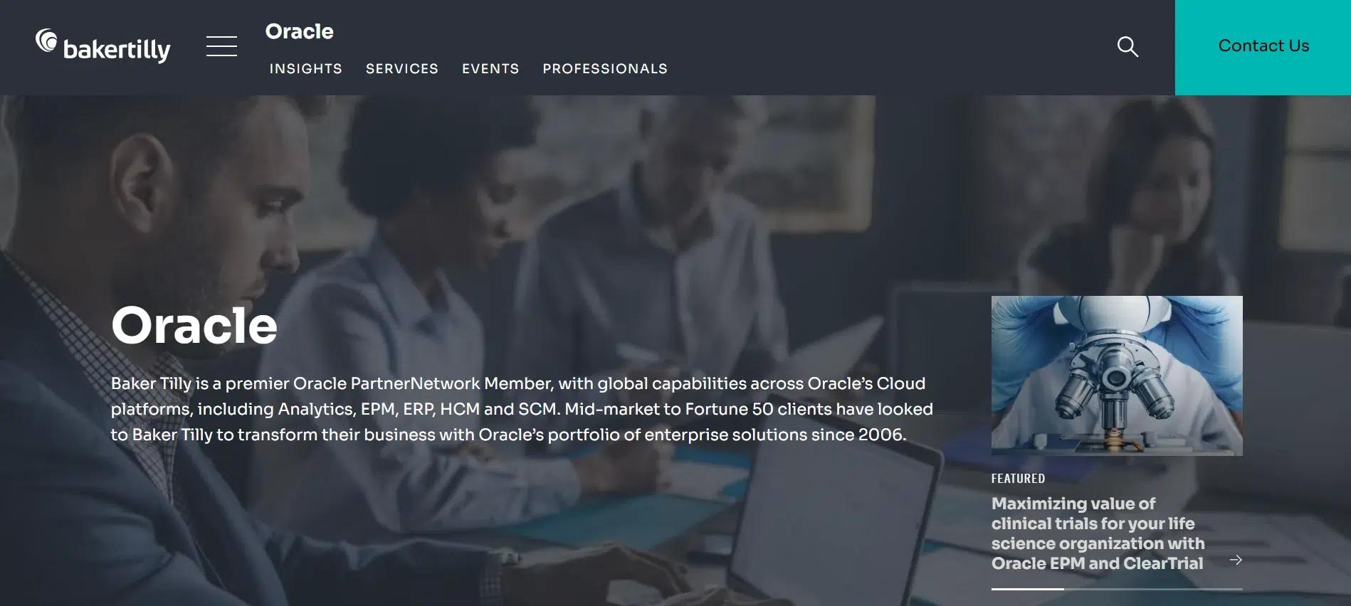
Baker Tilly’s website, particularly its Oracle Technologies section, is designed to provide a clear, user-friendly experience for businesses seeking technology consulting and solutions. The site showcases their Oracle expertise while offering easy access to relevant information and resources. With a professional and streamlined design, the website ensures that visitors can find specific services and solutions without feeling overwhelmed.
Features of the Website:
Service-Focused Structure: The Oracle section is part of Baker Tilly’s broader services, clearly focusing on offering Oracle-related solutions. The website features sections such as “Oracle Solutions,” “Advisory Services,” and “Client Success Stories,” helping visitors understand the scope of Oracle services and how they can benefit their businesses.
Clear and Concise Content: The website uses simple, concise language to explain the value of Oracle solutions. Each section provides essential details without overloading the visitor with information. By presenting the core benefits and solutions straightforwardly, the website ensures visitors can quickly understand what Baker Tilly offers and how they can help solve business challenges.
Professional and Clean Design: The design uses a minimalist approach with clean lines and ample white space. This helps maintain focus on the content and makes the site easy to read and explore. Using images and icons to support the content enhances the page’s visual appeal without distracting from the core message.
Clear Calls to Action: The website includes clearly visible calls to action such as “Contact Us,” “Request a Demo,” and “Learn More.” These buttons are strategically placed throughout the page to encourage visitors to take the next step, whether that’s reaching out for more information or requesting a demo. Advisors should implement similar calls to action to guide visitors through their site and encourage client engagement.
12. Blue Ridge Partners
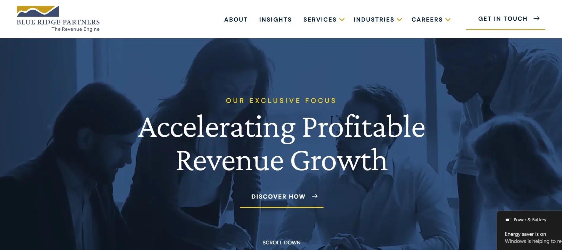
Blue Ridge Partners’website is designed with clarity and purpose, offering clients a professional yet approachable experience. The design highlights the company’s expertise in consulting for growth, helping businesses across industries achieve operational improvements. The website’s focus on clear messaging, easy navigation, and accessibility ensures a smooth user experience.
Features of the Website:
Clear Service Structure: The website organizes services like Revenue Growth, Cost Efficiency, and Market Expansion into easily accessible sections. This allows visitors to understand what Blue Ridge Partners offers quickly. Financial advisors can do the same by clearly categorizing their services.
Concise, Impactful Content: Blue Ridge Partners uses simple, clear language to describe its offerings. Its complex services are easy to understand, which builds trust with potential clients. Advisors can apply this approach to make their services relatable and easy to grasp.
Client Success Stories: The website highlights case studies and testimonials showing real results, which builds credibility and trust. Financial advisors should include similar success stories to showcase their expertise and impact.
Professional Design: The site uses a clean, modern layout with professional images and simple fonts, focusing on the content. Financial advisors can use this style to create an appealing, easy-to-read website.
Strategic Calls to Action: Clear calls to action, like “Contact Us” and “Get Started”, are placed throughout the site to guide visitors toward engagement. Advisors should ensure they have similar, easy-to-find options for visitors to take the next step.
Mobile-Optimized: The website adapts seamlessly to mobile devices, ensuring accessibility on all screen sizes. Financial advisors should ensure their websites are responsive to provide a smooth mobile experience.
13. Meridian Wealth Management
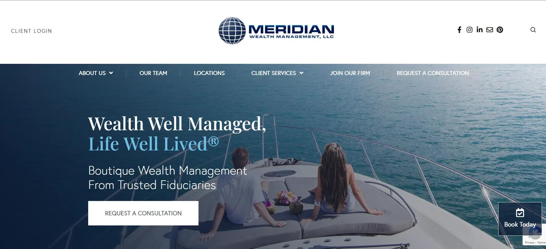
Meridian Wealth LLC’s website presents a clean, professional design that effectively communicates their financial services. It is designed for easy navigation, ensuring visitors can quickly find relevant information and engage with the firm’s offerings. The layout reflects the firm’s commitment to trust, expertise, and client success.
Features of the Website:
User-Friendly Layout: The website features a direct layout with essential sections like About Us, Services, and Resources. These are easy to find, making the site simple for visitors to explore. The clear structure ensures that users can easily access the information they need without feeling overwhelmed.
Clear and Direct Service Information: Meridian Wealth clearly describes its services, including financial planning, investment strategies, and retirement services, in a simple, direct manner. The focus is on presenting the core services in a way that is easy for potential clients to understand.
Professional, Modern Design: The website uses a clean, minimalist design, high-quality images, and readable fonts. White space is used effectively to create a visually appealing and uncluttered look. This professional design helps build trust with potential clients and conveys competence and attention to detail.
Encouraging Action: Strategic calls to action like “Get Started,” “Contact Us,” and “Request a Consultation” are prominently placed throughout the site. These buttons guide users toward the next step, such as reaching out for more information or scheduling a consultation.
Accessible Resources and Tools: The website includes helpful resources, such as blog posts and financial tools, allowing visitors to learn more about the firm and its services. These resources provide valuable information and position the firm as a knowledgeable industry leader.
Mobile-Optimized for All Devices: The site’s responsive design ensures that it works smoothly across all devices, from desktops to smartphones.
14. Fortress Investment Group
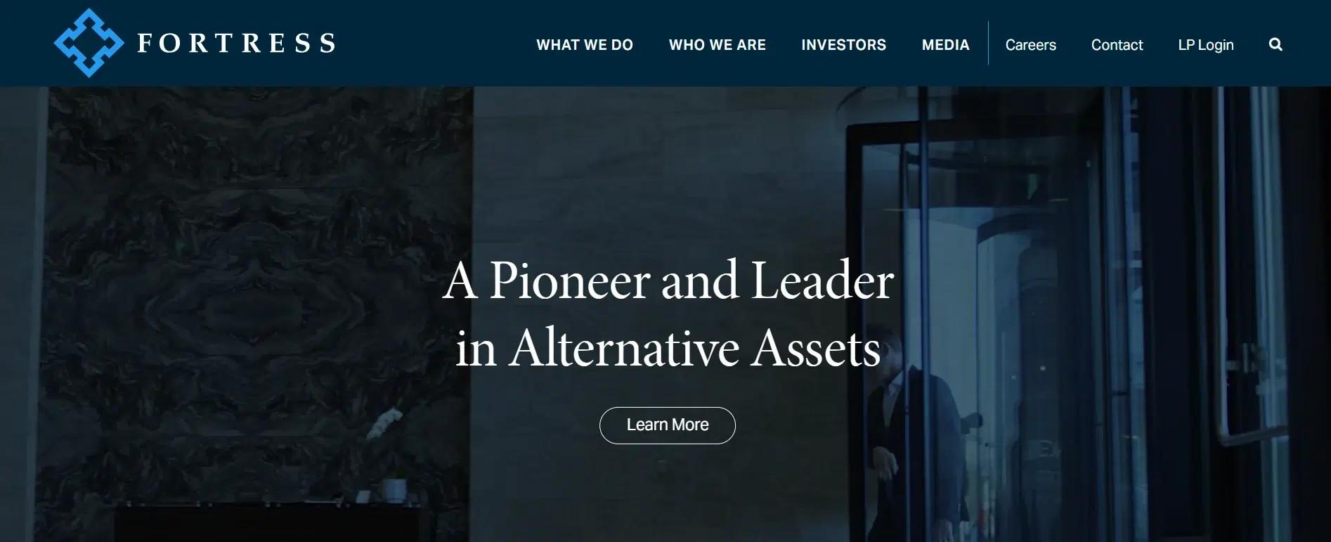
Fortress Investment Group’s website reflects its strong brand identity and institutional expertise. The design is modern, bold, and professional, reinforcing the firm’s reputation in alternative asset management. With a highly visual layout, large typography, and a structured content flow, the site creates an authoritative presence while maintaining clarity and usability.
Features of the Website:
Strong Visual Identity: The website immediately impacts with full-width, high-resolution imagery and a dark, professional color scheme. The bold fonts and structured content blocks reflect the firm’s emphasis on strength, stability, and leadership in investment management. This design choice conveys trust and authority, something financial advisors can incorporate by using strong visuals and well-defined branding on their websites.
Direct Content Structure: Fortress organizes information into clear sections, such as “About,” “Investment Strategies,” “News,” and “Contact”. The homepage quickly directs visitors to essential areas without unnecessary distractions.
Strategic Use of White Space: Despite its bold branding, the website maintains a clean look with generous white space, improving readability and reducing visual clutter. The content is laid out in digestible blocks, allowing users to scan through essential information quickly. This minimalist approach ensures that essential details stand out.
Emphasis on Expertise and Track Record: The website features a dedicated section for investment strategies, breaking down Fortress’s approach to credit, private equity, and real estate investment. Using case studies, insights, and historical performance highlights builds credibility.
Clear Calls to Action: The “Contact” and “Investor Relations” sections are manageable and guide visitors toward further engagement. The direct and professional placement of calls to action ensures that users understand how to connect with the firm.
15. Leekranefuss

Leekranefuss’s website is designed with a strong emphasis on simplicity and user experience. The site is structured to offer clear access to the firm’s services, expertise, and contact information, creating a seamless browsing experience for visitors.
Features of the Website:
Clear and Simple Navigation Bar: The website features a well-organized toolbar at the top of every page. The primary sections, such as “About Us”, “Services”, and “Contact”, are easy to find and clearly labeled. This structure helps users quickly locate key information without unnecessary effort.
Direct Access to Services: The website offers a direct and easy-to-find list of services under the “Services” section, where visitors can quickly explore financial planning, investment strategies, and other key offerings. This structure minimizes the need for excessive scrolling or clicking.
Professional and Clean Layout: The site’s layout is simple, with large fonts and clear headings that make content easy to read. The minimal design uses neutral colors and subtle images, keeping the focus on the information. This approach enhances professionalism while ensuring the site isn’t overwhelming to visitors.
Visible Calls to Action (CTA): Clear CTAs like “Contact Us” and “Schedule a Consultation” are strategically placed across the website, guiding visitors toward taking action. These CTAs are simple and easy to find, ensuring users can quickly move from browsing to engaging with the company.
Mobile-Friendly Design: The website is fully responsive, adjusting smoothly to different devices like tablets and smartphones. This ensures that users can easily access the site and explore its content without issues, whether at their desks or on the go.
16. SignatureFD
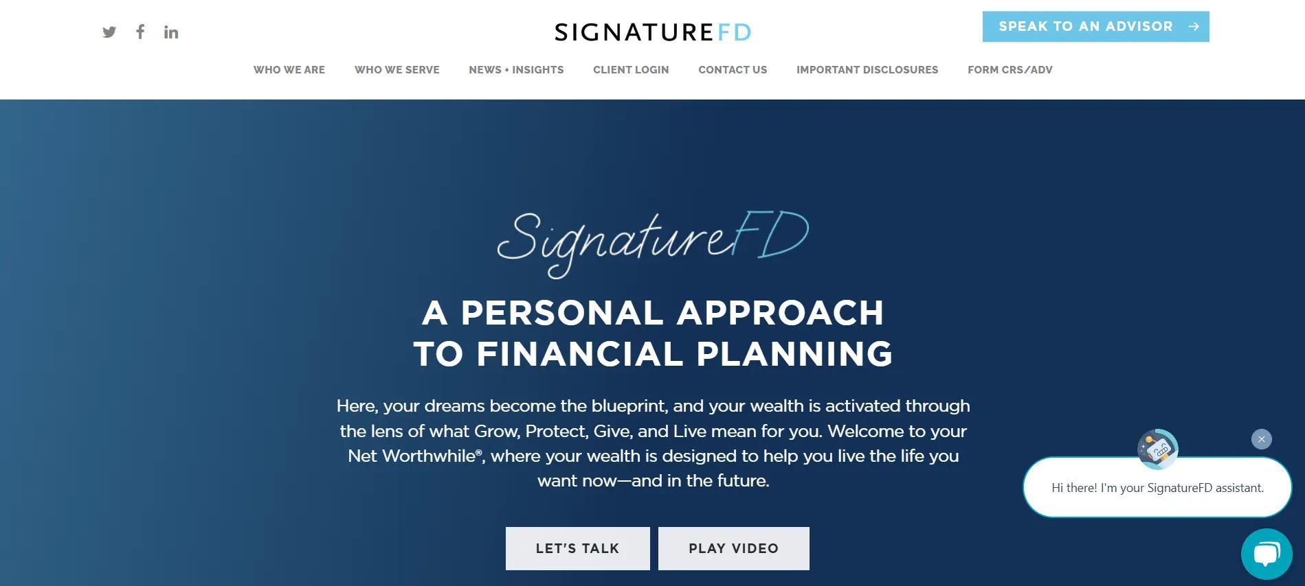
SignatureFD’s website is designed to highlight its approach to personalized financial planning. The clean, user-friendly layout showcases its services and client-first philosophy, providing a smooth experience for visitors.
Features of the Website:
Simple and Organized Layout: The website has a clear structure with sections like “Who We Are,” “What We Do,” “Insights,” and “Contact Us.” This makes it easy for users to find information quickly.
Client-Centric Approach: SignatureFD emphasizes its Net Worthwhile® approach, with principles like GROW, PROTECT, GIVE, and LIVE. These are clearly explained on the homepage, showing how the services align with clients’ financial goals.
Engaging Visual Design: The minimalist design features bold typography and hand-drawn icons for each principle, creating a personal and professional look that appeals to potential clients.
Clear Calls to Action: The site includes “Let’s Talk,” “Take Quiz,” and “Start Your Path to Net Worthwhile®” buttons throughout, encouraging users to take the next step.
Client Testimonials: The site showcases client testimonials to build trust and credibility, helping potential clients feel confident in the firm’s services.
Educational Content: The “News + Insights” section offers webinars, podcasts, and recordings that provide valuable financial knowledge to visitors.
Mobile Optimization: The website adapts smoothly to all devices, ensuring a consistent experience on desktops, tablets, and smartphones.
17. Gerstein Fisher
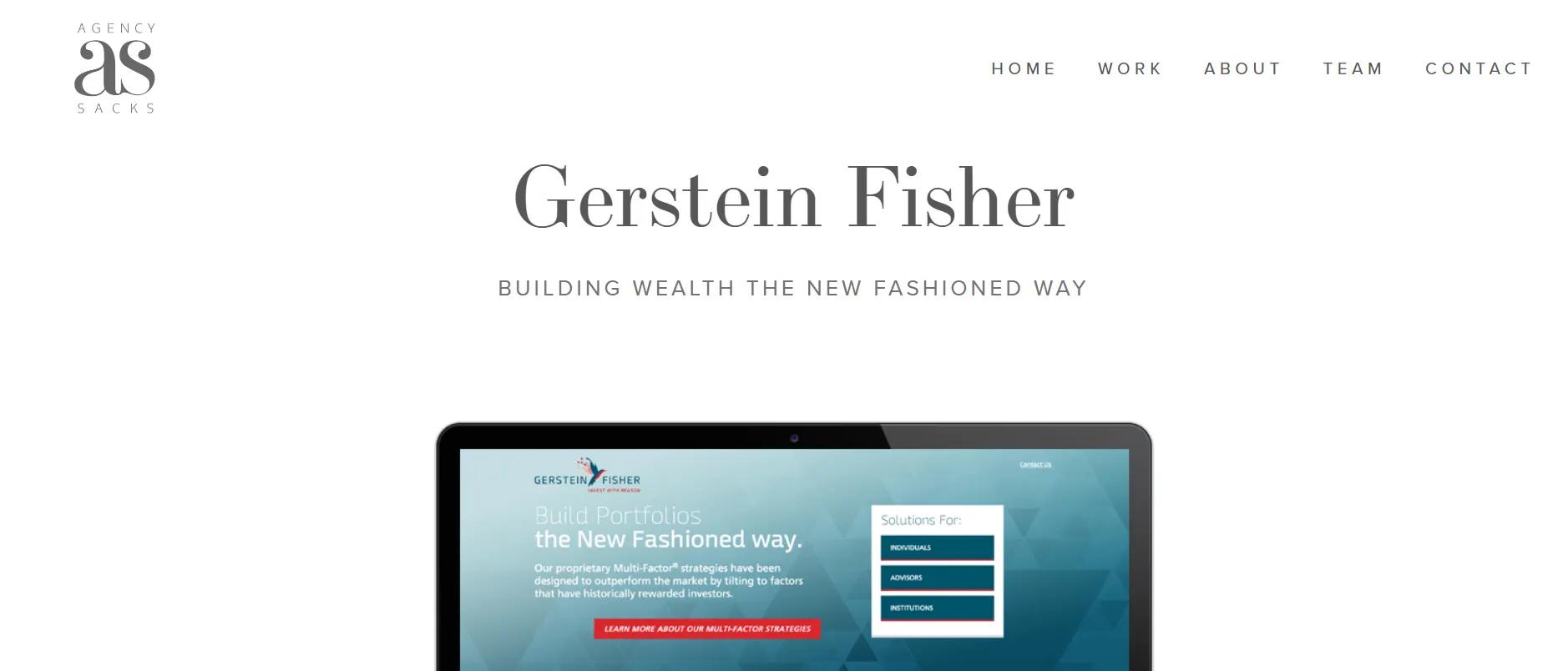
Gerstein Fisher’s website, designed by Agency Sacks, reflects the firm’s commitment to offering investment strategies tailored to the needs of individual clients. The clean, organized layout highlights the firm’s financial expertise while making it easy for visitors to find relevant information and take action.
Features of the Website:
Clear, Structured Layout: The website features a well-organized design with sections such as “About Us,” “Investment Strategies,” “Insights,” and “Contact”. These sections are clearly labeled, making it easy for users to find the information they need without confusion.
Client-Centric Content: Gerstein Fisher’s site is focused on personalized financial solutions. It emphasizes the firm’s approach to customized investment strategies, clearly describing how they cater to different client needs. This approach helps visitors understand how the firm’s services align with their goals.
Simple and Elegant Design: The design takes a minimalist approach, using a modern font and ample white space to improve readability. Professional images, combined with a muted color palette, create a clean and sophisticated look that builds trust.
Prominent Calls to Action: The website includes clear and accessible calls to action such as “Get in Touch” and “Request a Consultation”. These CTAs are strategically placed, making it easy for visitors to contact the firm or take the next steps in engaging their services.
Insightful Resources: The website also features a section with insights such as articles, news, and blogs. This establishes Gerstein Fisher as an expert in the field while offering visitors valuable information to guide their financial decisions.
18. Farr Miller & Washington
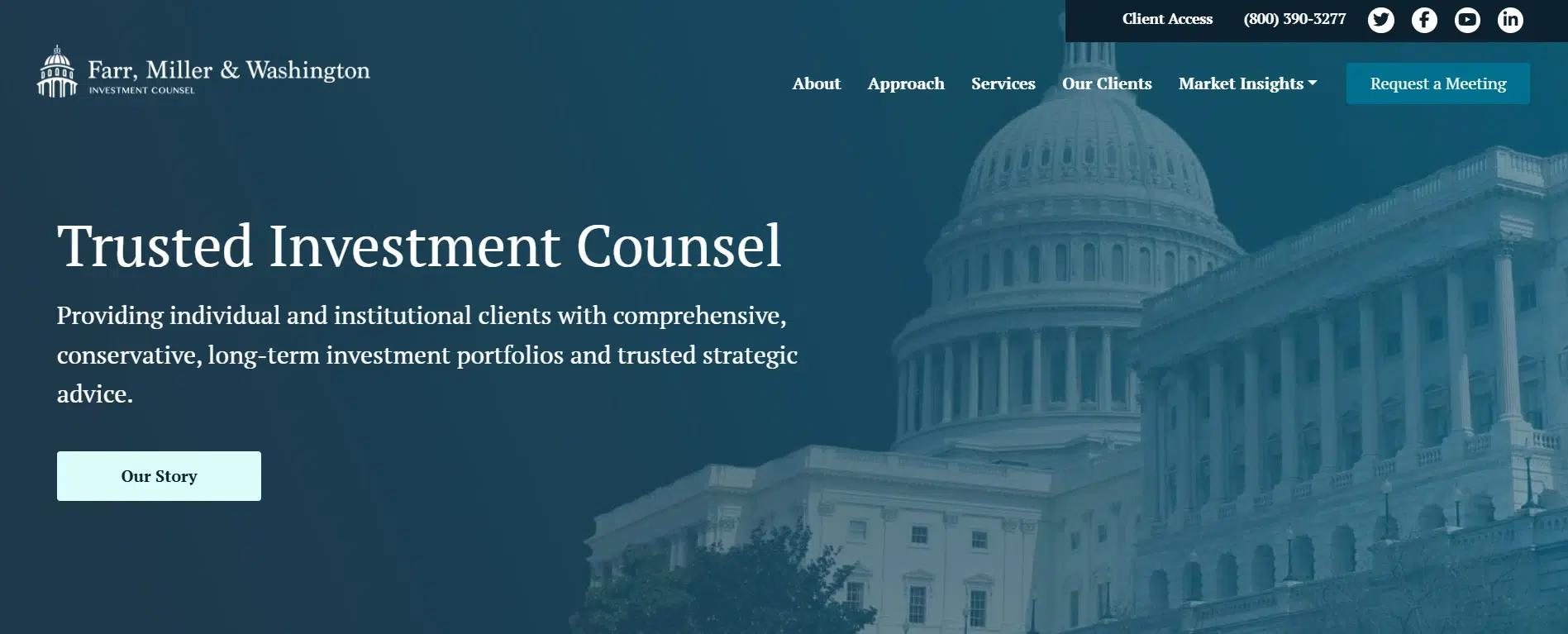
Farr Miller & Washington’s website combines simplicity with elegance, presenting a clear and organized layout. The design highlights the firm’s wealth management services while making it easy for visitors to access relevant information and engage with the firm.
Features of the Website:
Clear and Simple Layout: The website uses a direct layout with sections like “About,” “Services,” “Insights,” and “Contact.” This structure helps users quickly find the information they are looking for, without having to search through cluttered pages.
Focus on Client Needs: Farr Miller & Washington emphasizes wealth management and financial planning services. The website clearly explains how its strategies cater to the needs of high-net-worth individuals and families, making it easy for potential clients to understand the value it offers.
Elegant and Minimalist Design: The design relies on simple visuals, professional images, and a clean color scheme. This minimalist style ensures that the site looks polished and maintains a sense of professionalism without distractions, allowing visitors to focus on the content.
Easy-to-Find Calls to Action: The website includes prominent calls to action such as “Contact Us” and “Request a Consultation”. These are placed in key areas, encouraging visitors to take the next step in engaging with the firm.
Valuable Insights and Information: The “Insights” section features financial resources, news, and articles, adding value for visitors. This helps establish the firm as a knowledgeable resource, providing insights that support potential clients in making informed decisions.
Responsive and Mobile-Friendly: The site adapts well to different devices, providing a smooth experience for users on smartphones, tablets, and desktops. This ensures that all visitors can easily browse and interact with the content regardless of their device.
19. Aspiriant
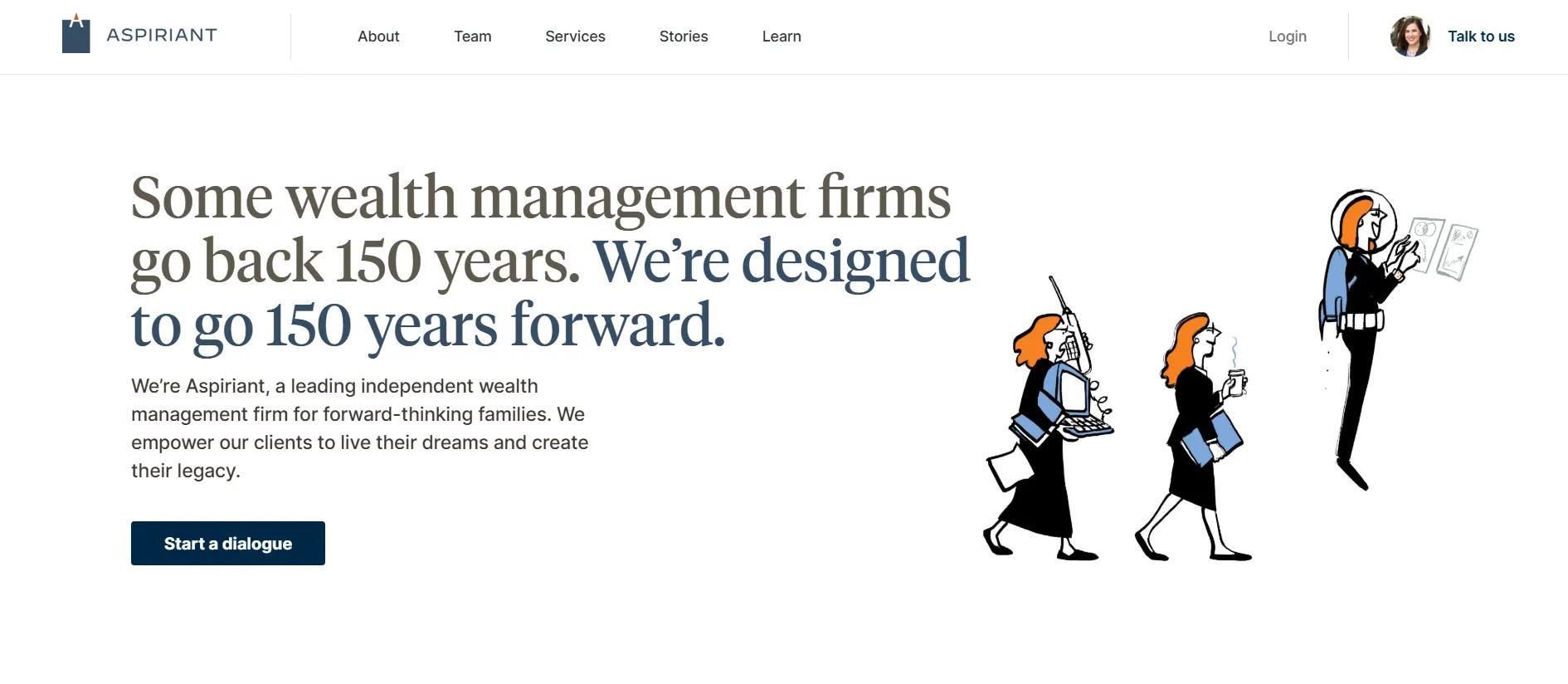
Aspiriant’s website is designed to offer a clean, structured experience that emphasizes the firm’s personalized wealth management services. By focusing on clarity and user engagement, the site ensures potential clients can easily navigate and understand the firm’s offerings.
Features of the Website:
Clean and Organized Layout: The website’s layout is simple, with clearly defined sections such as “Who We Are,” “Services,” and “Insights.” This allows users to quickly access relevant information without feeling overwhelmed.
Effective Use of Visual Hierarchy: The design uses large, bold typography to make key messages stand out, like their unique Net Worthwhile® approach. This draws attention to the most important aspects of the site, guiding visitors’ focus.
Client-Focused Messaging: The design conveys Aspiriant’s personalized service through clear, client-centric messaging, such as helping clients “live their dreams and create their legacy.” This direct approach and call-to-action buttons like “Start a Dialogue” and “Talk to an Expert” encourage user engagement.
Simple, Elegant Design: The minimalist design features large images, neutral colors, and plenty of white space, creating a professional and approachable look. This ensures the focus remains on the content while providing a clean, non-distracting visual environment.
Mobile-Friendly Design: Aspiriant’s website is fully responsive, providing a consistent, seamless browsing experience across all devices, ensuring all content remains readable and navigable.
Rich Content for Engagement: The website integrates insights, blogs, and resources to engage visitors further and position Aspiriant as a leader in wealth management.
20. JPMorgan Wealth Management
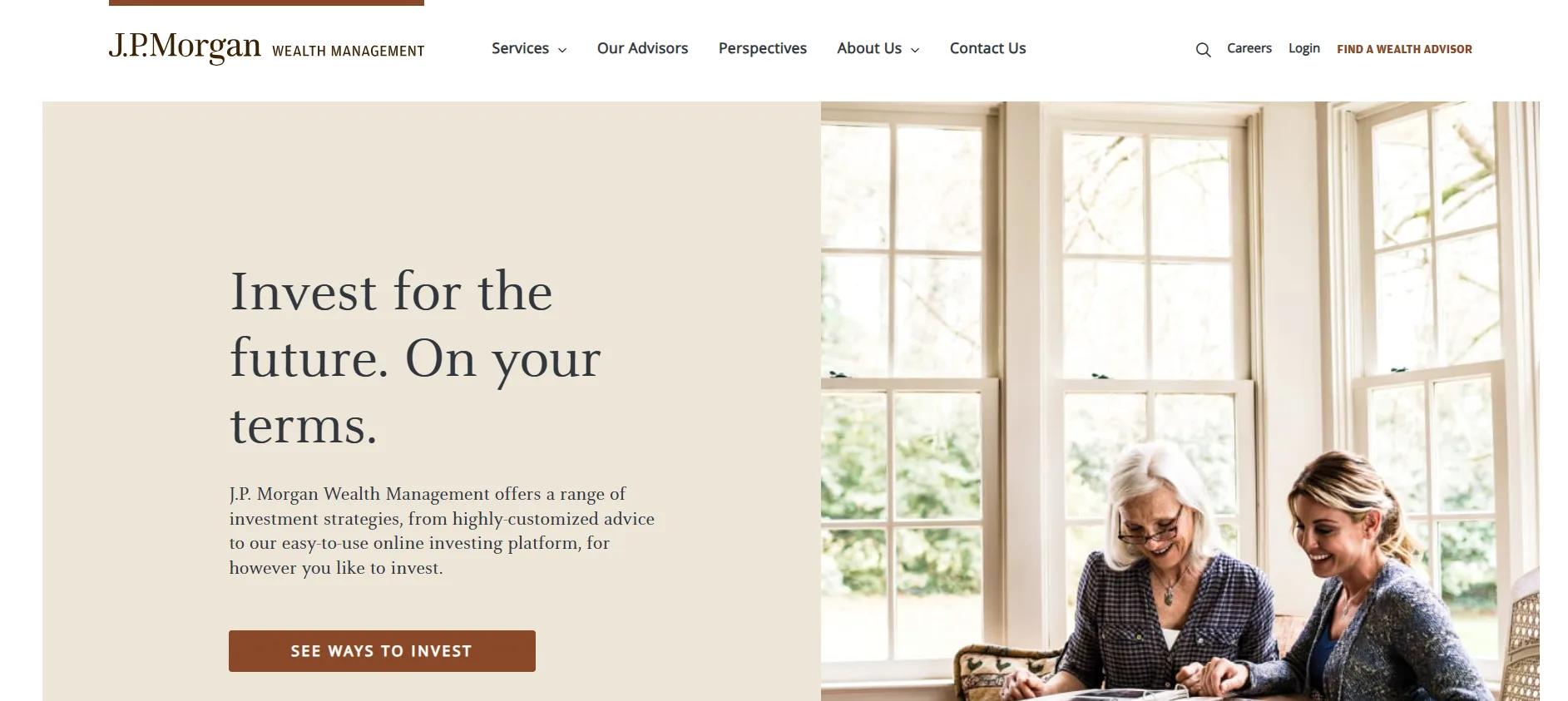
JPMorgan’s Wealth Management website combines sophistication with usability, offering a streamlined, user-friendly experience. The design reflects the firm’s high-level expertise while making it easy for visitors to understand their wealth management services.
Features of the Website:
Well-Structured Layout: The website is divided into clear sections, such as “Investment Services,” “Planning,” “Insights,” and “Client Resources.” This organized layout allows visitors to easily find the information that is most relevant to them.
Professional and Clear Content: The website uses simple language to explain complex financial topics. The wealth management services are clearly laid out, offering users a transparent view of what JPMorgan offers. This approach helps visitors quickly understand how the services can address their financial needs.
High-Quality Imagery and Design: The design uses a clean and minimalist style with high-resolution images and a neutral color palette. This gives the site a polished, professional look while ensuring the content remains the focus. Advisors can use a similar clean design to build a professional online presence.
Engaging Calls to Action: Clear calls to action, such as “Get Started” and “Speak to an Advisor,” are strategically placed to encourage visitors to engage with the firm. These visible CTAs guide users towards taking the next step.
Educational Resources: The website features various insights, articles, and market updates to help visitors make informed decisions. This demonstrates JPMorgan’s thought leadership and adds value to visitors by offering helpful financial information.
Responsive Design: The site is mobile-optimized, ensuring a consistent, easy-to-use experience on both desktop and mobile devices. This ensures that users can access services and information regardless of their device.
21. Merrill Lynch
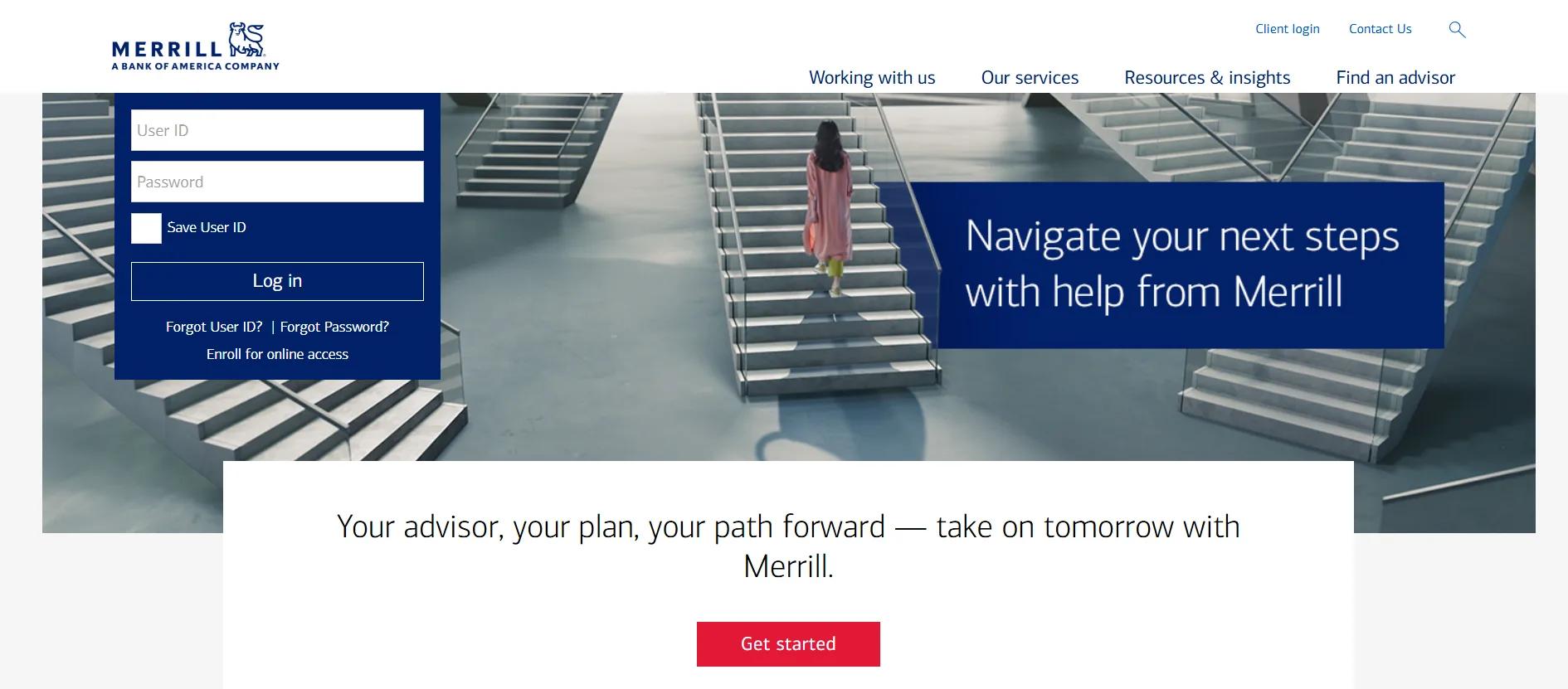
Merrill Lynch’s website is designed to present its wealth management services in an accessible, professional manner. The website emphasizes clear navigation, user engagement, and easy access to information, making it a reliable resource for current and potential clients looking for financial advice and solutions.
Features of the Website:
Simple, Well-Organized Layout: The website is divided into clear sections such as “Wealth Management,” “Investment Solutions,” “Client Resources,” and “Insights.” This organization ensures visitors can easily find the services and information they need. The design minimizes clutter and highlights the most important offerings.
Client-Focused Content: Merrill Lynch’s website focuses on the client experience, offering clear descriptions of its services, including investment management, retirement planning, and financial strategies. The content speaks directly to clients’ needs, using simple language to explain complex financial topics.
Visual Design Focused on Professionalism: The website uses high-quality images, clean lines, and a neutral color palette to maintain a trustworthy professional appearance. The minimalist design ensures that visitors are not distracted by unnecessary elements, allowing them to focus on the information provided.
Prominent Calls to Action: The site features clear calls to action, such as “Talk to a Financial Advisor” and “Get Started,” strategically placed to guide visitors toward action. These buttons are easy to find and encourage users to engage with the firm.
Educational and Interactive Resources: Merrill Lynch provides various educational content, such as articles, market insights, and financial calculators. This adds value for visitors and establishes the firm as a leader in wealth management.
22. Guggenheim Partners
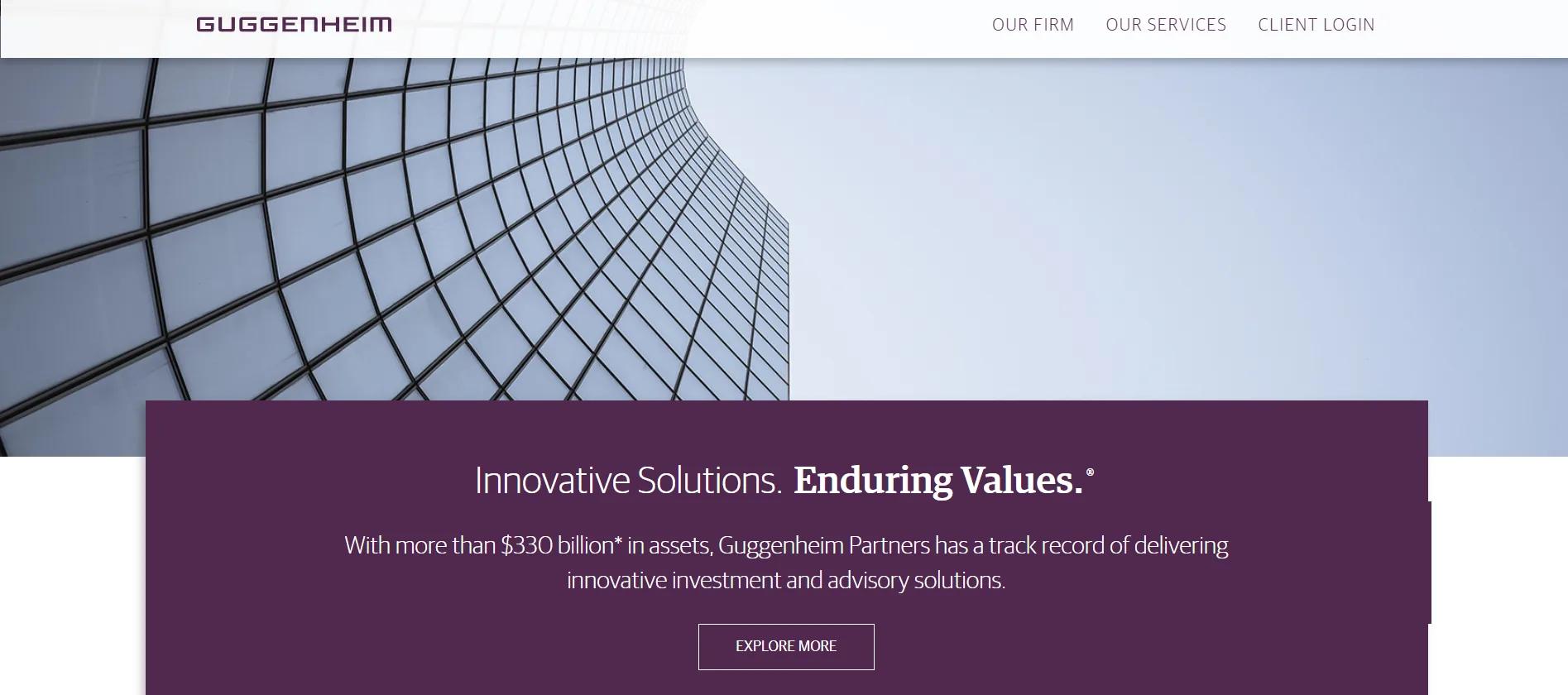
Guggenheim Partners’website is designed to reflect the firm’s financial expertise and professionalism. The clean and structured layout allows visitors to easily access relevant information and engage with the firm’s services.
The site’s design focuses on clear communication, ease of use, and a strong visual identity.
Features of the Website:
Focused on Expertise and Services: The site communicates Guggenheim Partners’ expertise in investment management, asset management, and private wealth. Each service is explained in clear terms, providing visitors with an understanding of how the firm’s offerings can meet their needs.
Sophisticated Visual Design: The website uses a minimalist design with professional images, muted colors, and ample white space. This approach helps maintain focus on the content while creating a clean, polished look that reflects the firm’s professionalism. The design supports the messaging and reinforces the firm’s high-level expertise.
Prominent Calls to Action: The site includes visible calls to action, such as “Contact Us” and “Learn More,” which guide visitors toward the next steps. These buttons are easy to find and encourage users to take action and engage with the firm further.
Engaging Resources and Insights: Guggenheim Partners provides access to articles, insights, and market research through a dedicated section on the website. This establishes the firm as an expert in its field and provides valuable information for visitors, helping them make informed financial decisions.
Mobile-Friendly and Responsive: The website is fully responsive, providing a consistent and smooth user experience across different devices, including smartphones, tablets, and desktops. This ensures that visitors can access the content easily, regardless of their device.
23. Harris Associates
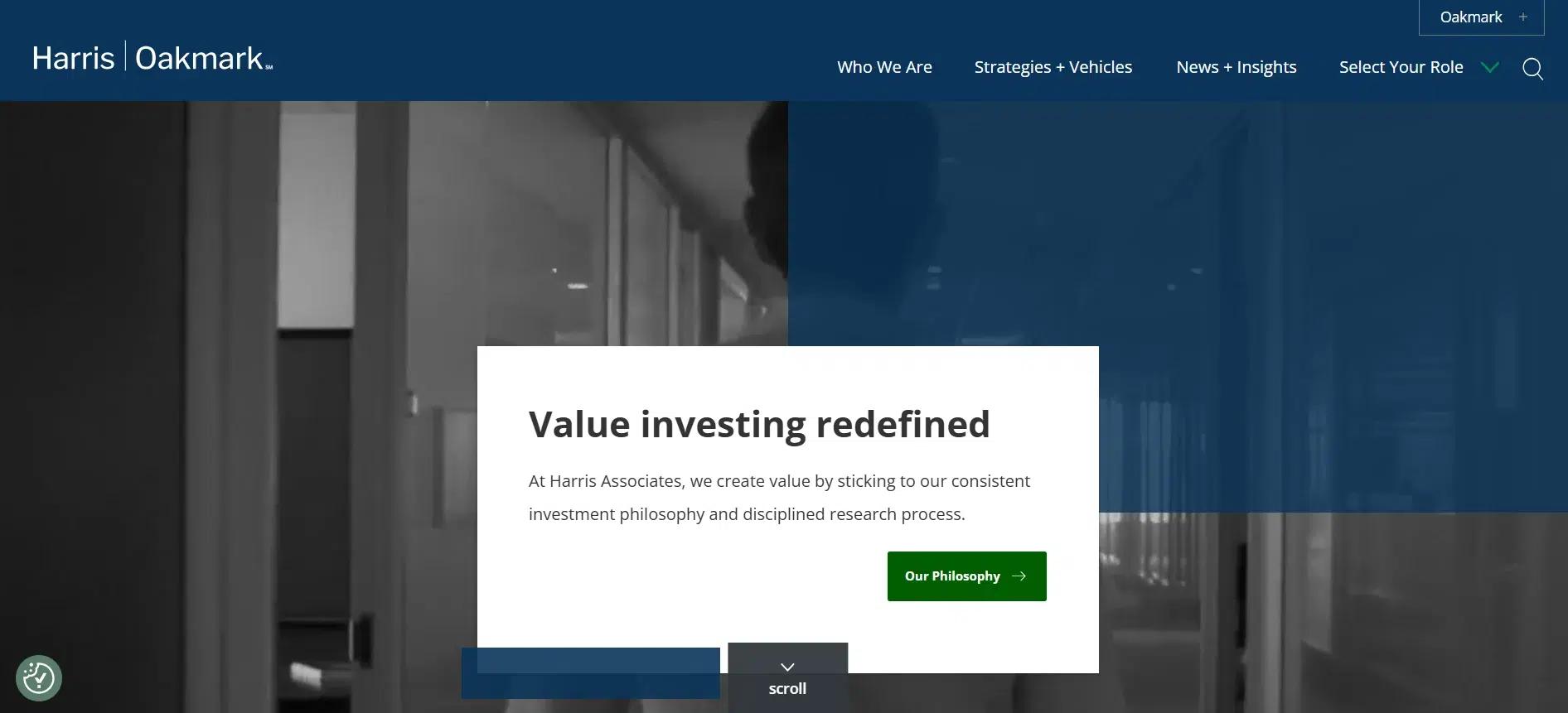
Harris Associates’website exudes professionalism and simplicity, perfectly reflecting the firm’s expertise in investment management. The layout is designed to provide visitors with a direct, user-friendly experience that drives clarity and engagement.
Features of the Website:
Effortless Structure: The website isn’t cluttered with unnecessary elements. With sections like “About Us,” “Investment Strategies,” “Insights,” and “Contact,” Harris Associates ensures that visitors can quickly find the core information they need.
Focused, Client-Centric Content: The messaging is all about value investing. Each section speaks directly to potential clients, showcasing how Harris Associates’ expertise can help grow their wealth. The direct content breaks down complex strategies into digestible information, ensuring anyone can understand the firm’s approach.
Professional, Clean Aesthetic: The website’s design is minimalist yet polished. It features high-quality images and a neutral color palette that keeps the focus on what matters: the content. The use of ample white space ensures that visitors don’t feel overwhelmed by visuals, allowing them to absorb the information.
Visible and Actionable Calls to Action: Harris Associates places clear, accessible CTAs like “Contact Us” and “Learn More” at the right spots throughout the website. These buttons stand out without being intrusive, guiding users gently toward making a decision.
Invaluable Insights: The website isn’t just about promoting services; it’s also about offering valuable knowledge. Harris Associates has a dedicated insights section with articles, research, and investment advice. This helps educate visitors and builds the firm’s reputation as a thought leader in the investment management space.
24. Anchor Financial
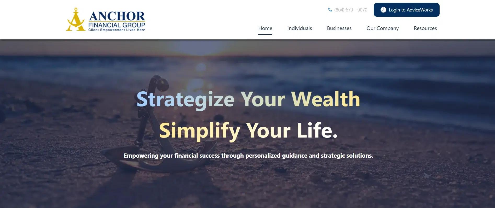
Anchor Financial’s website design emphasizes clarity and simplicity, ensuring visitors can quickly access important information about the firm’s services. The layout is direct and engaging, offering a seamless user experience while highlighting the firm’s expertise in wealth management.
It’s a strong example to add to the list of website design ideas for financial advisors who want a clean, professional, and client-focused online presence.
Features of the Website:
Clean and Well-Structured Layout: The website has a direct layout with sections like “About,” “Services,” “Contact,” and “Client Portal.” This clean structure allows visitors to navigate the site easily and find the necessary information.
Minimalist Design: The design focuses on clean lines, ample white space, and a neutral color palette. This minimalist approach helps keep the site looking professional and uncluttered.
Client-Focused Content: Each page is focused on client needs, explaining the firm’s services in a direct and easy-to-understand manner. The content clearly outlines the financial services offered, emphasizing how Anchor Financial can help clients with their financial goals.
Effective Use of Imagery: The website uses high-quality, relevant images throughout to complement the text and reinforce the firm’s brand. The imagery aligns with the site’s overall professional and polished tone.
Responsive Design: The website is fully optimized for mobile devices, offering a smooth and consistent experience whether users browse from a desktop, tablet, or smartphone. The site’s layout automatically adjusts for different screen sizes.
Fast Loading Speed: The website’s pages load quickly, even on slower connections, thanks to optimized images and clean coding.
25. Baird
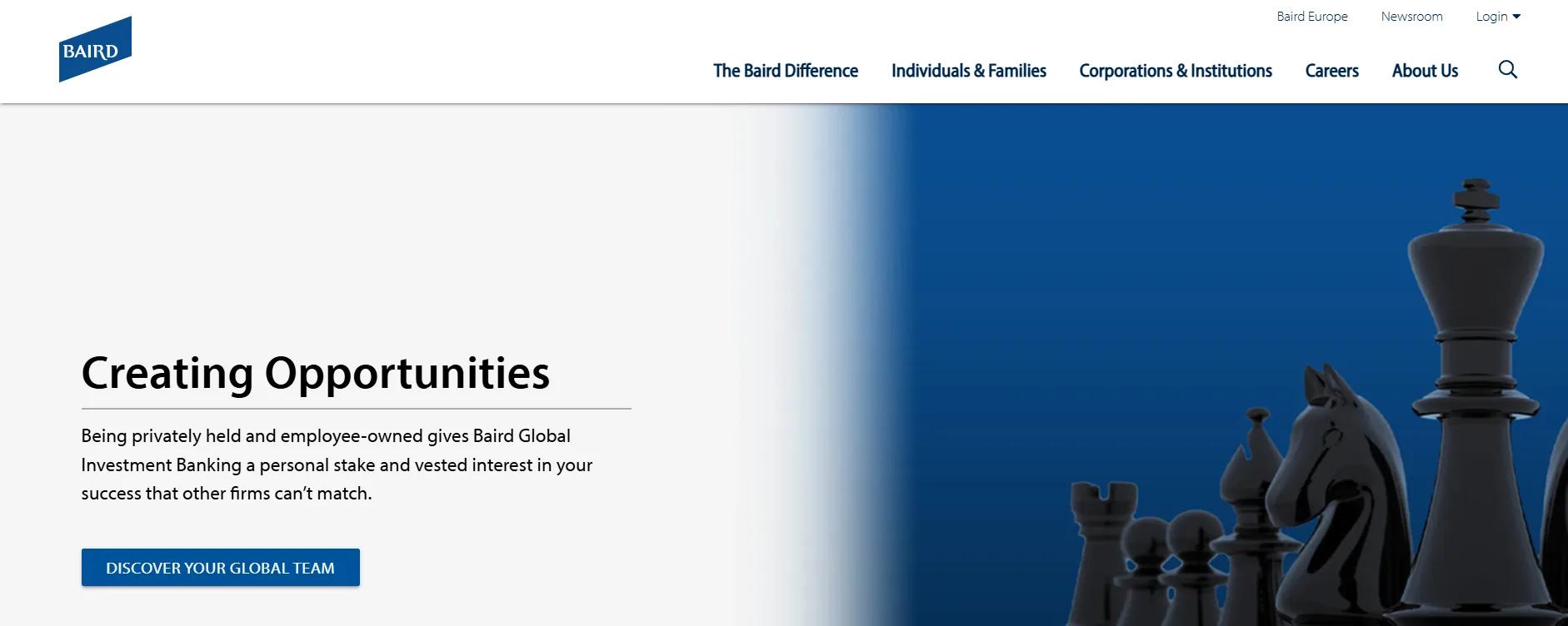
Baird’s website is a well-organized, professional space communicating the firm’s wealth of financial expertise in a streamlined, user-focused design. Its primary goal is to make it easy for users to access a wide range of services while providing a visually appealing experience that aligns with Baird’s established reputation. It’s a standout example among website design ideas for financial advisors aiming to balance trust, usability, and visual polish.
Features of the Website:
Organized Information: The homepage breaks down content into sections like “Individuals & Families,” “Corporations & Institutions,” and “Careers,” making it simple for visitors to find the right services for their needs.
Professional Visuals: The website uses high-quality images and a clean color palette to reflect the firm’s professional image without distracting from the content. The visuals add a sense of warmth while keeping the focus on the message.
Efficient Navigation: A fixed top menu helps visitors move between pages easily. Clear labeling and dropdown menus make it easy to find services without getting lost.
Clean Layout: The website uses direct typography and white space to ensure content is easily read. This minimalist design helps visitors focus on key information without feeling overwhelmed.
Clear Calls to Action: Baird’s CTAs, like “Find a Financial Advisor” or “Learn More,” are placed naturally throughout the site, inviting visitors to take action without interrupting their browsing.
Educational Content: The website includes insights, articles, and market updates, providing added value and establishing the firm’s authority in financial services.
Mobile-Optimized: The site is responsive, ensuring a consistent experience across all devices, from desktops to smartphones.
26. Apex Group
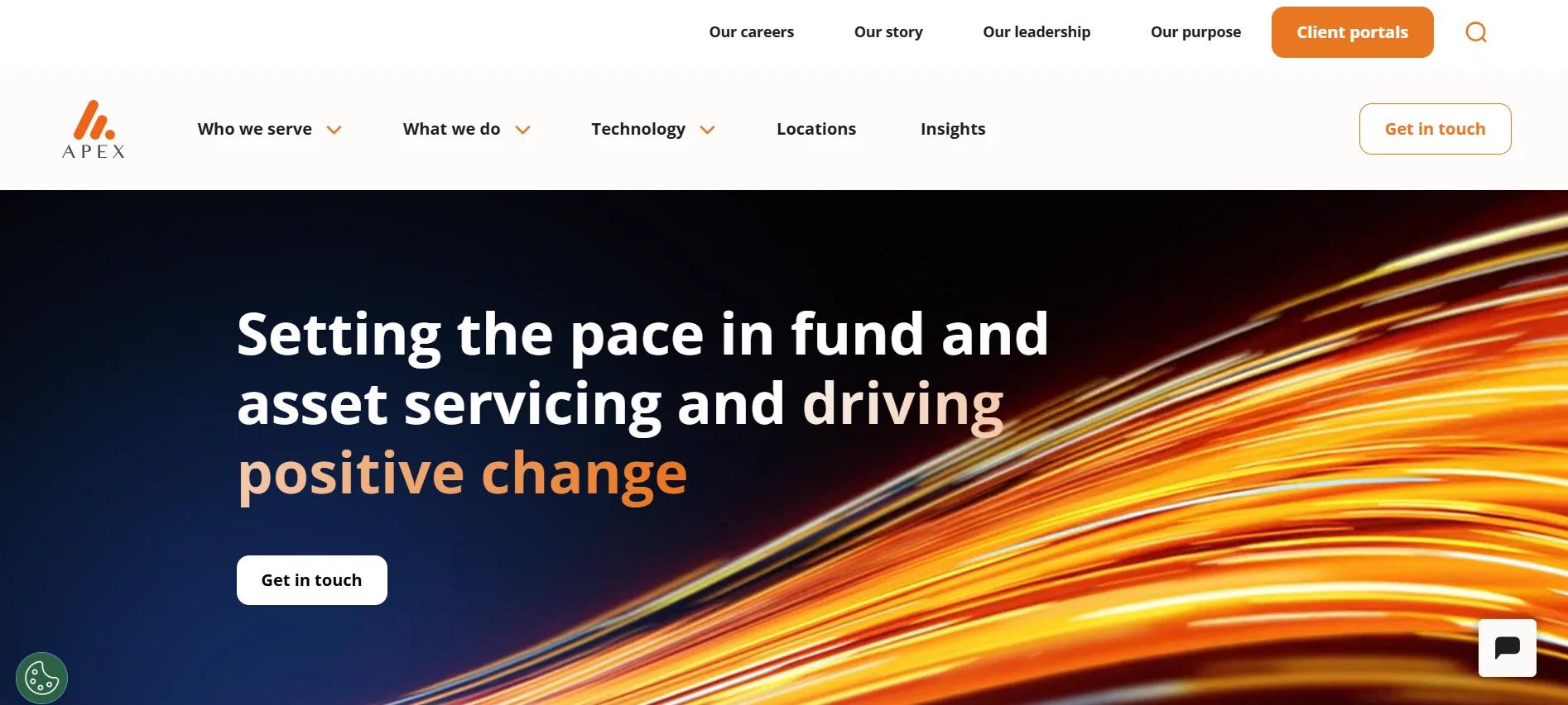
Apex Group’s website design is a visual standout, featuring a vibrant orange hue that adds energy and modernity to its brand presence.
The site maintains a structured and evenly spaced layout, making it easy for visitors to explore information about the firm’s financial services.
The design balances professionalism and innovation, reflecting Apex Group’s forward-thinking financial solutions provider role.
Features of the Website:
Bold Use of Orange Accents: The vibrant orange elements throughout the site create a strong brand identity, reinforcing Apex Group’s modern, energetic approach to financial services.
Evenly Spaced Layout for a Smooth Experience: The website uses well-balanced white space, ensuring that text, images, and sections don’t feel crowded. The spacing allows easy readability.
Clear Hierarchy and Content Flow: The homepage is structured to guide visitors smoothly through different sections, from company history and services to insights and career opportunities. The modular layout keeps content organized so users can quickly find what they need.
Strong Visual Storytelling: The website incorporates background visuals, infographics, and timeline sections to showcase Apex Group’s growth and milestones. This interactive approach engages users, making the content more dynamic and visually appealing.
Fixed Header for Easy Navigation: The top menu remains visible as users scroll, ensuring quick access to sections like “Who We Serve,” “What We Do,” and “Technology.”
Comprehensive Yet Concise Service Breakdown: Apex Group presents its fund, asset, and financial services in a well-structured format. Rather than overwhelming visitors with dense paragraphs, information is presented in short, digestible sections with clear subheadings and bullet points.
27. TIAA
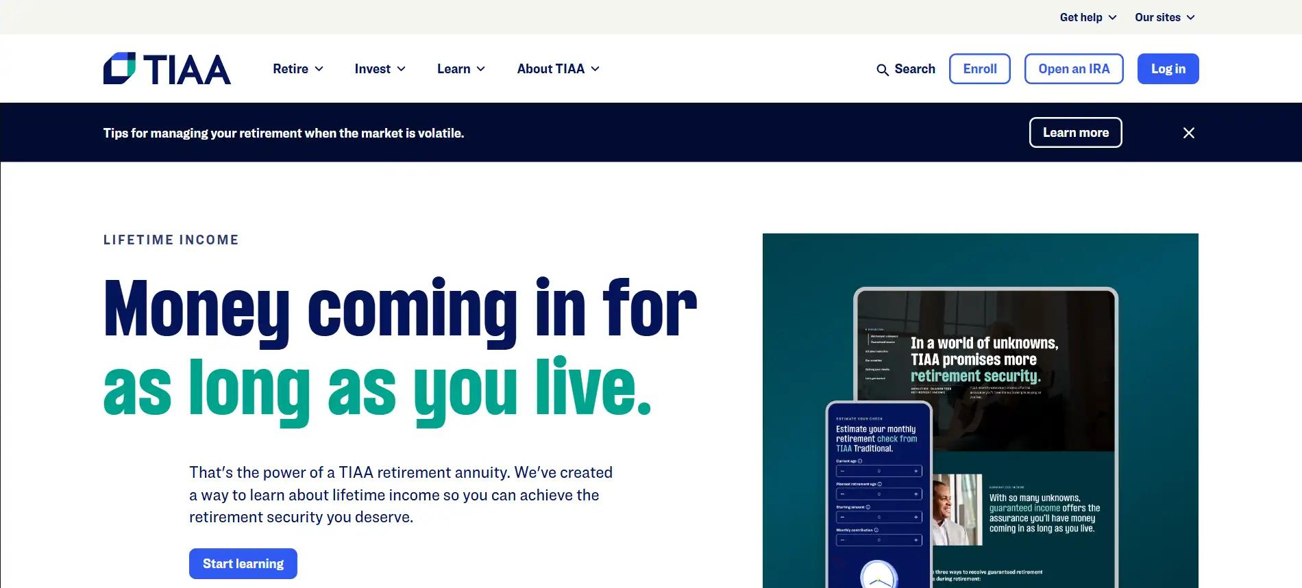
TIAA’s website strikes a perfect balance between professionalism and visual appeal. It uses a stunning combination of navy blue, sea green, and white to create a calm, trustworthy, and sophisticated aesthetic.
This carefully curated color palette enhances readability and reinforces the company’s retirement and financial planning expertise.
Features of the Website:
High-Resolution Imagery with a Personal Touch: The website features sharp, professional images that capture real-life moments’families planning for the future, retirees enjoying their lives, and professionals making financial decisions. These visuals humanize the brand, making financial planning more personal and relatable.
A Thoughtfully Designed Color Scheme: The deep navy blue conveys stability and trust, the sea green accents bring a sense of growth and renewal, while the white background keeps everything crisp and clean. This mix of colors creates an inviting and modern atmosphere that makes financial topics feel approachable.
Well-Spaced and Clean Layout: Content is neatly arranged with generous spacing, ensuring visitors aren’t overwhelmed by information. The structured sections make exploring retirement planning, investments, and wealth management easy without feeling cluttered.
Clear and Elegant Typography: The fonts are sleek and modern, ensuring a polished look that enhances readability. Every section is formatted to prioritize clarity, making complex financial concepts easy to digest.
Smooth User Experience with Clear CTAs: The website seamlessly guides users with subtle yet effective call-to-action buttons, like “Get Advice” and “Learn More”.
Mobile-Optimized and Responsive Design: Whether accessed from a desktop, tablet, or phone, the site retains its crispness and smooth navigation, ensuring a consistent and polished experience across all devices.
28. Charles Schwab
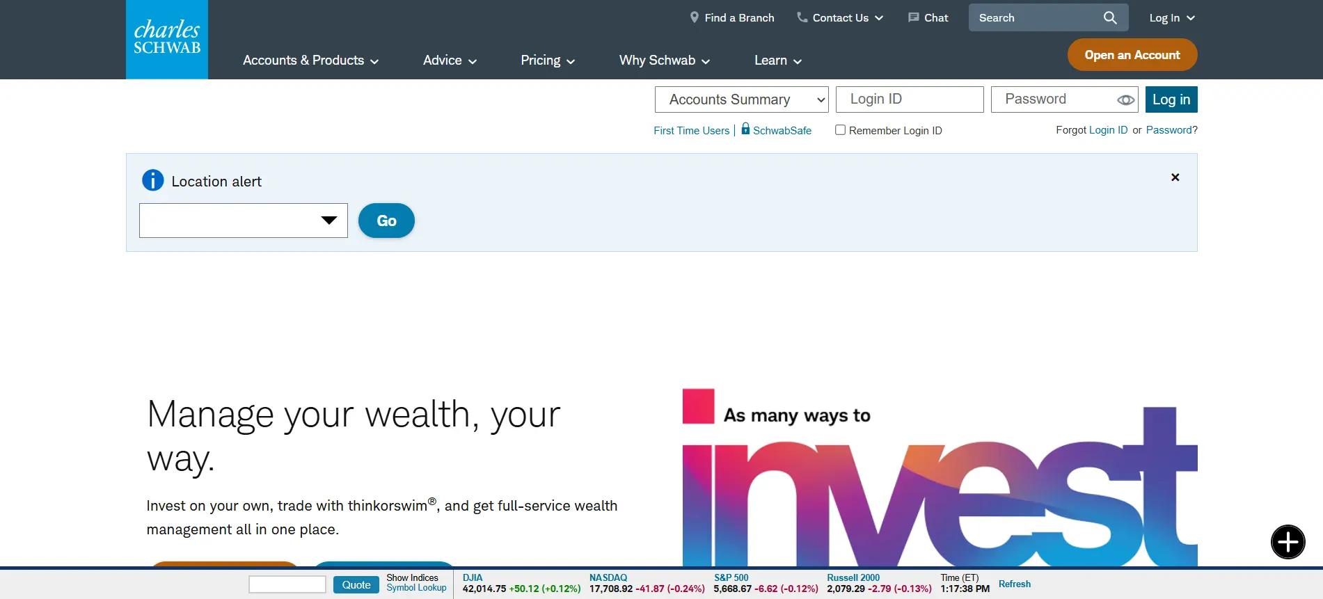
Schwab’s website provides a platform for investors, offering tools for self-directed investing, wealth management, and trading. The design effectively balances complexity and simplicity, allowing users to find the services they need easily. With a clean layout, interactive tools, and educational content, Schwab’s site is an excellent example for financial advisors looking to create user-friendly websites that build engagement and trust.
Features of the Website:
Clear Service Segmentation: Schwab organizes services into categories like “Invest on Your Own,” “Work with an Advisor,” and “Automate My Investing.” This clear structure helps visitors quickly find exemplary service, whether they want to manage their investments independently or with an advisor.
User-Friendly Layout: The website features a simple navigation bar with sections such as “Accounts & Products,” “Advice,” and “Pricing,” making it easy to access essential information. Financial advisors should ensure their websites are equally clear and accessible, with direct pathways to core areas.
Interactive Tools and Calculators: Schwab offers tools like retirement planners and IRA calculators. These tools are easy to access while browsing and help visitors make informed decisions.
Educational Resources: Schwab provides blogs, podcasts, and market commentary to educate visitors. Financial advisors should prioritize similar educational content on their websites to help clients make well-informed financial decisions.
Mobile-Friendly Design: Schwab’s website is optimized for desktop and mobile, ensuring a consistent device experience. Financial advisors should ensure their websites are mobile-responsive to accommodate users on the go.
Transparency in Pricing: Schwab outlines its pricing structure clearly, making finding fee information easy. Financial advisors should adopt a similar approach, offering upfront pricing and avoiding hidden charges to build trust with potential clients.
29. Fidelity Investments
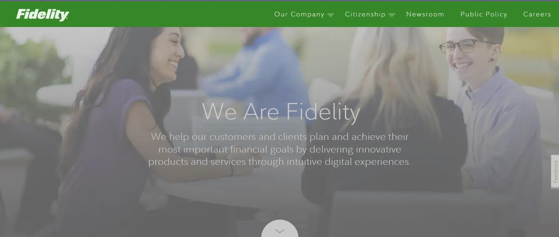
Fidelity’s website is designed to cater to a broad audience, including individual investors, employers, and financial institutions. The site delivers complex financial information in a clear, accessible way, ensuring visitors can easily find what they need, whether looking for financial planning tools, educational resources, or investment solutions.
Features of the Website:
Organized Service Categories: Fidelity divides its offerings into distinct sections like “Individual Investors,” “Employers,” and “Advisors & Institutions,” allowing users to navigate to the information relevant to them quickly. This clear structure helps users avoid confusion and find what they need without unnecessary searching.
Educational Tools and Resources: Fidelity’s website prominently features educational resources such as investment calculators, planning tools, and market insights, all designed to simplify complex financial topics. These resources are easy to find, ensuring that users can engage with the content and make informed decisions regardless of their financial knowledge.
Direct, Accessible Content: The website’s content is structured with clear headings and short paragraphs, making it easy for visitors to scan. This helps users quickly digest essential information, such as account options, fee structures, and investment strategies, without feeling overwhelmed by dense financial jargon.
Interactive Features: Fidelity incorporates interactive tools, such as retirement planners and portfolio trackers, that allow users to engage directly with their financial goals. These tools help users make informed decisions by providing real-time data and personalized recommendations.
Mobile-Friendly Design: The website is optimized for mobile devices, ensuring users have a consistent and smooth experience, whether on their desktop or smartphone. This mobile optimization is crucial for retaining users who may need to access financial tools on the go.
Strategic Call-to-Action Buttons: Fidelity’s website uses well-placed call-to-action buttons, such as “Open an Account” and “Talk to an Advisor,” visible throughout the site. These buttons guide users toward taking the next step in their financial journey, improving conversion rates by making it easy for visitors to engage with Fidelity’s services.
30. Northwestern Mutual
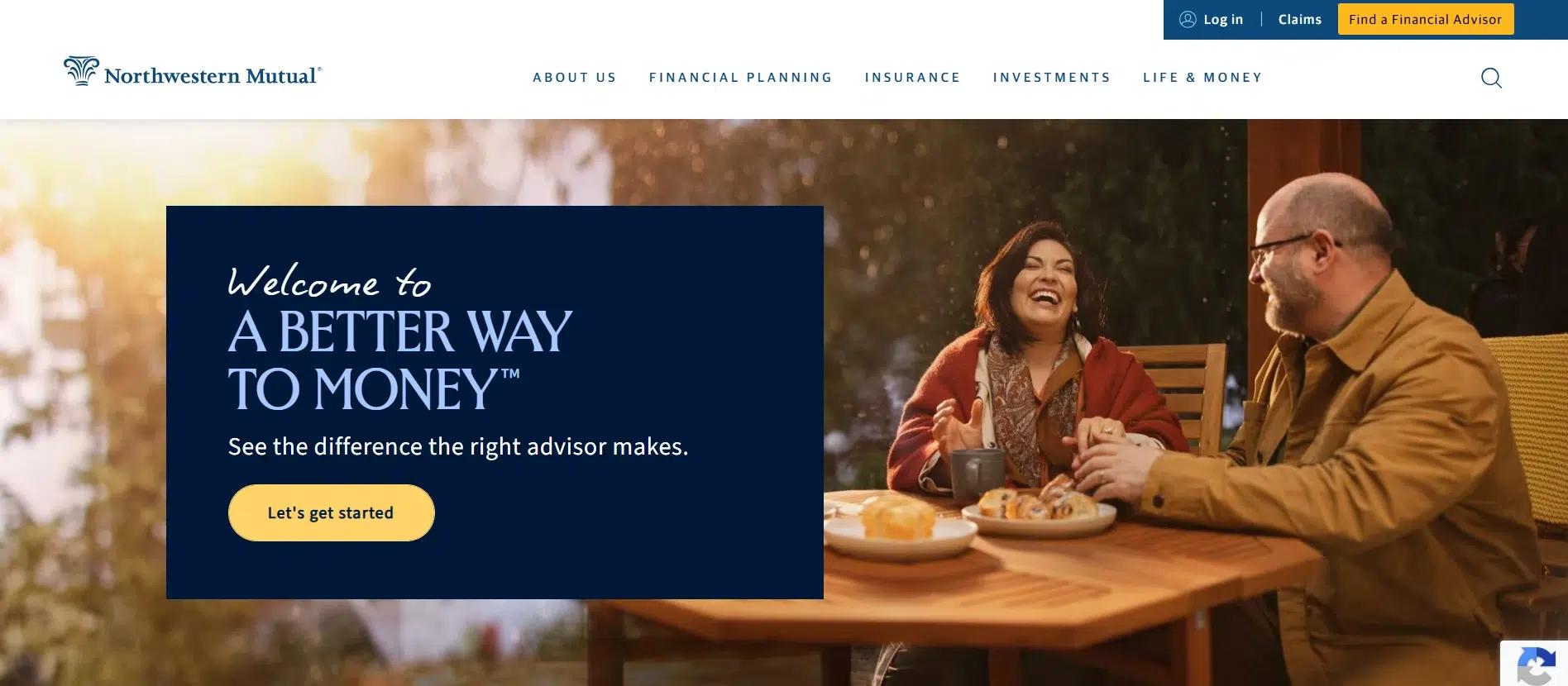
Northwestern Mutual’s website excels in combining clarity, authority, and ease of use, making it an excellent reference for financial advisors looking to build a trustworthy, client-centric online presence. The site reflects the brand’s emphasis on financial strength, personalized advice, and long-term relationships while offering a user-friendly digital experience.
Features of the Website:
Professional, Clear Structure: Northwestern Mutual’s website provides clear pathways for visitors, with primary sections like “Financial Planning,” “Retirement Planning,” and “Insurance.” Organizing website content into direct, easy-to-understand areas is crucial for financial advisors.
Focus on Client Education: One standout feature of the website is the emphasis on educational resources’whether calculators, financial tools, or blog articles. Financial advisors can replicate this by offering interactive content such as retirement calculators, investment simulations, or informative articles that guide potential clients through complex financial concepts.
Highlighting Financial Strength and Trust: The design clearly communicates Northwestern Mutual’s financial strength and stability, which are crucial for clients seeking security in their financial planning. Financial advisors should ensure their websites showcase their credentials, experience, and any third-party certifications or ratings to convey reliability and build trust from the outset.
Personalized Financial Guidance: Northwestern Mutual emphasizes the advisor-client relationship, presenting its advisors as approachable, knowledgeable, and supportive. The site uses clear, concise messaging to explain the benefits of working with a financial advisor, such as personalized guidance and strategies.
Responsive and Mobile-Friendly: The website is fully responsive, ensuring a smooth device experience. As more clients turn to mobile devices for financial information, financial advisors must ensure their websites are optimized for mobile use. A mobile-friendly website can significantly increase engagement and give clients easy access to their financial resources.
31. Savant Wealth Management
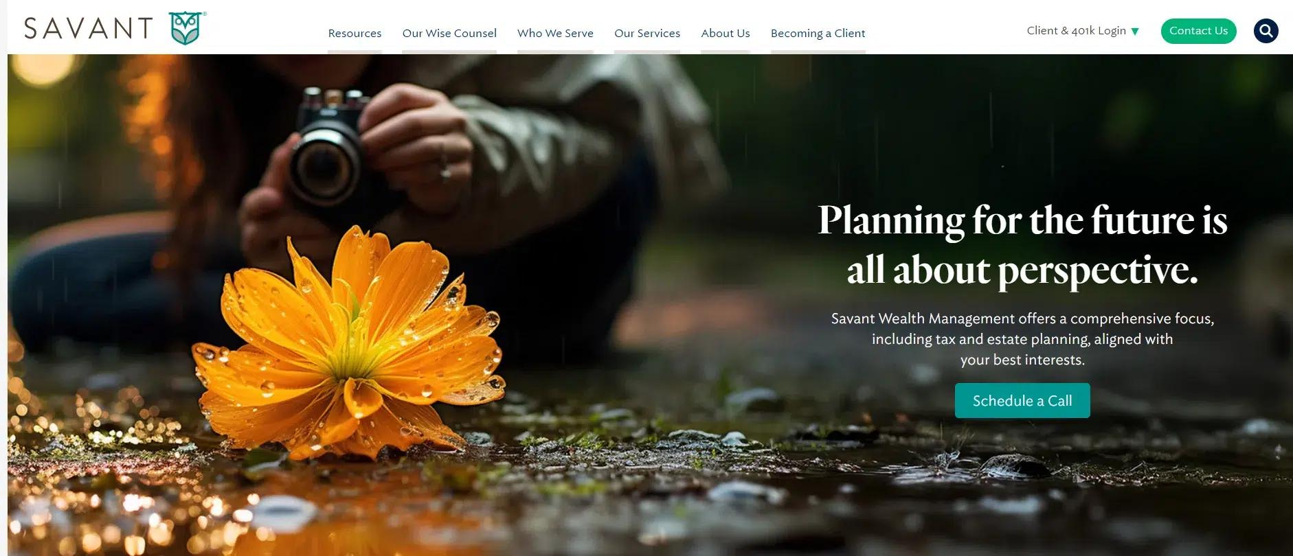
Savant Wealth’s website is an excellent example of how design can reinforce a firm’s credibility. The structured layout, professional imagery, and calming color palette create a welcoming and trustworthy digital presence.
Features of the Website:
Authentic and Relatable Imagery: Instead of generic corporate visuals, the website features real-life images of professionals, families, and retirees in genuine moments, making financial planning feel personal and approachable.
Structured and Well-Spaced Layout: Content is organized with purpose, guiding users smoothly through financial services, investment insights, and planning resources. The balanced use of white space ensures an easy reading experience without clutter.
Elegant Typography for a Premium Feel: The font choices are modern yet classic, with bold headings paired with light, well-spaced body text to enhance readability and maintain a high-end, polished look.
Soft Yet Effective Interactive Elements: The website incorporates subtle hover effects and transitions, adding a layer of sophistication without distracting from the core content. These refined animations enhance engagement without overwhelming the user.
Client-Centric Call-to-Action Placement: Instead of pushy sales-driven buttons, CTAs like “Let’s Talk” and “Schedule a Consultation” are strategically placed, encouraging users to take action at a comfortable pace.
Customized Client Journeys: The website quickly segments users’pre-retirees, business owners, and high-net-worth individuals’allowing visitors to find solutions relevant to their unique financial needs without unnecessary searching.
Mobile-Optimized for a Smooth Experience: The design scales flawlessly across all devices, ensuring smooth transitions, easy-to-click buttons, and a clean interface on both desktop and mobile.
Your Clients Expect Expertise’So Should Your Website
Would you trust a financial planner with an outdated, hard-to-use site? Neither will your clients. In an industry where credibility and professionalism define success, your website should reflect the expertise and precision you bring to financial planning.
A slow, confusing site turns potential clients away, while a sleek, optimized platform builds trust before they even schedule a consultation.
So, instead of struggling with site performance, let marketing experts who have built successful financial websites handle it. A well-structured, high-performing website sells your expertise before you even say a word.
INSIDEA
Ready to put this into practice?
INSIDEA is an Elite HubSpot Partner rated 4.99 across 450+ verified reviews. Let's map it to your goals.