Therapists are experts at helping people heal, reconnect, and move forward. But when it comes to building a site that reflects that depth of work? That’s where things get murky.
You know what a breakthrough looks like in a session, but how does that translate on a screen? The answer starts with one powerful step: having a website that truly reflects the impact of your work!
Your website is often the first thing people see when seeking help. It should feel straightforward, welcoming, and easy to explore. People are scanning and making decisions quickly, and 94% of those decisions come down to design, not words.
The way your site looks feels like something to a user. Color sets the tone. Layout signals trust. And if that first impression is off, they may not stick around long enough to read the part where you shine.
If your website doesn’t reflect the quality of your work, it’s time for a reset.
To help you out, I’ve compiled 20+ web design ideas for therapists that are worth exploringreal examples, honest insights, and no filler.
20+ Web Design Ideas for Therapists to Follow in 2026
These websites cover a range of therapy niches, including solo practitioners, group practices, coaches, and mental health platforms. Each one offers something unique in terms of layout, content, voice, or vibe.
Let’s get started!
1. State of Mind KC
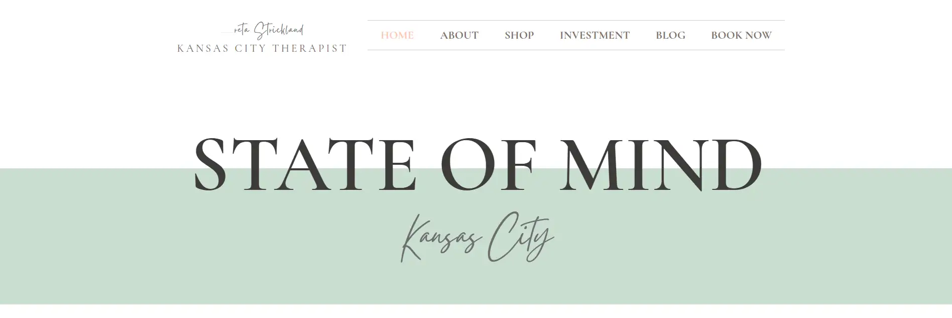
Greta Strickland’s website, State of Mind KC, feels like an open journal entryhonest, raw, and welcoming. It doesn’t try too hard. It doesn’t lecture. It simply connects. The moment the site loads, it gives off a soft, calming energy without saying a word.
Everything from the color palette to the conversational copy supports one clear goal: put people at ease, especially those struggling with anxiety or being overwhelmed.
Features of the Website
Pastel-Based Color Psychology That Calms Instead of Sells: The site leans into pastel pink and light teal, accompanied by cool gray tones. These aren’t randomthey’re emotionally intelligent choices. Pastels speak to softness, vulnerability, and emotional safety, especially in this mix. They’re not overly clinical or sterile, which helps visitors feel something rather than just read. The greys add maturity and calmness, while the pinks and blues reflect compassion and peace.
Spacious Layout with Zero Clutter: This is a perfect example of web design ideas for therapists, where intentional negative space replaces the usual corporate noise. The site doesn’t overload visitors with walls of text or aggressive menus.
Sections are padded generously, giving your eyes and brain a break. Menus are simple and labeled clearly: Home, About, Book Now, Anxiety, Depression, and Online Therapy. Each page is a natural continuation of the previous.
Conversational Copy That Builds Connection Instantly: Greta’s voice on the site is casual, grounded, and self-aware. She speaks directly to women tired of people-pleasing, burned out, or craving personal clarity. The language feels unfiltered.
It reflects someone who’s walked through the fog herself and is now guiding others out of it. Lines like “You’re worth the hard conversations and the babysitter” or “Feel free to leave your perfectionism at the door” don’t sound like website copy.
Typography That Supports the Message: The fonts on State of Mind KC are clean and soft, with no sharp serifs or loud headings. Section headers sometimes feel handwritten, reinforcing the content’s personal tone. It’s readable but still warm, never clinical or cold. The sizing also feels deliberateheadings are big enough to catch attention without overwhelming the flow.
Subtle CTA Flow That Doesn’t Feel Pushy: The site has calls to actionLet’s Team Up, Book Now, Contactbut they don’t scream for clicks. They’re casual, woven naturally into the copy. Instead of “selling” therapy, the site offers a partnership that aligns with the service’s relational nature.
Mobile Responsiveness: The mobile version retains the softness and flow of the desktop layout. Colors and spacing don’t get cramped. The CTAs are still easy to tap, and text remains digestible. There’s no clunky dropdown or broken formatting.
2. Dynamic Healing Therapy
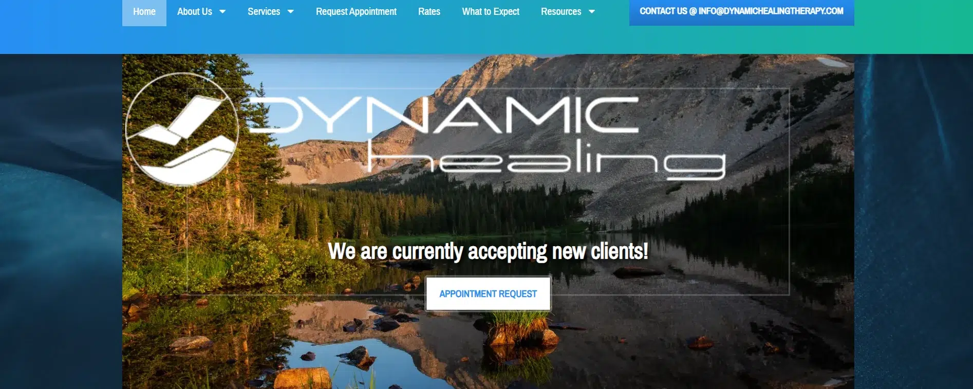
Dynamic Healing’s website reflects the same care and intentionality you’d expect in a therapeutic relationshipno excess, no distraction, just clarity and calm. The design aligns with the group’s mission: to create a space that honors identity, values connection, and de-stigmatizes mental health care.
Features of the Website
Neutral Color Scheme That Grounds: The website uses a steady palette of soft whites, blue tones, and subtle green tones. These colors support the message: We’re not here to overwhelm; we’re here to support. The white space makes each element breathable, while the greenery gives a quiet signal of growth and renewal.
It’s not flashy or trendy, and that’s the point. This palette is especially relevant when gathering web design ideas for therapists who want their digital presence to feel approachable without losing professionalism.
Practical Structure with Clear Entry Points: Exploring the website is crisp and obvious. Every categoryAbout Us, Services, What to Expect, Rates, Resourceshas its own space without clutter. There’s no second-guessing where to click. Each section gives just enough context without exhausting the user. This balance is essential for visitors who may be emotionally drained or overwhelmed and need clear, easy paths to help.
Therapist-Centered Design That Builds Trust: The site puts its therapists front and center with dedicated bios and friendly, authentic photos. This setup works for people who want to connect with a real person before booking. The bios strike a warm balance between credentials and relatability, a layout choice worth noting for anyone collecting web design ideas for therapists that convert curiosity into connection.
Typography That’s Steady and Unobtrusive: The site’s fonts are classic: sans-serif, clean, and evenly spaced. They don’t overpower the content, letting the therapy-focused messaging come through without being shaped by visual theatrics.
Accessibility and Consultation-First Flow: One of the site’s quiet strengths is its emphasis on accessibility. From a visible accessibility view toggle to a 15-minute consultation invite at the top-level menu, the site is designed visually, emotionally, and practically for different users.
Location and Contact Button Placement: The footer is clean, and the contact section includes maps, operating hours, and phone numbers that are easy to use on mobile. There’s no barrier between curiosity and scheduling.
3. EMDR International Association (EMDRIA)
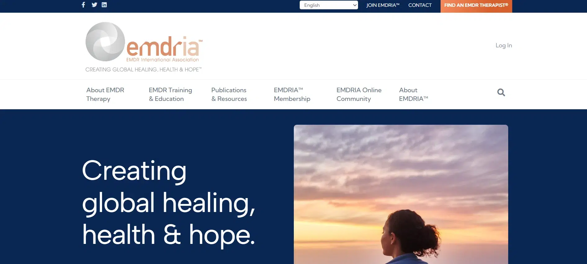
The EMDR International Association (EMDRIA) website is built for scale without sacrificing clarity.
Its structure reflects the organization’s depth in education, clinical care, and community engagement while staying focused on what matters: providing therapists and clients with resources to move forward. Every design choice here supports trust, precision, and expertise.
Features of the Website
Organized Density Without Confusion: EMDRIA is rich in content. Though dozens of programs, toolkits, and educational paths are listed across multiple layers, it never feels chaotic. The site manages volume with precise sectioning and clean whitespace. The typography, mostly sans-serif with steady sizing, breaks long-form material into manageable pieces. Each header is functional. This kind of design is a powerful case study for researching web design ideas for therapists who need to showcase more than just a private practice, especially those offering resources, training, or certifications.
Palette That Signals Professionalism: The visual tone leans toward credibility. Blues, soft grays, and pale gold accents give it a polished feel. They establish authority and competence. This works exceptionally well for an organization promoting standards, licensing, and ongoing education in trauma-informed care.
Action and Exploration-Oriented Layout: Each section of the site, About EMDR Therapy, Training, or Find a Therapists formatted for action. Buttons are prominent, consistently labeled, and appear precisely where you expect them to. There’s no hunting for links or dead-end pages. The flow feels intentional: read, understand, act.
This efficiency is a standout feature for anyone considering web design ideas for therapists offering clinical services and professional development tools.
Content That Knows Its Audience: The writing here doesn’t oversimplify or overexplain. It’s built for mental health professionalsintelligent, informed, time-sensitive readers. Definitions are crisp. Mission statements are clear. Value propositions are stated without hype. The tone hits that rare balance: professional without being cold, academic without being dry.
Functionality Over Flash: The site does not use animation or gimmicks. Its minimal motion fits the serious subject matter and enables faster page load times across devices. The fixed elements, like the therapist locator and certification guides, are intuitive and efficient, respecting the user’s time.
4. Child and Family Therapy Collective
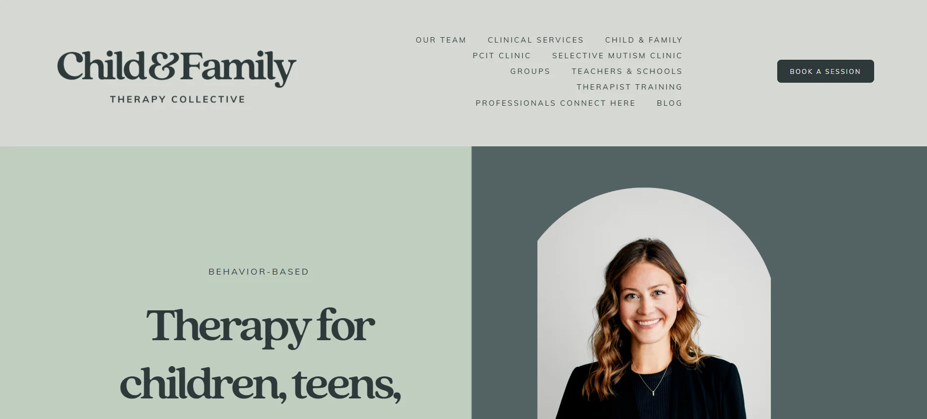
The Child & Family Therapy Collective serves children and families facing anxiety and behavioral challenges, and its site makes that mission feel approachable, focused, and full of heart.
Features of the Website
Clean, Contemporary Visuals That Support Clarity: The design avoids anything overly playful or cartoonish, which is a smart move for a practice working with both young clients and their caregivers. Instead, it leans on a modern, professional layout that respects the emotional complexity of family dynamics.
Soft neutrals, calming whites, and muted color accents give the entire site a composed and welcoming tone. It’s a perfect example of how web design ideas for therapists can use restraint to build trustespecially when working with children.
Layout that Respects Time and Emotion: The site is well-structured and prioritizes function: Book a Session, Our Team, Clinical Services, and Groups are all clearly presented without distraction. Parents under stress don’t need six menus and buried formsthey need to know who you are, what you treat, and how to reach out. This site delivers that in a smooth, supportive way, and not rushed.
Copy That Speaks Like a Human: The tone of voice throughout the site is conversational without being casual. It meets the emotional weight of the subject matter with calm assurance. Phrases like “we love science, and we love the sacred nature of this work” don’t sound like marketing; they sound like someone who means it.
The direct note from Clinical Director Eleanor Ezell adds a rare level of warmth and human connection, something many therapist websites overlook.
Content Hierarchy That Honors the Caregiver’s Role: Instead of pushing services first, the site builds its message around the caregiver’s experience. Every section subtly reinforces that parents aren’t just clientsthey’re partners in treatment. The values (Balance, evidence, integrity, truth, empowerment) are embedded in the site’s construction and the team’s communication. This structure is essential when looking at web design ideas for therapists who work with families.
Typography That’s Purposeful: The font choices here are clean and neutral. There are no oversized headers or try-hard styling. The text is well-spaced and easy to read, keeping the attention on the content.
Message and Medium Aligned: The entire website feels unified, from the visuals to the words and the structure. It’s built for overwhelmed, emotional, or unsure peopleincluding kids and adults. There’s no disconnect between the brand’s philosophy and how it shows up online.
5. De la Tierra Wellness Collective
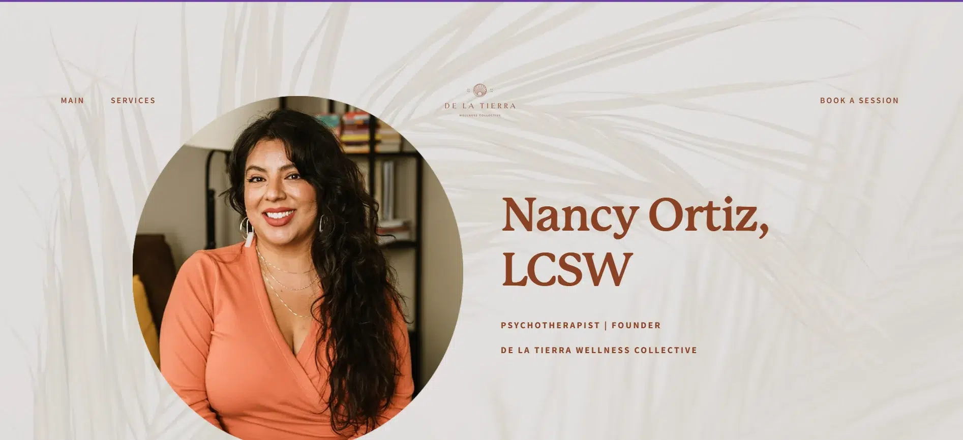
Nancy Ortiz’s De la Tierra Wellness Collective site embodies her therapy philosophy. This space is rooted in compassion, identity, and cultural awareness. Every elementtone, color, structuresupports her integrative, somatic, and community-driven work. This is not a generic therapy site. It’s personal, political, and healing all at once.
Features of the Website
Color Palette That Carries Emotional Weight: Muted browns, soft creams, and gentle earth tones form the base of the site’s design. Grounded colors communicate safety, tradition, and warmth. They reinforce the “De la Tierra” (of the earth) message while rejecting sterile medical aesthetics.
For therapists working in trauma or identity-based healing, this is one of the most meaningful web design ideas for therapistsdesign from your worldview, not a stock template.
Photography That Builds Presence: Prominent, unposed images of Nancysome candid, others centeredcreate a sense of immediacy. This isn’t about branding polish; it’s about being seen and relatable. Her face appears early and often, paired with honest, confident messaging. These visuals do more than humanize the sitethey affirm that care here is personal.
Especially for marginalized clients, seeing a therapist who looks comfortable in her skin sets the tone before a word is read.
Copy That Sounds Like a Conversation: Nancy speaks about ancestral connection, queer healing, and liberation without diluting the message for readability. That clarity, mixed with her voice, makes the content feel like a one-on-one introduction, not a pitch. This is the tone to explore when building web design ideas for therapists who must speak across lines of identity and lived experience.
Clear, Non-Intrusive Site Flow: Each section is stacked vertically with a simple scroll-based progression. There are no aggressive banners or distracting pop-ups. The session booking link is visible but not loud, and services like Sex Therapy and Psychotherapy are just a click away, cleanly laid out.
Typography That Lets the Message Lead: The fonts are readable, clean, and soft. Nothing elaborate or ornate. Headings are assertive without being oversized. Paragraphs are spaced for clarity, which matters on mobile. The reading experience has a calm rhythm.
6. Jaree Basgall
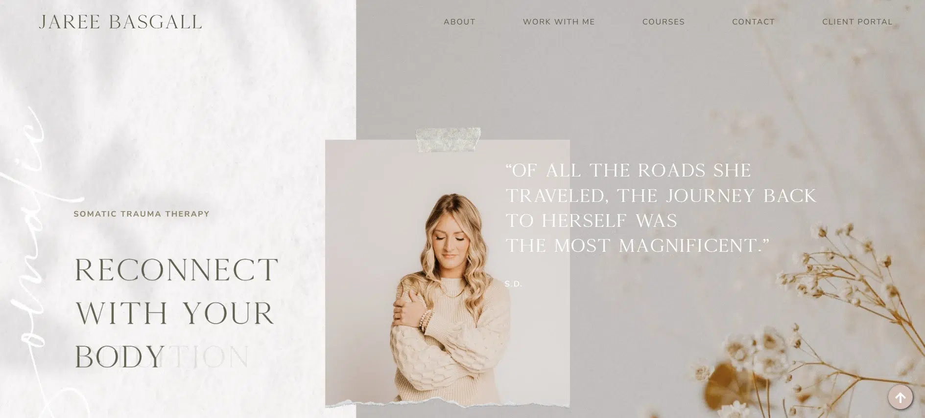
Jaree’s website invites healing. Every visual, sentence, and structure element supports one thing: presence. This website showcases a haven for individuals experiencing trauma; moreover, it removes barriers and replaces them with softness.
There’s no performance here, no over-designed gloss, just grounded warmth and clarity.
Features of the Website
Pastel Tones with Purpose: The palette leans into pale earth tones and soft pinks, wrapped in imagery of water, sky, and mountains. These colors speak to emotional safety. Instead, they avoid clinical harshness and echo calm, natural rhythmsan intentional choice for trauma work.
The aesthetic avoids the over-sanitized feel of many mental health sites and instead focuses on genuine comfort. For therapists in healing-focused work, this is one of the strongest web design ideas.
Breathable Layout: The content isn’t packed or forced. It’s spaced generously, letting the message sit with the reader. The pages are vertically stacked, guiding the user without urgency. Buttons like “Work With Me” or “Book a Session” are visible but not loud. This design supports the site’s non-intrusive, invitational, and transparent therapeutic energy.
Writing That Builds Immediate Emotional Trust: The writing is personal and unfilteredbut not unstructured. Jaree shares her trauma history with clarity and care, offering a mirror to potential clients who’ve lived in silence or self-doubt. She avoids clinical terminology unless it serves the user’s understanding.
Instead, she speaks plainly about loneliness, shame, and rediscovery. The site becomes a part of the healing journey, a reminder that good web design ideas for therapists go well beyond the visuals; they include tone, honesty, and intention.
Typography That Supports Clarity: The fonts are soft, rounded, and human. Headings feel handwritten without being hard to read. Body text is spaced out and smooth, never crammed or formal. The typography keeps the experience accessible and consistent with the emotional tone.
Personal Photography That Focuses on Storytelling: Images of Jaree in nature reflect the core message of returning to self. These photos don’t feel stock or staged. They support her story and serve as non-verbal reassurance: You’re not alone, and this space is safe. Her visual presence builds trust before a form is ever filled out.
Structure that Respects Users’ Time: Everything is easy to find without being overwhelming. About, Services, Courses, Contacteach section is stripped of fluff and built for clarity. There’s no noise, no sales pitch, just practical, clear pages that guide gently and stay out of the way.
7. Attuned Psychology
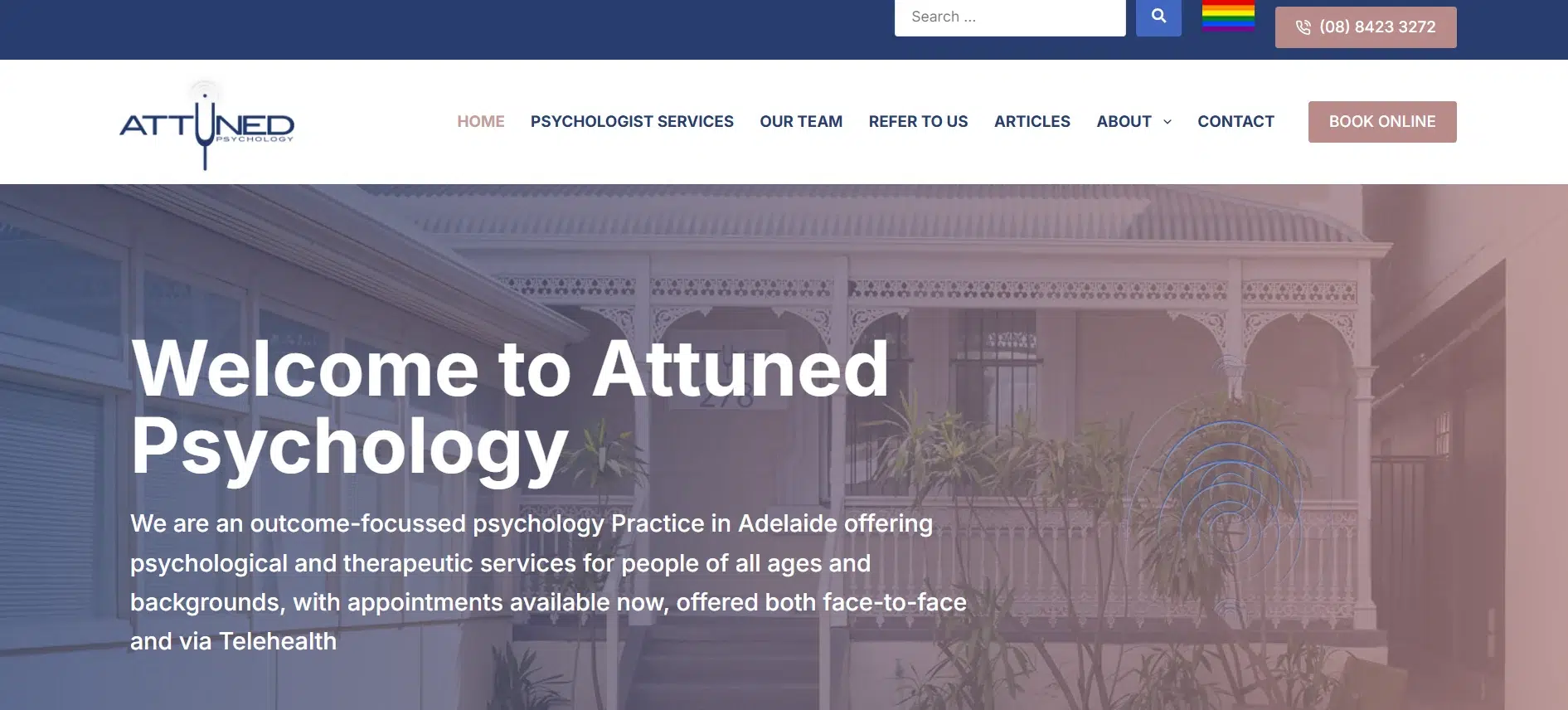
Attuned Psychology’s website delivers what many therapy websites miss: professional depth that still feels human. Built around a broad practice with multiple locations and specialties, the design balances accessibility with authority.
Everything about the sitefrom tone to layout to visualsfocuses on making the therapy experience feel approachable and intentional.
Features of the Website
Layout That Anticipates Client Needs: Instead of layering content across multiple dropdowns or making users chase answers, the site is structured in a simple top-down format: Psychologist Services, Our Team, Refer to Us, Articles, About, Contact. Every page opens with clear language and practical detail. The presence of two office locations (North Adelaide and Glenelg) is emphasized early and often, ensuring potential clients don’t need to search for basic logistical info. This layout keeps decision-making friction low for therapy practices offering in-person and telehealth options.
Content That Communicates Clarity and Intent: The site’s tone is confident and compassionate. It avoids overly clinical language and instead focuses on outcomeswhat changes, how therapy works, and what clients can expect. Statements like “Your journey begins now” are backed by direct information about services and scheduling.
There’s no emotional overreach or vague promises. This is an essential takeaway for anyone looking into web design ideas for therapists offering multi-modal services.
Calm Color Palette: The site uses white, gray, and soft neutrals to create a clean, non-distracting visual environment. This neutral base gives the content room to lead without overloading the senses. Blue accents subtly signal trust, which aligns well with treating anxiety, relationship distress, and performance blocks.
This deliberate palette choice is a helpful reference when exploring web design ideas for therapists who need to convey credibility without losing warmth.
Thoughtful Use of CTAs: Calls to action are on every pageBook Online, Email Us, Call Usbut they’re never aggressive. Their placement feels natural and supportive, inviting users to take the next step without urgency. Forms are short, direct, and clearly labeled, removing common barriers that slow reaching out.
Mobile Experience That Maintains Integrity: The mobile site is fully responsive, with smooth transitions and no drop in clarity or access. The exact layout, logic, and tone translate cleanly to smaller screens.
8. New Heights Counseling
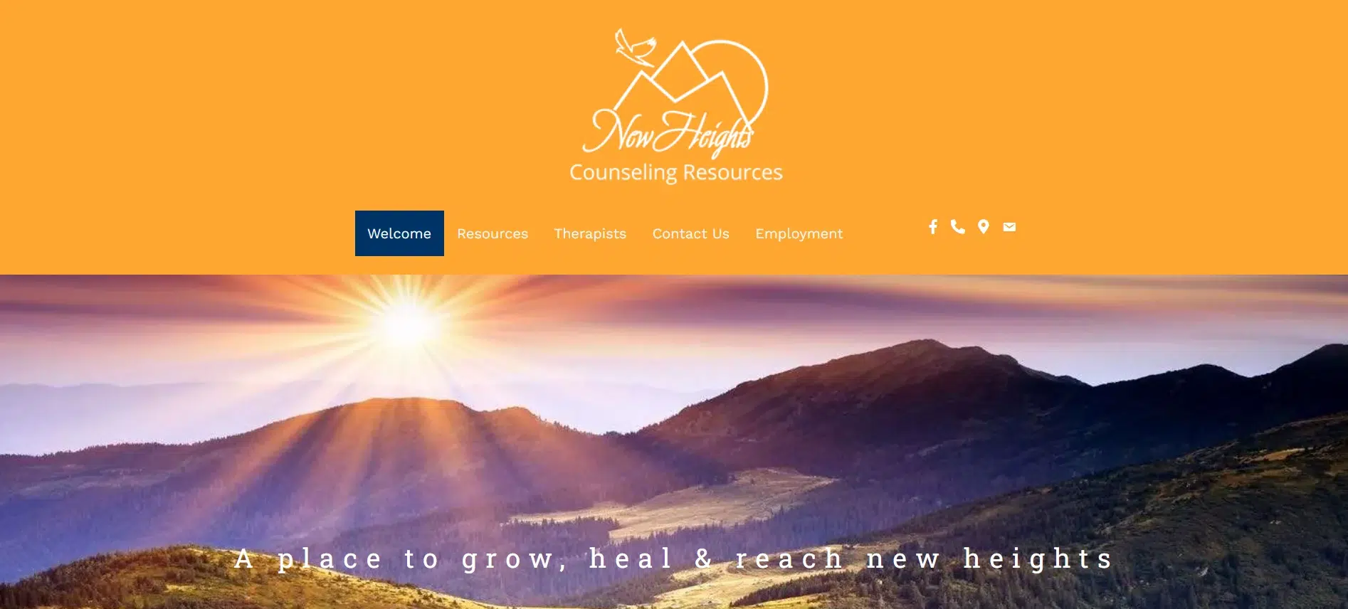
Jill Bradford’s New Heights Counseling doesn’t try to mimic a corporate clinic or overstyle itself with digital polish. The site is honest and minimaljust like the space Jill describes offering her clients.
It’s the web presence that feels accessible from the moment it loads, particularly for those who might be intimidated by therapy in general.
Features of the Website
Warm Colors That Reflect Comfort: Muted tans, soft blues, and cream backgrounds give the site a relaxed, earthy tone. This subtle use of color supports a setting focused on growth and emotional safety. For smaller practices, this is a bright example of web design ideas for therapists that don’t rely on heavy graphics or flashy visuals to make an impact.
Straightforward Layout: The homepage is structured to serve, not sell. Service categoriesindividual Therapy, Couples Therapy, and Family Therapyare laid out in visual blocks, making it easy to understand what’s offered without digging. Each section has its own space and purpose, avoiding clutter or confusion. Visitors aren’t overwhelmed with information, which is especially helpful for those already dealing with mental fatigue or emotional stress.
Content That Aligns with the Therapist’s Voice: The copy reflects Jill’s approach: down-to-earth, steady, and human. Phrases like “grow toward healing and wholeness” and “treasure life as a journey” are simple without being vague. The message feels personal and quietly encouraging. This content is a strong reference point for web design ideas for therapists who want to keep things natural without being overly casual.
Typography That’s Familiar and Easy on the Eyes: The fonts used are modest and readable sans-serif, medium-weight. There’s no oversized headline shouting for attention, and spacing between text blocks feels intentional.
Subtle Visual Elements That Reinforce Care: Images throughout the sitelike the waiting area photooffer small but effective glimpses into the environment. They feel real, which goes a long way in helping clients visualize themselves in the space. That sense of relatability often matters more than sleek design tricks.
Blog That Adds Substance: The Book of the Month feature is a simple, consistent content series that adds depth without overcomplicating the site. It gives returning visitors something to explore and subtly reinforces Jill’s presence as a thoughtful, ongoing guide. The occasional worksheet or blog post helps build quiet credibility.
9. San Diego Couples Counseling- Dr. Rich Hycner
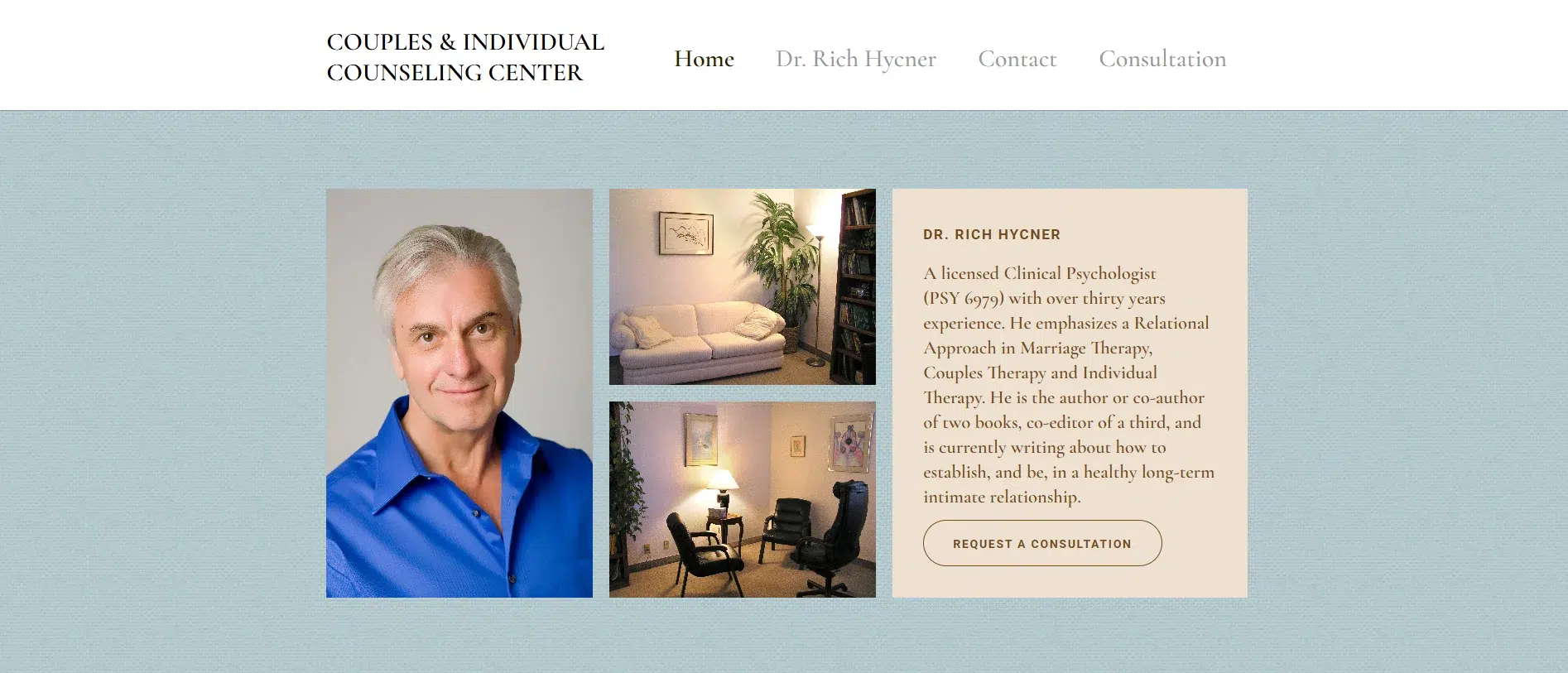
Dr. Rich Hycner’s San Diego Couples Counseling website is stripped of excess. There’s no unnecessary movement and no flashy design tricks. Instead, it delivers exactly what his approach promises: clarity, reflection, and relational presence. With over 30 years in the field and a specialty in emotionally complex couples work, the website communicates trust by keeping everything focused and intentional.
Features of the Website
Design That Reflects Professional Maturity: The layout is spare but works. There’s no heavy imagery, loud colors, or overly formatted sections. Instead, a clean white background with structured text and minimal color accents keeps the attention on the content. The simplicity reflects a confidence in the material and the practitioner behind it. For seasoned therapists, this calm, content-first presentation offers a refreshing alternative among more polished but impersonal templates. It’s a relevant model when considering web design ideas for therapists who want substance over surface.
Content That Leans on Insight, Not Marketing: Dr. Hycner’s writing speaks like a therapist in sessiondirect, layered, and exploratory. Concepts like “connection and separateness” and “relational coaching” are fully explained without dumbing them down. The text assumes an intelligent reader, and it pays off. There’s no performance, no filler. This kind of transparency builds immediate trust, which is what therapy websites are meant to do.
Structured for Focused Exploration: The site offers the essentials: Home, About, Contact, and Consultation. Each page serves a specific purpose and keeps the user oriented. There are no dropdowns, dead ends, or excessive links. It’s a structure built for clients who want clarity on how to start, what to expect, and how to reach out. It’s one of the most functional web design ideas for therapists in high-trust, emotionally involved specialties.
Typography That Serves the Tone: The fonts are modest, consistent, and easy to read. There’s no oversized formatting or distracting styling. Subheads are used sparingly to break up text, and paragraph spacing is generous enough to keep the content breathable.
10. Liverpool Therapy Rooms
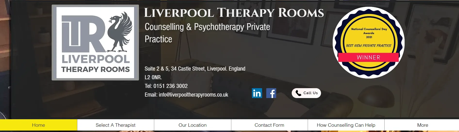
Liverpool Therapy Rooms operates with one priority: making therapy accessible and approachable without distraction. The site is practical, direct, and focused on helping users connect with therapists, including Sara Douglas, through a clean, no-frills experience. Its simplicity works because it centers real-world usability over digital flash.
Features of the Website
A Calming Visual Baseline That Keeps the Focus on Choice: The color scheme sticks to a muted neutral backgroundwhite and soft graywith minimal accent colors. There’s no heavy visual noise, allowing the therapist profiles, service info, and logistics to stand out. It’s subtle but effective. This approach is smart for therapists who prioritize user calm and clarity over stylization.
Page Structure That Minimizes Barriers to Entry: Everything is designed to prompt the client to make a choice. The therapist directory is straightforward. Each profileincluding Sara Douglas’scontains core info: specialties, modality, and how to get in touch. There’s no clutter and no overcomplicated digital interface. The steps for arranging an appointment are outlined plainly and in orderchoose a therapist, fill out the form, and wait for a call.
Writing That Avoids Hype and Builds Trust: The copy across the site is conversational and direct. There’s no exaggeration, no emotional overreach. Sentences like “therapy is for anyone no matter how big or small the issue” and “we never share any of your details to a third party” speak to user concerns without pretense. This transparency is the core element of private practices and should guide web design for therapists aiming to earn clients’ trust immediately.
Typography That Supports Speed and Comfort: The site’s fonts are clear, medium-weight, and consistent. Headings are large enough to orient without dominating the space, and body text is readable across devices.
Direct Pathways Without Distractions: No pop-ups, banners, or unnecessary content gates exist. Calls to action are integrated into the content, such as filling out a form, checking availability, or joining the waiting list.
11. Dr. Sam Adams Counseling
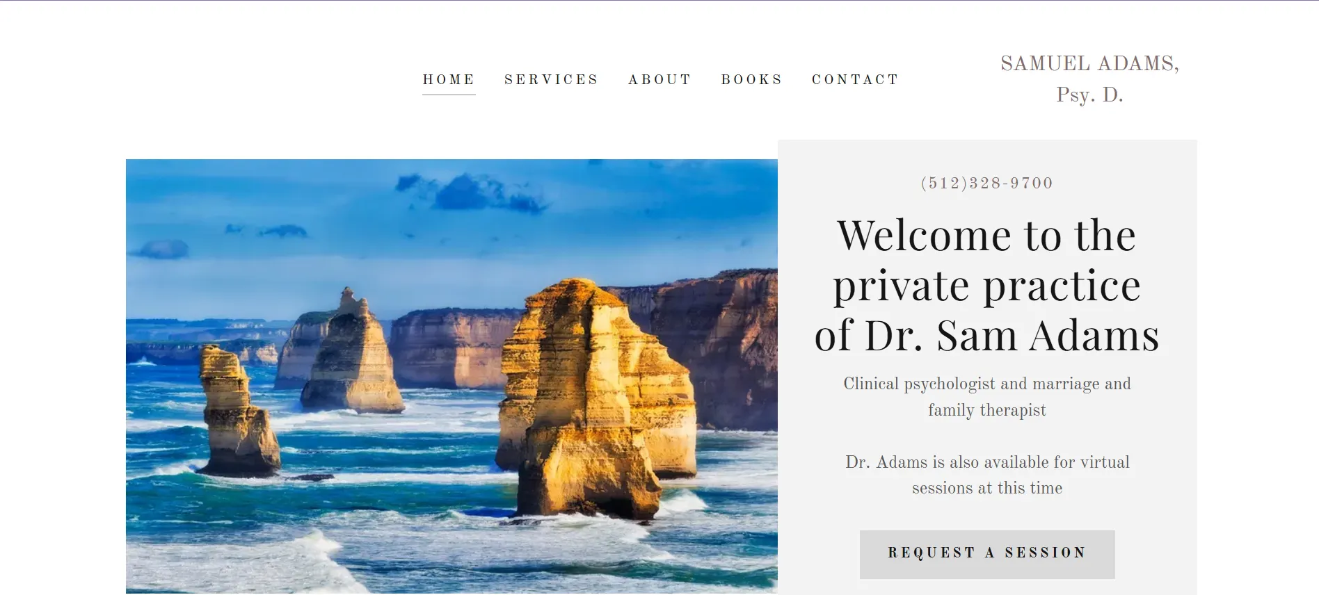
Dr. Sam Adams’ website reflects his practice: grounded insight, relational depth, and faith-integrated healing. The layout isn’t elaborate, and that’s exactly what works. It’s stripped down to the essentials, giving the content space to lead and making it easy for potential clients to understand who he is, what he offers, and how to begin.
Features of the Website
Color Palette That Reflects Warmth and Stability: The color scheme leans toward neutral creams, muted whites, and soft grays. There’s no attempt to impress through vibrancy. Instead, the tone mirrors the counseling approach: calm, honest, and steady. These choices support the experience he offersespecially for clients seeking faith-informed guidance or working through emotional burnout. This is a valuable benchmark for therapists offering integrative or spiritual approaches when exploring web design ideas that prioritize presence over performance.
Layout That Stays Focused on the Relationship: The homepage is simple and direct. The About section takes center stage, placing Dr. Adams’ voice and story front and center. Visitors aren’t hit with jargonthey’re introduced to the person behind the credentials. Exploration is lean: Home, Services, About, Books, Contact. There are no dropdowns, no buried pages, just a clean path to the information that matters. This minimal site architecture is especially effective for solo practitioners who want to reduce overwhelm for first-time visitors.
Writing That Feels Like an Invitation: The language is clear and conversational. Dr. Adams speaks from his lived experience32 years of marriage, raising four kids, integrating faith and psychologyand it immediately builds trust.
The tone avoids both clinical detachment and emotional overreach. Instead, it stays centered on what therapy with him looks and feels like: collaborative, direct, and spiritually grounded.
This approach sets a strong example for web design ideas for therapists who work within personal or faith-based frameworks.
Simple Typography: Fonts are straightforward and legible. No stylized flair or uppercase is shouting, just calm, consistent formatting that supports readability across devices. Subheaders break up longer text into digestible parts, and the structure makes it easy to scan without losing context.
Booking Flow That Respects Emotional Bandwidth: The Contact form is short and practical, asking only for the basics needed to initiate the therapeutic process. There’s no multi-step process or barrier to entry. Paired with a visible phone number and office location, the structure keeps things efficient without sacrificing warmth.
12. Angie Richey
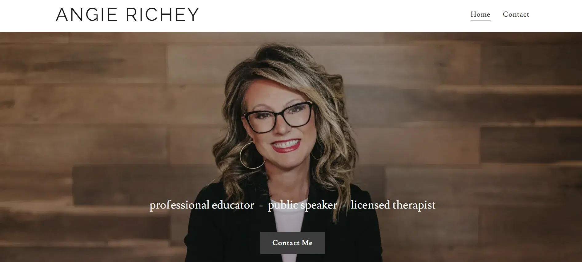
Angie’s website blends credibility across multiple roles as a licensed therapist, university president, public speaker, and educator. It reflects this hybrid identity with a structure that positions her as an expert voice in education and mental health while maintaining a human-centered tone.
Features of the Website
Visual Simplicity That Directs Focus: The site uses a clean white background with bold photography that alternates between candid and professional. There are no harsh colors or overdone design flourishes. This keeps the attention exactly where it belongs: on Angie’s credentials, message, and personality. The site is an example of how web design ideas for therapists can adapt when the therapist is also a public-facing figure.
Layout That Supports a Multi-Disciplinary Identity: Three core sectionseducation, speaking, and mental healthare given equal weight. This is rare in therapist sites, which usually center around clinical services only. Here, the structure makes room for all dimensions of Angie’s work, showing that personal growth can happen in classrooms, on stages, or in one-on-one therapy. Each page keeps the copy brief, with concise blurbs and visual anchors.
Messaging That Mixes Professionalism with Relatability: Angie’s tone is confident but grounded. She talks about “personal freedom,” “healthy relationships,” and “critical thinking” in ways that don’t feel scripted or generic. Mentions of her documentary work, leadership at Life Pacific University, and mental health experience add depth without sounding performative.
For therapists who also work in adjacent spacescoaching, speaking, or educationthis format presents a firm reference for web design ideas for therapists with hybrid professional identities.
Bold but Balanced Typography: The fonts are modern and professional. The headers are slightly oversized but still readable across devices. Each section effectively uses hierarchytitles, subheaders, and body copy that are separated.
Contact Structure That’s Minimal and Direct: No cluttered intake form or multi-step request exists. A single Contact Me button gives visitors a straightforward way to reach out. It’s informal, but that matches the brand: approachable, high-trust, and built on reputation.
13. Claire Clerkin Nutritional Therapy
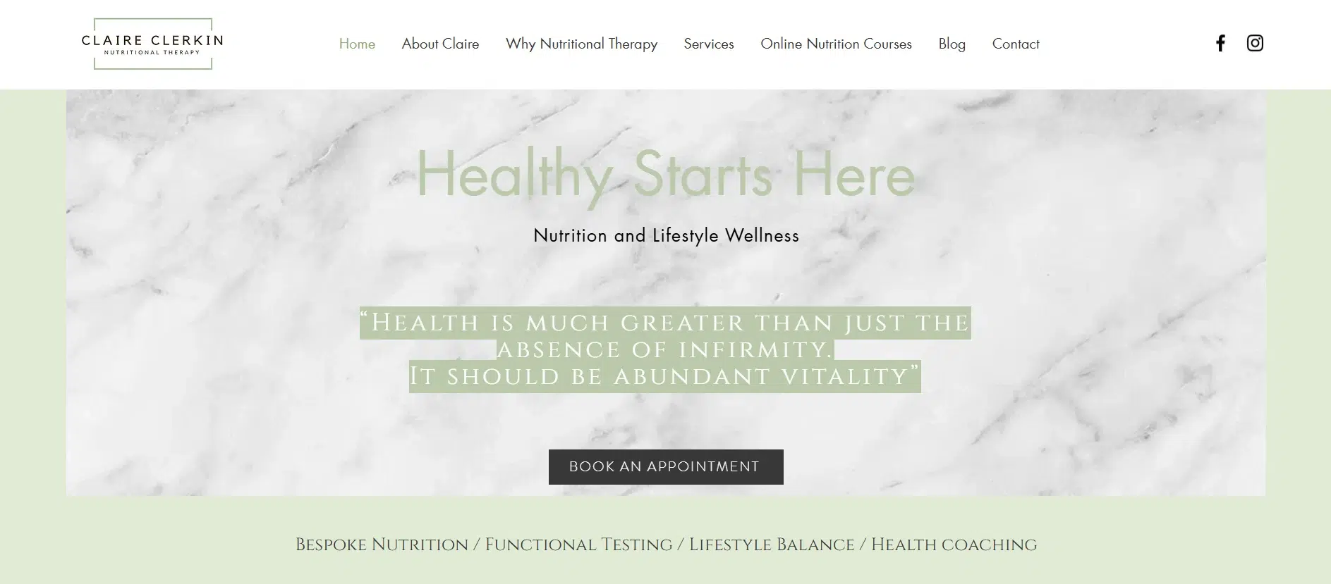
Claire Clerkin’s site stands out for its clarity, credibility, and care. It’s built around one clear intention: to support, educate, and guide people toward better health through nutritional therapy and coaching. The design, structure, and copy all serve the same purpose to create a calm space where clients feel seen, informed, and equipped to take their next step.
Features of the Website
Integration of Services Without Losing Focus: Claire offers a range of services from 1:1 sessions to online courses and corporate wellness programs, yet the site never feels scattered. Each offering is clearly defined, visually separated, and tied to her core focus: helping people improve their health through personalized nutrition and coaching.
Calm Color Palette with a Clean, Clinical Finish: Soft whites and pastel tones dominate the visual experience. The absence of bright or saturated colors gives the site a calm, grounded feelaligned with the emotional tone of holistic healing. This makes the site a strong example for anyone researching web design ideas for therapists who want a balance of professionalism and personality.
Structure That Anticipates the User Journey
The site is organized around how clients thinknot how a business markets. Sections like “Why Nutritional Therapy, Why Health Coaching, and Functional Nutrition Services” each answer a specific question someone might ask when considering this kind of support. The flow moves naturally: who Claire is, what she does, how it works, and how to begin.
Messaging That Educates Without Overloading: The copy across the site is well-measured and deep enough to show expertise, but never overwhelming. Claire explains conditions, tools (such as functional testing), and approaches (such as health coaching) with just enough depth to make her services feel understandable and trustworthy. This balance between clarity and authority makes this site a standout example when exploring web design ideas for integrative or functional wellness therapists.
14. Rachel Rudman
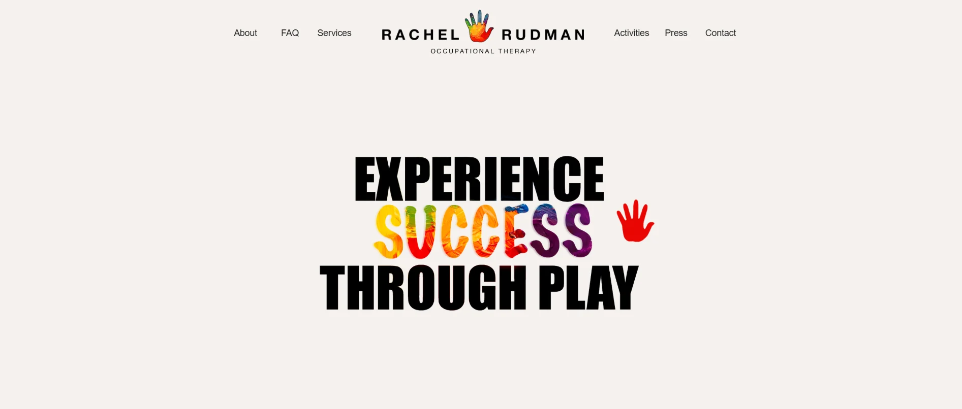
Rachel Rudman’s website is a visual and functional match for her client basechildren and their families. Unlike more clinical or minimalist therapist sites, this one leans into vibrancy, color, and personality, making it feel warm, inviting, and age-appropriate.
Her website creates an experience that mirrors Rachel’s hands-on, child-centered therapeutic approach.
Features of the Website
Interactive Touches That Match the Brand: Elements like hover-based prompts (What is sensory processing? Let’s talk about executive function) reflect Rachel’s teaching approach. These prompts guide the user through complex developmental topics without being didactic. They serve as mini-educational tools for parents, reinforcing that therapy here is collaborative and transparent.
Color and Visuals That Match the Client Base
Bright colors, soft shapes, and playful handprint graphics are used consistently across the site. It’s child-focused without being chaotic. These elements evoke safety and curiosity, essential for a parent deciding whether a therapist is a good fit for their child.
The playful cursor interaction (hand imprint visuals) adds a subtle layer of engagement, making the website feel like part of the therapeutic setting. This approach stands out among web design ideas for therapists who work in pediatrics and need to signal that it is “child-friendly” without relying on gimmicks.
Structure That Supports Parental Decision-Making: Despite the visual playfulness, the site is structured around what parents need to know: What does Rachel do? How does she work? What are the next steps? Services are laid out: Evaluations, One-on-One Sessions, Parent Consultations, and Therapy Check-ins.
Each service is explained clearly, using understandable terms without oversimplifying. Calls to action such as “Get in Touch” or “View Our Activities” are consistently placed, guiding parents toward useful actions without overwhelming them.
Relatable Content: Rachel’s writing style is relaxed and real. The tone is clear, kind, and rooted in practical knowledge. Lines like “My philosophy combines my wide range of experience and techniques to look at the whole child and piece together their puzzle” avoid marketing fluff and instead reflect a therapist who’s in the work for the right reasons. This tone is a reference point for web design ideas for therapists who want to sound knowledgeable and approachable.
Visual Anchors for Space and Safety: The repeated use of The Office imagery and subtle prompts to View Our Office give the site a physical anchor. The physical setting for therapy involving young children is as important as the therapist. Showing the office space provides a bridge for parents trying to imagine their child in this environment. It’s a subtle but brilliant touch that enhances trust.
15. Jessamy Holland
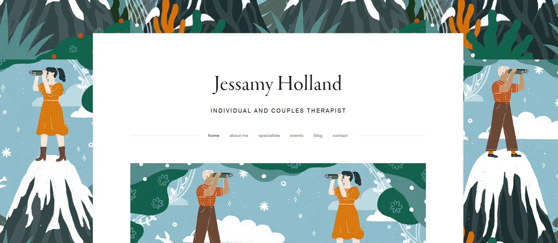
Jessamy Holland’s website offers something rarely done well in therapist branding: It brings sex therapy into the open without clinical coldness or over-marketing. The site reflects her work, centered on the emotional, physical, and spiritual aspects of sexuality, with clarity and warmth.
Features of the Website
Vibrant Aesthetic That Mirrors the Subject Matter: The site features a deep, rich visual paletteearthy tones, warm photography, and personal imagery. It doesn’t feel sterile or overdesigned. Instead, it creates an atmosphere of emotional safety and feminine energy through soft lighting and intimate visual storytelling. This balance of softness and depth is a strong example of web design ideas for therapists in sexual health, where tone and emotional safety are central to client experience.
Community and Event Integration:
The Sisterhood Circles, Workshops, and Events pages extend the therapy offering beyond the one-on-one format. These additions are framed as supportive, open spacesfree from formality and rooted in shared learning. The events aren’t treated as secondary; they’re front and center, which expands the brand’s impact. This is a strong content model for therapists building community in their practice.
Exploration That Prioritizes Self-Selection: Every page serves a direct purpose: About Me, Specialties, Events, Blog, Contact. There’s no dropdown overload or extra categories. The user is guided toward Jessamy’s areas of expertise and invited to explore at their own pace. Services and values are presented without the pressure of a sales funnel.
Content That Balances Education and Emotional Clarity: The writing is assertive without being academic. Jessamy’s voice is honest, conversational, and rooted in personal and professional insight. She explains complex emotional and physiological issues (like pain during sex, attachment styles, and desire disconnection) in language that feels human.
Her site avoids overly medicalized terminology in favor of language that supports empowerment and agency. That’s a takeaway for web design ideas for therapists who want to talk about sex and relationships with maturity and care without drifting into clinical detachment or an overly casual tone.
Editorial Style of Typography: The typefaces are clean and modern, similar to those in a well-designed lifestyle magazine. The body text is soft and fluid, with enough breathing room for long-form content (such as her blog posts and event descriptions) to remain readable.
Strong Integration of Identity and Practice: Jessamy’s personality and values are present throughout the sitenot just in the copy but also in the visual choices, tone, and content strategy. She discusses being a “fellow traveler” with clients, embodiment, sisterhood, and self-awareness.
16. Minaa B.
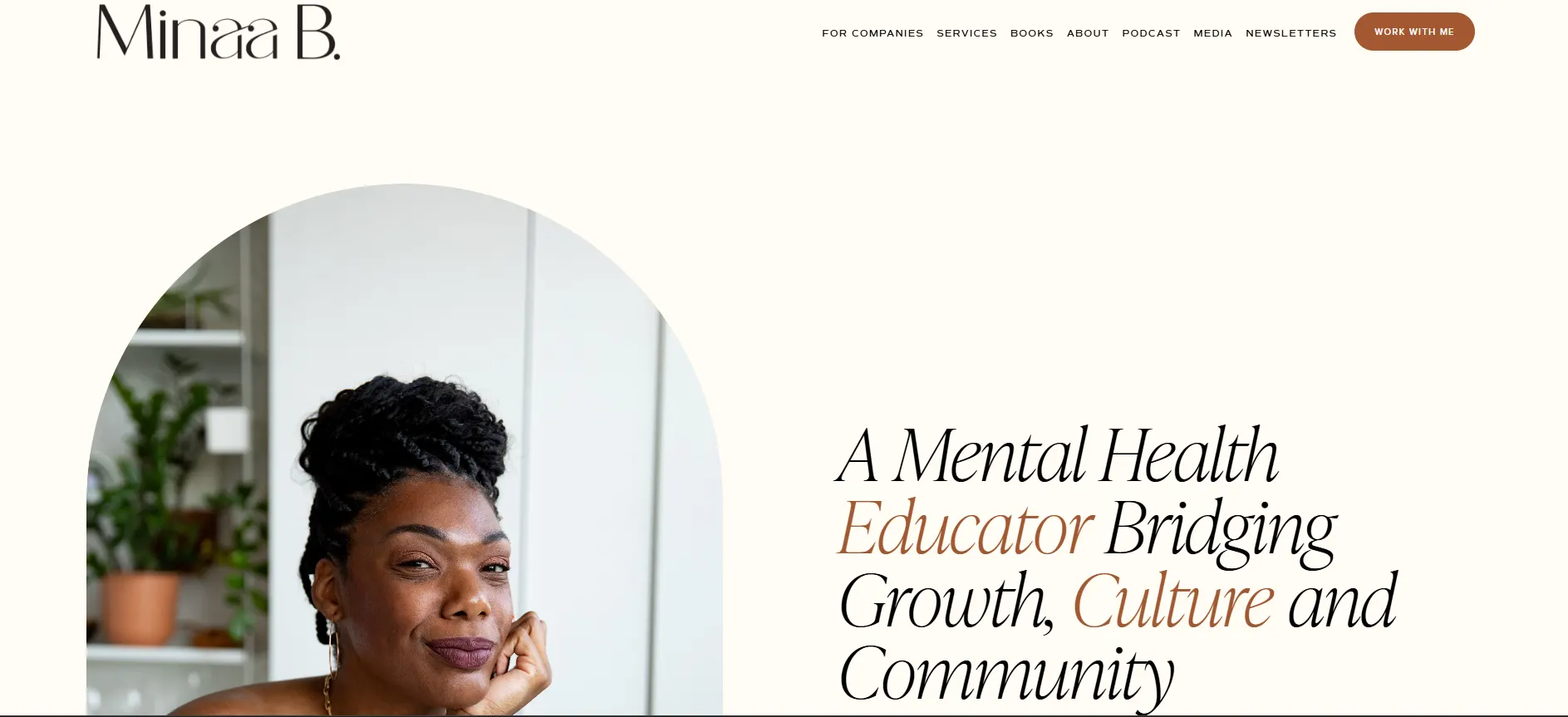
Minaa B.’s website is a powerful example of what happens when a therapist’s brand is intentionally built to stretch across therapy, media, culture, and community.
It doesn’t follow the typical private practice template. Instead, it operates more like a digital hub, developed for collaboration, education, and cultural dialogue.
For multi-hyphenate therapists, this is a textbook case of communicating a complex identity clearly and confidently.
Features of the Website
Visual Branding That Matches Thought Leadership: Every visualfrom photography to layoutis high-quality and aligned with Minaa’s authority. The photos are expressive, grounded, and professionalno generic headshots or sterile office backdrops. This helps convey her presence as someone who speaks to public issues, leads dialogue, and isn’t confined to a single professional lane.
Aesthetic Color Palette: The site’s visual tone leans into soft neutralsbeiges, pale pinks, and earth tonesbalanced by bold, editorial photography. It’s professional without being overly delicate. This palette creates a calm space that still carries energy, matching the brand’s tone: restorative but forward-moving.
Layout That Serves Multiple Audiences: The site is segmented cleanly for different user journeys: individuals, brands, organizations, media, and readers. Each offeringWorkshops, Speaking, Coaching, Books, and Podcastsgets its own defined space with clear paths forward. Despite the breadth of services, the layout avoids clutter.
Voice That Balances Professionalism With Cultural Authority: Minaa’s tone is confident, informed, and deeply rooted in lived experience. She speaks with the clarity of a mental health educator, the intimacy of a therapist, and the energy of a thought leader. Phrases like “healing should be fun and engaging” and “culture serves as a mirror” signal a rejection of overly clinical frameworks in favor of accessible, inclusive language.
Typography That Feels Editorial and Intentional: Fonts are elegant and modern; there are no default sans serifs or heavy blocks. Titles, quotes, and sub-sections are intentionally spaced, creating a reading experience that feels more like browsing a magazine than scrolling on a service site. This aligns with the multimedia content strategy and helps the brand project its authority across various formats, including books, podcasts, workshops, and more.
17. Jonathan Shehee
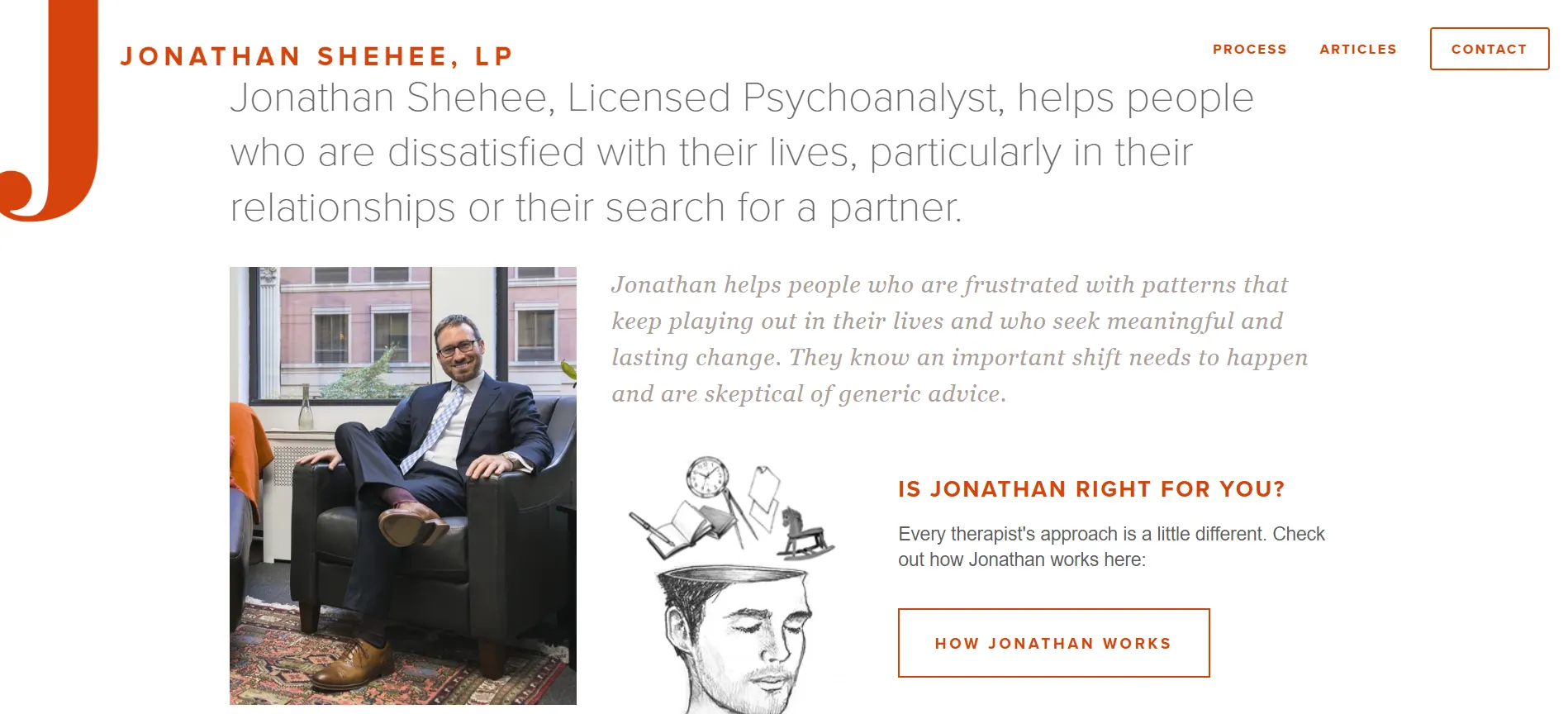
Jonathan Shehee’s site is exclusively for people tired of surface-level answers. It’s minimal, direct, and grounded in emotional depthjust like his psychoanalytic work. Every design choice supports that tone.
Features of the Website
Orange and White Palette That Holds Attention: Orange isn’t just for styleit brings energy to a site that’s otherwise very clean. Paired with white space, it keeps things open and approachable without being flashy. This combination works well for therapists who want their site to feel professional but warm. It’s a great example of how web design ideas for therapists can use bold color sparingly to create personality.
Structure That Highlights the Work: There’s no clutter here. The sections are simple: Process, Articles, Contact. The focus is on helping visitors understand how therapy with Jonathan works, not selling services. That restraint builds trust for clients looking for something serious and honest.
Language That Speaks to the Right People: The copy is calm and thoughtful. It’s clear he’s speaking to clients who’ve done some self-work and are ready for more. Sentences like “skeptical of generic advice” hit the mark without trying too hard. This kind of voice is an excellent reference for web design ideas for therapists working with introspective, self-aware clients.
Fonts and Spacious Layout: The typography is clean and distraction-free. There are no big headings or design tricksjust steady, readable content that lets you focus on the message.
Articles That Extend the Experience: Jonathan’s blog offers thoughtful takes on relationships, love, and personal frustration. Titles like “Never Say Never Compare” show his approach without oversharing. It gives potential clients a feel for his mindset, a smart way to build an early connection.
Contact Is Simple and Direct: There are no forms to fill outjust an email, phone number, and address. That simplicity makes reaching out easy, unlike signing up for something you’re unsure about.
18. Wholeness Collective Therapy Group
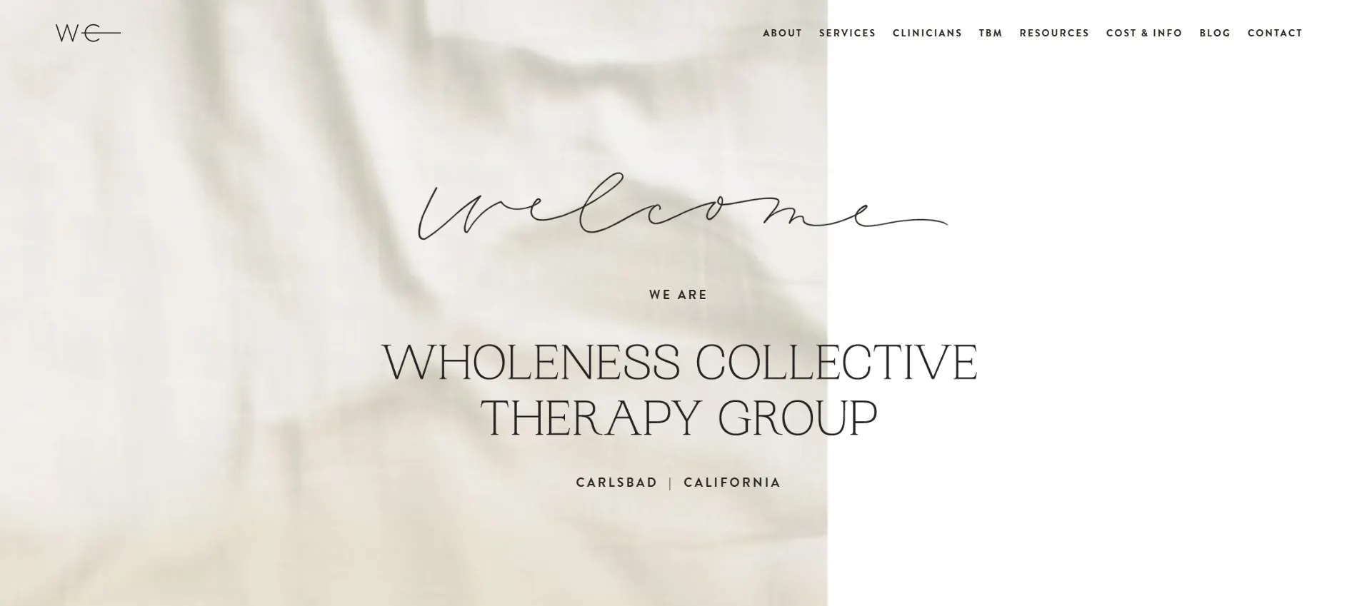
Janelle Nelson’s therapy group site reflects the practice’s values of depth, connection, and wholeness. From the tone to the structure, the site isn’t just promoting therapyit’s showing what integrated care looks like. It speaks to clients who want something more than surface-level sessions.
Features of the Website
A Calm, Earthy Color Scheme That Signals Balance: The site uses muted whites, warm tones, and low contrast, creating a clean, grounded look. There’s no visual clutter. It’s subtle and steady, matching the brand’s emphasis on holistic healing. This soft but intentional palette is an excellent example of web design ideas for therapists looking to foster calm without feeling cold.
Organized Structure: Pages are organized About, Services, Clinicians, Resources, Cost & Info, Contact. Everything flows in a way that respects the user’s time and energy. This layout makes it easy for clients to find what matters most.
Content That Puts People Before Promotion: The copy is thoughtful and warm, especially on Janelle’s profile. Instead of overselling her expertise, she describes her work in terms of care, supervision, and collaboration. Phrases like “we believe our body, soul, and mind are all interconnected” align with the tone of the services offered: EMDR, somatic therapy, mindfulness, and trauma-informed care.
Profiles That Feel Personal, Not Generic: Each clinician has a short, focused bio that outlines their strengths, modalities, and areas of focus. These bios feel curatednot copy-pastedgiving users a clearer sense of who they’ll work with. That kind of detail builds trust quickly.
Typography That Supports the Content: The fonts are modern, soft-edged, and easy to read. The headings are bold enough to guide but not so large that they feel overwhelming. Everything is legible across devices, keeping the experience smooth from start to finish.
19. Cappino Physiotherapy and Wellness Center
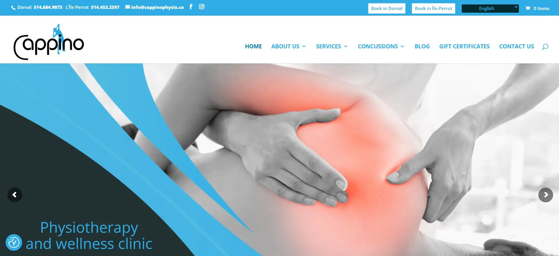
Cappino’s website reflects the practice’s integrated approach to care. It balances a clinical look with a warm, client-focused tone, making it approachable without losing professionalism. From design choices to content layout, everything is built to build trust, inform quickly, and support action.
Features of the Website
Blue-Toned Palette That Signals Calm and Expertise: Soft blues and neutral whites give the site a steady, polished look. The color scheme feels medical without being cold. It reflects emotional calm and clinical authoritya strong design model for wellness centers, and an example of web design ideas for therapists who need to speak to physical and mental health clients.
Clear, Functional Layout with Quick Entry Points: The homepage gives visitors direct access to what they needservices, booking, and clinic locations. Sections like services and healthcare, virtual tour, and testimonials are manageable and clearly labeled. The user doesn’t have to search or guess. This layout respects clients’ time and energy, especially those in pain or distress.
Messaging That Puts Care First: The site’s tone is reassuring and service-oriented. There’s no overuse of clinical jargon, but the language still communicates expertise.
Typography That Balances Professionalism and Ease: Fonts are modern, clean, and consistently sized. Headers guide the eye naturally, and body text is spaced well for readability across devices. There’s no crowding, and visual hierarchy is maintained throughout, keeping the site user-friendly.
Visuals That Support Connection and Trust: Photos of real staff and the space (through the virtual tour) help build familiarity. This transparency adds a layer of trust, especially for new clients unsure about booking.
Testimonials and Tour Add Authority: Short, authentic reviews are placed where users can see them without having to dig. The virtual tour is a thoughtful touch that lets people get a feel for the space before walking in. This is especially helpful for anxious or first-time visitors.
20. Empower Family Therapy
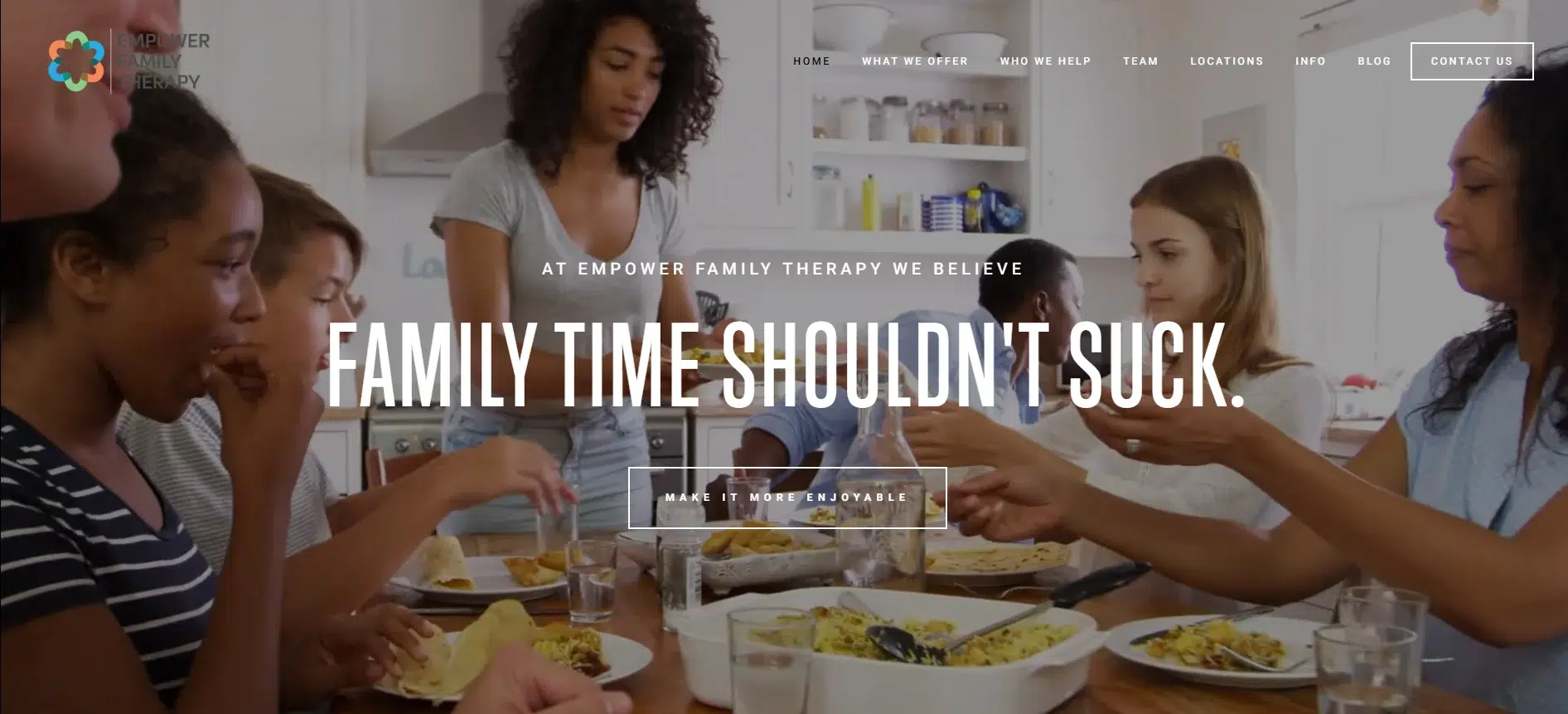
Empower Family Therapy’s website speaks directly to pain points without sugarcoating in a way that feels human, grounded, and hopeful. It’s a strong example of how a therapy website can balance empathy with action.
Features of the Website
Soft Visuals That Balance Warmth and Structure: The site blends soft colors and clean design to create a calm, welcoming atmosphere. There’s nothing clinical or coldimages of real people, natural lighting, and warm hues set the tone. This visual language communicates care and safety, which is crucial for families and couples seeking help. The styling is a great model for web design ideas for therapists who want to look professional without losing warmth.
Clear Content Structure That Reduces Friction: Everything is laid out with intention, from the homepage to deeper service pages. Core sections like What We Offer, Who We Help, Team, Locations, and Contact are easy to find and move between. Clear CTAs like “Contact Us” and “Schedule Your First Session” are visible without being pushy.
Copy That Speaks Directly to the Client’s Pain: This is where the site shines. Lines like “You may be at this site because you’re avoiding going home” don’t hide behind polished language. The writing names real, challenging experiences and follows up with clear next steps. It gives potential clients both recognition and relief. It also sets the bar for web design ideas for therapists who want their message to land emotionally, not just inform.
Visuals That Reflect Authentic Connection: Photos of therapists, office spaces, and real people add credibility. The site doesn’t feel staged; it feels like the place people want to walk into when things at home feel broken. There’s a genuine energy here, and it’s reflected visually and emotionally.
Social Proof That Feels Earned: Google reviews are embedded with real names and detailed feedback. These don’t feel genericthey add trust and reinforce the impact Empower has had. Clients scanning for confidence before committing will find real value here.
21. Authentic Self Consulting & Psychotherapy
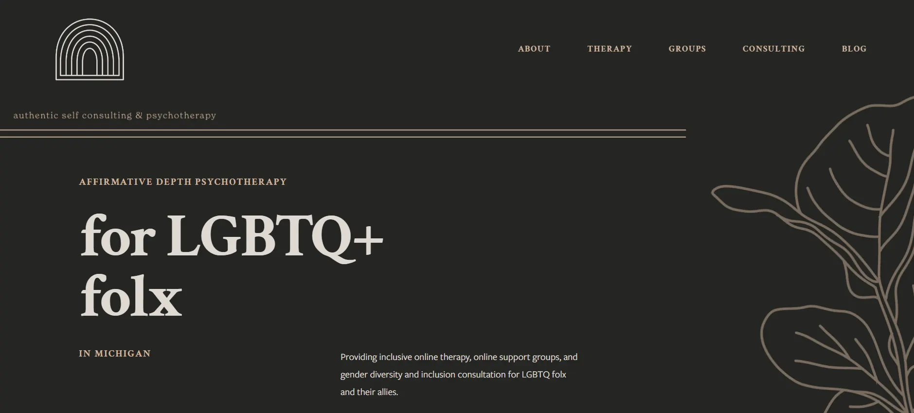
Cate Desjardins’s website, Authentic Self Consulting & Psychotherapy, reflects their therapy approach: thoughtful, transparent, and deeply rooted in LGBTQ+ advocacy. The tone, design, and structure all support a space built not just for clinical care but for belonging.
It’s a clear example of how therapists can use web design to center identity and build trust without compromise.
Features of the Website
Soft, Intentional Color Choices: The site leans into gentle whites and muted earth tones, avoiding the overly clinical or playful. The overall palette supports approachability and calm, essential when the primary audience includes LGBTQ+ clients who are often hyper-attuned to whether a space is truly safe.
This palette is a guidepost for therapists creating inclusive environments within broader web design ideas that focus on marginalized communities.
Layout That Prioritizes Clarity and Connection: The structure is minimal and to the point: about therapy, groups, consulting, and the blog. There are no distractions and no unnecessary tabs. The writing leads the layout, and the content speaks with clarity so that the site feels like a conversation. Visitors immediately understand what Cate offers, who they help, and how to take the next step.
Content That’s Raw, Relatable, and Human: Cate doesn’t hide behind formalities. They speak from lived experience, not just professional training. Lines like “I’ve been in five-day-a-week therapy for over five years and counting” are bold and rare in therapist sites, but here, they fit. Honesty creates an instant connection for users who are skeptical of performative allyship or generic bios. This style offers a fresh web design model for therapists who want to feel real, not rehearsed.
Consulting and Therapy Both Given Space: Unlike many therapist websites that mention consulting as a side note, consulting has equal weight here. The Gender Diversity & Inclusion section is clearly outlined, with a tone that calls in allies without talking down to them. This dual focus on therapy and systemic change broadens the practice’s reach while staying aligned with its core values.
Minimalistic, Simple Design: There are no loud graphics or overdone animations. The energy is confident and steady. The photos are clean and curated, keeping the attention on content and connection. Everything about the design serves a purposenothing is added just to “look nice.”
Let Your Website Reflect the Ease You Bring to Your Clients
You’re already juggling clients, documentation, supervision, continuing educationand let’s not forget your own nervous system. Now, if you’re also trying to decode which fonts build trust, which color palette reduces bounce rates, or how to structure a homepage that converts… you’re spreading yourself too thin. And honestly, who better than youa therapistto recognize that?
Designing and growing a website? That’s a full-time job. And it’s not the one you signed up for.
Creating a site that feels like you, functions seamlessly on every screen, and draws in the right clients isn’t about guesswork. It’s about aligning psychology, visual design, and digital behavior into one cohesive experience.
That’s where design experts come in. You focus on healing, let marketing professionals handle the pixels, padding, and layout logic. Your energy is better spent helping people, not stress-scrolling through template settings at midnight.
Grow Faster and Smarter with INSIDEA’s Digital Marketing Subscription

At INSIDEA, we deliver powerful digital marketing strategies that elevate your brand’s presence, attract the right audience, and drive measurable growth. Our expert team is dedicated to creating top-tier marketing solutions to meet your unique business needs. With in-depth industry knowledge, we craft customized strategies that align perfectly with your goals, all within our all-in-one digital marketing subscription.
Our comprehensive subscription includes everything you need to succeed in the digital space.
From Search Engine Optimization (SEO) that boosts your search rankings and drives organic traffic to WordPress Management, ensuring your website is visually appealing, highly functional, and optimized for conversions.
Our content marketing services establish your authority with engaging, insightful content. Social media marketing builds your presence across platforms with interactive and authentic strategies. Our email marketing solutions connect directly with your audience, driving engagement and conversions.
With INSIDEA’s all-in-one subscription, you can access these services seamlessly, supported by our dedicated digital marketing experts committed to delivering measurable results for your business.
Book a meeting with our experts to explore how we can support your business goals.