Car dealerships know how to sell in person: firm handshakes, polished showrooms, and test drives that close the deal. But when it comes to translating that same energy online in terms of digital marketing, video marketing? That’s where most fall short.
Because today, buyers don’t start with a visit, they begin with a website. And if that site doesn’t immediately convey trust, clarity, and control, the opportunity slips away.
The truth is this: a website is where decisions begin, doubts form, and loyalty starts to build or fall apart. That’s why strong, clear, conversion-ready design matters more than ever. And that’s precisely where great website design ideas for car dealerships come in.
You might be building from scratch. You might be rethinking a tired layout. Either way, the right design can pull buyers in before they ever set foot on the lot.
In this blog, I’ve rounded up over 20 fundamental, standout website design ideas for car dealerships that get it right: clean layouts, intentional color, innovative search tools, and everything in between.
20+ High-Impact Website Design Ideas for Car Dealerships
Great design doesn’t come from guessing; it comes from seeing what works.
These dealership websites show how different brands tackle design, layout, and customer experience. Scroll through, take notes, and steal what fits.
Let’s get started:
1. Tesla

Tesla’s website delivers a bold, frictionless experience from the first second. Every design choice reflects confidence, no distractions, no salesy fluff, and no hand-holding. The brand trusts its audience to explore, and the website backs that up with clean exploration, striking visuals, and an almost editorial approach to layout.
High-Impact Visual Presentation: The homepage uses full-screen imagery that rotates like a cinematic sequence. It doesn’t rely on flashy animations or forced slogans. The focus is on design and movement, with vehicles shown in action and products framed with purpose. This kind of strong visual storytelling makes a lasting first impression, especially for dealerships that want to lead with their brand identity.
Clean Structure: Tesla trims the fat. The header menu sticks to five essentials: Vehicles, Energy, Charging, Discover, and Shop. No submenus, no clutter. It’s a direct route to what users care about.
Crisp, Confident Copy: Tesla keeps its copy brief and assertive. Phrases like “Make badass, zero-emission vehicles” or “The Machine That Builds the Machine” hit hard and land fast. There’s no over-explaining. The tone feels like it’s written by someone who knows exactly what they’re sellingand trusts the product to speak for itself.
Unified Product Ecosystem: Tesla doesn’t present its offerings in silos. Vehicles, solar, and storage all live within the same design language. Each section supports the others, which encourages users to explore across product categories.
Mobile-First Experience: The mobile version delivers the same smooth experience as the desktop version. Layouts adjust perfectly. CTAs are easy to access. Images retain their quality and proportions. Nothing feels cramped or compromised.
Subtle CTAs That Support Action: Tesla’s calls to action, “Order Now” and “Explore,” are low-key, well-placed, and quietly compelling. They never interrupt the user flow. Instead, they show up exactly when needed. This type of non-intrusive CTA placement creates a better user experience and reflects more confidence in the product.
2. Piston Nerd
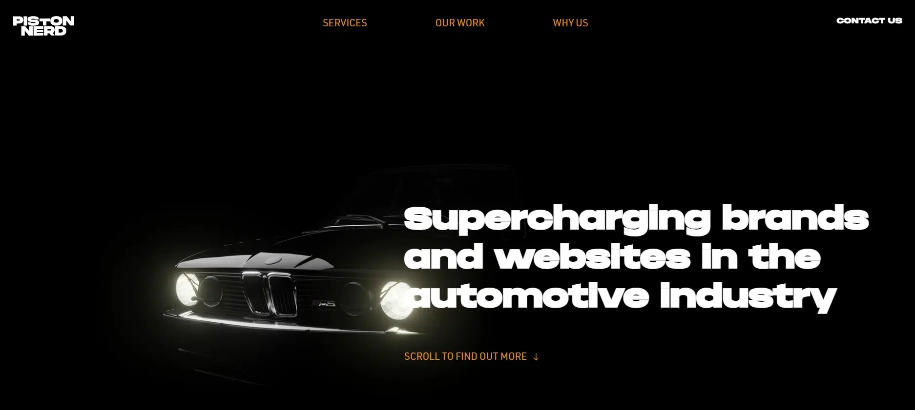
Piston Nerd presents a dealership website built with cinematic precision. From the first scroll, it sets a tone that’s moody, confident, and built to impress. The black theme, combined with orange and white accents, immediately separates it from the crowd. There’s nothing template-driven or generic here. Every element feels crafted for a specific audience with a passion for cars.
Cinematic Homepage: The homepage introduces visitors to the BMW M5 through a slow, intentional visual sequence. As you scroll, the site reveals the car piece by piece, from the engine to the cabin. It’s a storytelling approach that captures attention and builds anticipation. Anyone exploring website design ideas for car dealerships should pay attention to how this technique turns a simple product showcase into an immersive experience.
Bold Visual Language: The color scheme leans into black for depth, orange for energy, and white for clarity. It’s not just color, it’s attitude. The visual choices set a strong tone and support the brand’s confident personality. This kind of visual presence is crucial when designing websites for car dealerships that aim to create a lasting impression.
Structured Content Layout: Core sections, such as Services, Our Work, and Why Us, are clearly defined and arranged for easy reading. Each one delivers just enough information to build interest without overwhelming the visitor. There’s a clear understanding of what matters most to the audience, and the layout reflects that focus.
Authentic Copywriting: The voice throughout the site feels grounded in authentic automotive culture. Phrases like “We’re car guys. We talk the same language” don’t feel like marketing; they think like identity. This style builds trust, especially with enthusiasts who value authenticity over polish.
Responsive Design: The site transitions smoothly across screen sizes. Layouts maintain their structure. Images scale without distortion. Buttons and links are spaced for comfortable interaction. That consistency reflects a strong understanding of how today’s visitors interact with websites on different devices.
Consistent Brand Identity: Every visual and textual detail supports a cohesive brand voice. The logo, section headers, and even microcopy feel aligned.
3. Chevrolet

Chevrolet’s website doesn’t chase trends. It focuses on delivering a stable, refined experience that mirrors the longevity of the brand itself. From the layout to the copy, it all comes together with a sense of balance. It’s not loud, not too slick, just a clear, confident design backed by a message of trust and reliability.
Visual Clarity: White space plays a significant role in giving this site a sense of clarity. Images fade in gently without competing for attention. Each section stands on its own, separated by deliberate spacing that offers the content breathing room. This technique sets a solid reference point when considering website design ideas for car dealerships that value clarity over chaos.
Simple Site Structure: The menu structure is trimmed to essentials. Visitors can easily navigate through vehicle categories, owner support, and service details without any friction. There’s no confusion, just a straightforward path to information. It’s the kind of layout that earns users’ confidence and should be top of mind when planning website design ideas for car dealerships.
Strong Copy: Chevrolet doesn’t flood the site with taglines. Instead, it focuses on sharp, no-nonsense messaging. Headlines are direct, and support copy backs them up with credibility. Even the public notice section takes care to communicate responsibility and protect the brand.
Visual Assets: The image quality is strong across pages. Vehicles are presented in clear light, with no distracting backgrounds or gimmicks. Each photo supports the idea of reliability and quality without overpromising.
Mobile Experience That Matches the Desktop: Nothing is lost in translation when switching from desktop to mobile. Text blocks scale well, images remain sharp, and all core features stay easily accessible. It’s not flashy, but it works precisely the way a well-built site should.
4. Toyota

Toyota’s global website strikes a balance between precision and scale without losing its focus. From the opening frame, it signals a brand that knows how to use technology to communicate clearly. The design is balanced and practical, but it also adds a subtle polish that holds attention without being distracting.
Opening Video That Sets the Tone: Instead of a typical image slider, the homepage launches with a full-screen video that introduces movement and depth. The white and gray color scheme reinforces this calm energy while still feeling modern. It doesn’t try to wow with flash. It earns interest by staying refined. This sets a firm reference for website design ideas for car dealerships focused on experience without clutter.
Clear Layout: The homepage structure avoids noise. Sections are neatly stacked, and spacing is generous. Everything feels placed with intention, from vehicle search tools to pricing insights and accessibility options. The ease of finding what matters quickly is a reminder that the best website design ideas for car dealerships often come from knowing what not to include.
Focused Visual Choices: Toyota keeps its imagery clean and product-driven. Vehicles are well-lit, well-framed, and consistently styled. Nothing distracts from the core visuals. Even downloadable assets are organized for utility, not just presentation. This attention to visual standards reflects a broader design discipline.
Conversion-Driven Tools: From inventory search to category breakdowns, every functional element is there to help the visitor take the next step. But none of it feels forceful. The tools sit quietly in the background until they’re needed. That kind of non-pushy support builds trust and improves conversion without pressure.
Responsive Execution Across Devices: The mobile experience carries the same clean feel as the desktop. Features scale naturally, content stays readable, and design doesn’t lose balance. It feels like it’s built to support all users, regardless of where they start.
5. Volvo Cars Manhattan

Volvo Cars Manhattan delivers a polished and efficient web experience that mirrors the brand’s commitment to premium service. From its structure to accessibility tools, the site is designed to make interaction smooth and straightforward for all types of visitors.
Clear Homepage Layout: The homepage opens with direct access to inventory value, and new arrivals and contact points are all immediately visible. Large headlines and clean spacing guide visitors without confusion. For those exploring website design ideas for car dealerships serving large urban markets, this layout demonstrates how to stay user-focused without sacrificing visual appeal.
Accessibility-First Design: With AudioEye technology integrated, the site offers extended support for assistive technologies. Users can open the accessibility toolbar with a single keystroke, making it easier for people with disabilities to engage with the content. This kind of feature signals forward-thinking design and should be seriously considered when evaluating website design ideas for car dealerships in 2026.
Professional Messaging: From the About Us section to service offerings, the copy stays focused and professional. Messages are clear, friendly, and written to inform, not overwhelm. It positions the dealership as accessible, helpful, and well-established in its region.
Quality Visual Elements: High-resolution vehicle photos and location imagery add a sense of place and purpose. The use of large banners and clean typography helps the brand stand out without being flashy. This keeps the design grounded in quality.
Smooth Mobile Transition: The mobile version mirrors the desktop experience’s structure. Every feature, from vehicle search to contact forms, remains fully functional and easy to navigate. Content adjusts smoothly to different screen sizes without losing impact.
6. The Elite Cars

The Elite Cars brings a high-end dealership experience online without cutting corners. The moment the site loads, a full-page background film offers a window into spotless showrooms and a curated collection of luxury vehicles. This digital presence speaks directly to buyers who expect more and are willing to invest in that level of quality.
Immersive Homepage Film: Rather than relying on still images, the homepage opens with live footage of the showroom. This choice creates a more engaging introduction, showing off the brand’s physical space and vehicle inventory in action. For those evaluating website design ideas for car dealerships, this visual format sets a strong example of how to make a first impression without relying on words.
Strong Visual and Brand Consistency: The website heavily leans into its luxury identity, featuring high-resolution photography, elegant font choices, and smooth transitions. Color plays a significant role. Deep blacks, clean whites, and occasional pops of gold reinforce sophistication without being loud. This kind of design consistency builds recognition and trust, two non-negotiables for premium automotive brands.
Proper Search and Filter Features: The vehicle inventory section includes filters that make browsing by make, model, price, and year easy. Each vehicle listing includes multiple images, pricing details, and specifications without requiring extra clicks. This is a standout website design idea for car dealerships that need to keep users engaged while still offering choice.
Clear Services and Corporate Offerings: Apart from the vehicle sales, The Elite Cars highlights financial services, partnerships, and after-sales support with equal weight. Each section is segmented and tied back to the dealership’s overall value promise. This balance of product and service coverage helps convert visitors who are looking for a long-term relationship, not just a single transaction.
Polished Mobile Experience: On smaller devices, the site maintains its structure without compromise. Video loads cleanly, filters are functional, and all interactive elements remain responsive. Exploration is touch-friendly and intuitive, which is crucial for a market where most browsing starts on mobile.
7. Sun City Motors

Sun City Motors presents a luxury dealership experience with a clear commitment to customer satisfaction. The site reflects a business that understands its market, high-end car buyers looking for both quality and a sense of trust. Everything from layout to copy supports that goal without overcomplicating the user journey.
Direct Homepage Experience: The homepage is focused and uncluttered. Main categories, such as stock, offers, and services, are easily accessible without needing to scroll endlessly. Important calls to action are placed with intent. This setup should be studied closely when analyzing website design ideas for car dealerships aiming to streamline user behavior.
Consistent Visual Styling: Branding is consistent throughout the site. Vehicle images are presented with intense lighting and sharp detail. The logo placement and color palette convey a premium feel without being overly flashy. It creates a smooth experience where buyers can focus on what matters: cars and offers.
Clear Mission and Brand Voice: The site’s messaging reflects a dealership that prioritizes transparency and professionalism. Their mission section doesn’t just check boxes explains how the brand operates and what customers should expect. For anyone building website design ideas for car dealerships that aim to convert visitors into loyal buyers, this kind of honest tone can make the difference.
Detailed Inventory Search: The inventory section features advanced filtering, allowing users to search by brand, model, and other functional categories. Listings include strong photography and relevant specifications. Everything is laid out cleanly, allowing users to compare options without extra friction.
Mobile Layout Built for Utility: The mobile version retains the whole experience. Category links, service sections, and inventory are easy to browse and interact with. Layouts adjust without squeezing or breaking, which keeps the site accessible for users shopping on the go.
8. Rimac Automobili

Rimac Automobili approaches its digital presence the same way it builds hypercars – with extreme focus, advanced engineering, and total control over the user experience. From the moment the site loads, visitors are pulled into a world built on speed, precision, and innovation.
Dynamic Full-Screen Video: The homepage opens with a bold full-screen video showcasing the Nevera. It’s not just background contentit’s part of the experience. It sets the mood instantly and helps establish the brand’s identity in motion. For those mapping out website design ideas for car dealerships, this level of visual storytelling offers a strong way to turn first-time visitors into engaged viewers.
Smooth Animations: Use animations to guide, not distract. Every movement feels engineered, with smooth transitions, subtle zooms, and clean section shifts that mirror the sophistication of the vehicles themselves. These visual elements support the story without overwhelming the core content.
High-quality Imagery: Images are carefully selected. The Nevera and the production facilities are presented in rich, crisp visuals that carry depth and tone. There’s no filler photography. Every image plays a role in reinforcing credibility and performance.
Precise Brand Voice: The copy is sharp and minimal. Phrases like “We challenge convention” and “Push technology to the edge of possibility” reflect a straightforward brand ethos. The tone is geared towards innovators, engineers, and serious buyers. It avoids over-explaining, which adds authority and confidence to the message. For teams working on website design ideas for car dealerships targeting high-performance or niche segments, this voice is a solid benchmark.
Mobile Performance: Mobile users get the whole experience. Video scales without lag. Animations remain fluid. Every piece of content retains its structure, allowing users to browse without compromises. That kind of execution is essential when brand image and user trust are tightly linked.
9. Lamborghini

Lamborghini’s website feels exactly like its cars: high-performance and deeply refined.
The digital design is clean and immersive, built to showcase a brand’s heritage and future, one known for pushing the limits. Every visual and feature is focused on letting visitors experience the brand without distraction.
Video-Driven Homepage: The homepage opens with full-screen visuals that transition through Lamborghini models and the brand’s history. These aren’t just clips; they’re sharp, cinematic sequences that establish mood and legacy in seconds. This style is a valuable reference for those developing website design ideas for car dealerships looking to capture attention with clarity and precision.
Straightforward User Experience: The menu is concise and purposeful, with sections for Models, Ownership, Dealerships, and Motorsport. Each category opens into clearly labeled subpages with strong visual anchors and minimal copy. There’s no guesswork. Visitors know where to go and what to expect. That kind of structural control should be at the forefront of any conversation about high-end website design ideas for car dealerships.
Strong Visual Hierarchy: Lamborghini uses a white and charcoal palette to ground its content, while letting the car models’ colors carry visual weight. This contrast keeps the focus on the product without pulling attention in too many directions. Typography is clean, bold, and evenly spaced, enhancing the site’s overall confidence.
Accessibility Integration: A dedicated accessibility section is available through the main menu, reflecting an inclusive design philosophy. It’s not an afterthoughtit’s part of the core site structure. This is increasingly important as dealerships build for global, multi-device audiences who expect usability at every level.
Responsive Design: On mobile, the site remains fluid and complete. Menus tuck away smoothly, images remain sharp, and content stays in place without crowding. The experience feels engineered, not resizedexactly what users expect from a brand built on precision.
10. INFINITI USA

INFINITI’s website is a reflection of its vehicleselegant, modern, and performance-driven. The design strikes a balance between bold visuals and quiet confidence, using dark backdrops, clean typography, and sharp calls to action to guide users through the experience without distraction.
Bold Visual Presentation: The homepage features high-resolution images of flagship models, such as the QX80, set against a sleek black background. Lighting, angles, and motion all contribute to a sense of precision. For those developing website design ideas for car dealerships, this is a masterclass in letting product imagery carry the weight of the experience.
Clean Layout with Clear Actions: Core sections, such as Build, Search, and Shop, are visible from the top-level navigation. Buttons like “See All Vehicles” and “Learn More” are frequent, consistent, and placed with intention. The site invites users to take the next step without being aggressive. That structure should be noted when collecting website design ideas for car dealerships that aim to blend elegance with high conversion rates.
Refined Brand Voice: Copy across the site is concise and poised. Phrases like “Power Beyond Convention” and “The Next Generation of INFINITI” align perfectly with the visuals, never overstating the message. There’s a sense of clarity in how features, concepts, and models are introduced, especially in future vehicle previews.
Thoughtful Integration of Concept and Future Models: The concept vehicle section offers a strong storytelling layer. Each design preview includes a dedicated space with focused copy and dynamic images. It invites deeper exploration without overloading the visitor. This approach builds brand authority while maintaining high user interest.
11. AAA Auto

AAA Auto’s website delivers exactly what its audience expects: clarity, speed, and conversion-focused design. As a primary used vehicle dealer across Europe, the site reflects years of operational maturity packaged in a crisp digital format that prioritizes results.
Focused Homepage with Direct Messaging: The homepage uses bold graphics, a strong headline, and a clean layout to make an immediate impression. The value proposition is unmissable: fast delivery, reliable sourcing, and long-term partner benefits. Anyone researching website design ideas for car dealerships should take note of how quickly this site communicates what matters most.
Streamlined Search and Category Flow: As you scroll, categories appear that guide users through search paths by car type, intent, or curated suggestions. The layout is intuitive and easy to use. Whether a visitor knows what they’re looking for or is browsing options, the structure keeps them engaged without forcing them to make unnecessary decisions. This tactic ranks high among practical website design ideas for car dealerships looking to increase inventory views.
Refreshing Color Scheme and Graphics: The site features bright, energizing colors while maintaining a clean interface. White backgrounds paired with bold reds and sharp blacks create contrast and highlight calls to action. Vehicle images are well-framed and consistent in quality, making the product feel central to the experience.
B2B Portal Integration: AAA Auto offers features tailored to dealers, including wishlist notifications, VIP offers, order history, and even customizable portals. These tools are baked into the user interface without overcomplicating the experience. It’s a strong example of how digital tools can support both end buyers and reseller relationships on the same platform.
Optimized Mobile Structure: On mobile, category blocks remain legible, CTAs are easily tappable, and listings retain sharpness. The performance doesn’t lag, and users can move through filters and offer pages as smoothly as on a desktop.
12. Dodge

The Dodge website delivers a sharp digital experience that reflects the brand’s muscle-car persona, bold, focused, and unapologetically direct. The design uses classic contrasts and functional layout choices to present information without slowing the user down.
Structured Homepage With Balanced Imagery: The homepage features a rotating image slider that introduces vehicles and campaigns. Unlike most auto sites that flood users with back-to-back visuals, Dodge takes a measured approach. Each image holds its place, spaced with purpose, giving the user time to absorb instead of skim. For teams studying website design ideas for car dealerships, this visual pacing makes a strong case for control over chaos.
Classic Color Palette That Reinforces Identity: Dodge uses a black, white, and red color scheme to significant effect. These choices are more than aesthetic; they tie directly into the brand’s aggressive, no-nonsense tone. Subtle accents of blue and yellow add variety without diluting the look. This is a reminder that when color aligns with brand voice, it strengthens the experience without needing extra elements.
Clean Layout With Focused Functionality: Menus are slim and well-organized. Features like “Build & Price,” “Find a Dealer,” and “Shop Online” are right where users expect them. The site avoids clutter by keeping each section separated with generous white space. This clean separation improves usability and lowers the effort required to explore. It’s a technique worth noting for anyone gathering website design ideas for car dealerships that prioritize user experience.
Symmetrical Visual Framing: Across landing sections and product pages, image alignment remains consistent and symmetrical. Vehicle shots, calls to action, and background graphics follow a precise grid. That attention to visual order adds a layer of polish that many automotive sites overlook.
Mobile Execution That Mirrors Desktop Precision: On mobile, Dodge’s layout holds its shape. CTAs remain prominent, menus collapse cleanly, and sliders respond quickly. The design doesn’t over-adapt. For dealerships that want consistency across devices, this performance standard is a good target.
13. Alba Cars

Alba Cars delivers a lively, polished web experience that matches its reputation in the UAE’s luxury used-car market. From animations to structure, every element of the website feels crafted to keep users engaged while making it easy to explore, decide, and act.
Visually Engaging Homepage: The site opens with smooth scroll animations that guide users through the homepage’s sections. As users move between top and bottom menus, the design reacts seamlessly, making the browsing experience feel responsive and intentional. This is a standout example for those collecting website design ideas for car dealerships that want motion to serve a function.
Bright and Consistent Color Scheme: Alba’s color palette balances white space with cheerful accents that add personality without creating visual noise. The soft tones paired with bold highlights create a positive atmosphere that encourages exploration. This balance between energy and clarity makes the brand feel approachable and premium at the same time.
Simple Typography and Clean Layout: Font choices are clear, minimal, and well-spaced, helping content stay easy to scan on all screen sizes. Headings, CTAs, and vehicle specs are organized into blocks that feel familiar, reducing the time users spend finding what they need. For teams building website design ideas for car dealerships, this kind of readability supports both brand identity and usability.
Filtered Inventory and Smart Search Options: Users can browse by make, body type, price, and more from the homepage. Listings update fast and display all core details upfront. Each listing includes high-quality images and concise summaries, with booking and inquiry options one tap away. The flow is simple but effective.
Dedicated Sections for Selling, Financing, and Team Access: The website doesn’t just focus on buying. Selling a vehicle, applying for financing, and connecting with the team are just as accessible. Each page maintains visual consistency and uses direct, friendly language. This kind of structure helps retain users who may not be ready to buy today but are exploring long-term options.
Fully Responsive Mobile Layout: On mobile, the scroll animations remain intact. Buttons are spaced for touch interaction, inventory filters function smoothly, and navigation elements adjust without lag. There’s no drop in quality or usability across devices.
14. Lotus of Vancouver

Lotus of Vancouver brings a unique, interactive web experience that mirrors the precision and engineering of the vehicles it sells. With subtle motion and functional creativity, the website offers visitors more than just a list of cars; it creates a moment of engagement before any text appears.
Interactive 3D Car Scroll: One of the most striking features is the 3D-rendered car scroller on the homepage. As users scroll, the model shifts in real time. Hovering over a car even changes its color. This adds a layer of interaction that doesn’t feel gimmicky, it draws users in with motion that serves the product. This is a strong example of forward-thinking execution within website design ideas for car dealerships that want to turn engagement into deeper interest.
Visually Strong Backgrounds: Behind the text and imagery, full-width background visuals anchor the content in brand personality. Whether it’s a static image or a slow fade-in visual, the effect builds atmosphere without slowing page speed. The consistency of style from section to section keeps the experience feeling seamless.
Precise Content Flow: After the initial scroll and interaction, the site transitions cleanly into core dealership offerings, available inventory, services, contact points, and model-specific pages. The layout is deliberate yet straightforward, allowing users to navigate the experience without feeling overwhelmed. For anyone collecting practical website design ideas for car dealerships, this level of clarity in progression matters.
Responsive and Refined: The interactive features and visual elements translate well to mobile devices. While the 3D hover effect is desktop-first, the rest of the site adjusts without friction. Menus stay accessible, pages load quickly, and image quality remains sharp across devices.
15. Pierre Ford

Pierre Ford’s website reflects the confidence of a dealership that’s been serving the Seattle area for decades. The design is sharp and structured, helping users move quickly from interest to action without losing momentum. The site offers a consistent visual experience and the kind of clear organization that builds trust immediately.
Strong Visual Theme: From the first frame onward, the background video, sharp vehicle imagery, and bold headings create a strong digital presence. The color schemedeep blues, black accents, and white spacefeels solid and professional. For teams exploring website design ideas for car dealerships that need to balance legacy and modern expectations, this kind of thematic clarity stands out.
Clean Layout and Straightforward Exploration: The top navigation menu places New Vehicles, Pre-Owned, Finance, and Service right where users expect them. Each dropdown expands with logical, uncluttered categories. Whether a visitor is booking a service or requesting a quote, the path is friction-free and straightforward. The structure feels like it was built to respect the user’s time.
Clear Inventory Filter Design: Just beneath the homepage header, the site features a highly functional inventory dropdown. Users can filter vehicles by category, keyword, budget, body style, year, and condition, all without leaving the page. Each filter works instantly, helping buyers narrow their search quickly. This feature is especially valuable when evaluating website design ideas for car dealerships that prioritize usability and customer choice.
Sharp Typography and Visual Balance: Headlines are bold but not overwhelming. Fonts are clear and sized for easy reading, while images support each section without crowding the layout. Vehicle listings are paired with pricing, core specs, and CTAs that are always visible but never distracting. The entire flow feels balanced.
Integrated Shopping Tools: Every crucial action, such as getting a quote, applying for credit, or scheduling a test drive, is supported by short, intuitive forms placed at the right touchpoints. These tools are not hidden behind excessive copy or extra steps. The website positions them exactly where they’ll make the most impact.
16. DealerOn

DealerOn’s website reflects the confidence of a company that has helped shape digital retail for dealerships across North America. The design stands out with intentional styling, clear organization, and high-contrast visuals that guide the user to take action, without ever being too pushy.
Intentional Use of Color: The color scheme, blue, orange, and white, is a standout feature. Each color plays a role: blue brings trust, orange adds energy, and white keeps the interface clean. These choices work together to create hierarchy and drive attention where it matters most. For those seeking website design ideas for car dealerships that blend brand identity with usability, this is a firm reference.
Bold Layout With Visual Rhythm: The homepage is divided into confident, modular sections. Each one uses strong visuals, clean headlines, and distinct calls to action. There’s no clutter. Every section guides the user forward, whether they’re exploring SEO solutions, inventory management, or digital advertising. This sense of flow creates a natural momentum that supports conversions.
Standout Call-to-Action Placement: Buttons such as “Request a Demo” and “Start Selling More” are strategically positioned throughout the site. The CTAs are never buried; they’re visible without being overwhelming. The language is direct, and the styling makes them easy to click. This is the kind of execution that should be top of mind when building website design ideas for car dealerships focused on results.
Creative Visual Touches: DealerOn uses animated graphics, iconography, and stylized imagery to create a more engaging scroll. These visual cues don’t distract from the content; they add movement and reinforce the message. It’s a good reminder that aesthetics and conversion strategy don’t have to be at odds.
Structured Exploration and Fast Access to Tools: The top menu is well-organized, with fast access to solutions, success stories, and resources. Users can explore the site without needing to backtrack or dig through secondary pages. It’s clean, intuitive, and respects the visitor’s time.
17. Jay Wolfe Honda

Jay Wolfe Honda’s website is designed to convert, and it does so with clarity, energy, and a personal touch. The layout is clean and direct, but what sets it apart is how it blends functionality with subtle flair. Every feature is placed to move the visitor closer to action, while design choices keep the experience approachable and easy to follow.
Bold Use of Color and Typography: From the moment the homepage loads, the site uses color to guide the visitor. Different colored fonts highlight promotions, offers, and programs, helping key messages stand out without overloading the screen. The overall palette stays grounded, featuring deep reds, whites, and charcoal grays, but pops of accent color give energy to key sections. This use of color is a practical reference for anyone developing website design ideas for car dealerships that want to highlight their value propositions effectively.
Conversion-Focused Pop-Ups: One standout feature is the brilliant overlay that occasionally appears, asking users whether they’re looking to buy and introducing suggested models. The message is clear, and the timing feels purposeful rather than intrusive. It’s a strong example of how to introduce intent-driven prompts without derailing the user experience.
Functional and Organized Layout: Main categories such as Shop New, Shop Pre-Owned, We Buy Cars, and Service, are structured to reduce decision fatigue. Dropdowns and in-page filters make exploring options quick and straightforward. This layout supports both first-time visitors and return customers, and should be considered when exploring website design ideas for car dealerships that need to balance multiple inventory paths.
User-Friendly Filtering System: The homepage features an inventory filter that lets users filter by condition, keyword, or vehicle type. Categories such as SUV, Sedan, Van, Hybrid, and AWD are presented, and results are updated immediately. This kind of search efficiency keeps users engaged and lowers bounce rates by reducing unnecessary clicks.
Simple Visual Elements That Support Content: Images are clean and consistent, paired with concise copy. Typography is easy to read, with no heavy blocks or overdesigned effects. The site’s visual balance gives it a trustworthy feel that supports the overall brand positioning.
18. Camacho Auto Sales

Camacho Auto Sales has built a website experience that’s as direct and reliable as the dealership itself. The design is clean and straightforward, avoiding visual noise while still delivering all the tools and information a customer needs to make a decision. The simplicity is intentional, and it works.
Minimalist Layout With Clean White Space: The website opens with generous white spacing that keeps the layout breathable and organized. Core content areas are visually centered, making the homepage feel stable and easy to explore. This minimal layout is a smart move and one that stands out when evaluating website design ideas for car dealerships that want clarity without complexity.
Balanced Color Palette: The color scheme is subtle and pleasing, with neutrals as the main colors and select accent tones used to highlight buttons and headings. It doesn’t try to grab attention with flash. Instead, it reinforces readability and ease. This type of design control can improve user time on the page.
Clear Exploration and Straight Paths: Top-level menus, such as “Shop,” “Sell or Trade,” “Get Approved Now,” and “Refer a Friend,” are placed where they should be, and each dropdown follows a predictable, easy-to-navigate structure. There’s no guesswork. Users can find inventory, apply for financing, or schedule a test drive in just a few clicks. This approach supports conversion and provides a reference point for practical website design ideas for car dealerships.
Lightweight Content With Focused CTAs: The homepage keeps copy short and lets the visuals guide attention. Sharp photos support inventory sections, while calls to action like “Get Approved Today” and “Make a Payment” are easy to find and use. Each CTA leads to a fast-loading, purpose-built form.
Consistent Layout Across Sections: Whether browsing vehicles, learning about financing, or viewing the About Us page, the layout remains consistent. Font choices are readable and straightforward, headings are clear, and image placement doesn’t interrupt the flow. The entire experience feels designed for users who want to act without being distracted.
19. Hertz Car Sales

Hertz Car Sales delivers a vibrant and refreshing digital experience that feels light, modern, and approachable from the very first click. The design reflects the same accessibility and friendliness the brand is known for, wrapped in a layout that’s visually clean and easy to navigate.
Bright Color Palette That Commands Attention: The yellow across the site plays a role beyond aesthetics; it sets the tone. Paired with neutral white and black elements, it creates a cheerful but structured interface. The color doesn’t just decorate; it guides the eye, gives focus to buttons and calls to action, and boosts energy across every section. This kind of color integration is an excellent model for anyone studying website design ideas for car dealerships, aiming to strike a balance between personality and usability.
Clean Layout with Engaging Visuals: The homepage features well-spaced blocks, sharp photography, and confident headlines to structure its content. Each section, inventory, trade-in, Rent2Buy, and financing, has its own space with just enough information to prompt action. Nothing feels buried or overloaded. It’s a prime example of how a modern layout can improve navigation and drive engagement.
Conversion-Driven CTAs: Throughout the site, prompts such as “Search All Used Cars,” “Get Pre-Approved,” and “Value Your Car” are placed where they have the greatest impact. These buttons are sized, colored, and positioned to be clickable without overwhelming the design. Their frequency and clarity are worth noting when exploring high-performance website design ideas for car dealerships.
Streamlined Inventory Access: Product browsing starts immediately from the homepage. Search and filter tools are front and center, allowing users to explore certified vehicles by type, price, or feature set. Each listing includes imagery, specs, warranty details, and pricing without requiring extra clicks. It’s functional and fast, with zero friction.
Strong Visual Identity Across Pages: Every page on the site, whether it’s about financing, warranties, or trade-ins, uses the same tone, spacing, and design cues. Fonts remain legible, images are consistent in style, and animations are kept subtle. This consistent branding reinforces trust and keeps the experience smooth from start to finish.
20. Alfa Romeo USA

Alfa Romeo USA delivers a sleek digital experience that captures the brand’s elegance without overcomplicating the interface. The layout is built with precision, providing just enough movement and design character to feel premium without compromising usability. The entire site reflects the brand’s Italian performance legacy while maintaining a clean, focused design.
Balanced Use of White Space: The design leans into generous spacing between elements, allowing every image and line of text to breathe. Each section is framed with clarity, making the content easier to absorb. This approach is efficient for website design ideas for car dealerships aiming to elevate the user experience without adding visual clutter.
Clean, Consistent Structure: From homepage banners to model landing pages, the layout remains consistent. Fonts are sharp, sizing is balanced, and alignment stays precise across every screen. Whether highlighting a limited-edition model or a special event, the structure never overwhelms the user. This consistency keeps the flow uninterrupted and professional.
Subtle Occasion-Based Design Touches: During special seasons or launches, Alfa Romeo incorporates temporary design elements, such as background textures or promotional banners, that blend seamlessly with the main design. These updates are natural extensions of the brand rather than separate promotions. It’s a smart way to refresh a site without breaking rhythm, and a valuable example for crafting seasonal website design ideas for car dealerships.
Clear Exploration and Fast Access: Exploring the website is direct. Users can explore models, offers, build tools, or locate dealerships from a clean menu that never feels overcrowded. Every section opens smoothly with minimal page-load friction, helping retain attention and lowering bounce rates.
Visual and Textual Balance: Photography across the site is high-quality and tightly edited. Each image supports the narrative without overpowering it. Text placement and content length are carefully controlled; nothing runs on too long, and nothing is wasted. It’s a design built to let the product speak first.
21. Lexus of Las Vegas

Lexus of Las Vegas has one of the most visually refined dealership websites in its class. Every section, every scroll, and every button placement feels intentional. It’s not just functionalit’s elegant. From the sleek silver palette to the polished layout, the site reflects luxury without overdoing it.
Sophisticated Color Palette: The silver theme instantly sets the tone. Combined with crisp whites and deep blacks, the color scheme gives the site a professional and high-end feel. There’s a balance here that reinforces trust and attention to detail. For those building website design ideas for car dealerships with a premium focus, this palette offers a strong reference point.
Clean Layout With Strong Visual Cues: Well-placed visuals and confident headlines lead the way on the homepage. Calls to action like “View Offers” and “Schedule Service” are prominent but not aggressive. Each button uses contrast and space to stand out, making interaction easy and intuitive. This structure helps build user confidence and ensures a smooth navigation experience.
Professional Use of Typography and Spacing: Font choices are elegant yet sturdyclean, modern, and highly legible. Headings guide the page flow while content blocks remain light and easy to scan. This level of typographic consistency adds polish, a key element when exploring website design ideas for car dealerships that need to blend performance with visual calm.
Effective Menu and Category Design: The top navigation is clean, and dropdowns are well-organized by user intent: New Vehicles, Pre-Owned, Specials, Service, and Finance. Every path is simple to follow, with no hidden clicks or confusing labels. It’s a structure that helps move visitors from the homepage to the inventory in seconds.
Polished Visual Hierarchy: Images of current models are positioned to command attention, without compromising usability. Layout spacing allows each element to stand on its own. The site feels elevated, not just in its appearance, but also in how it presents information. The overall design shows how charisma can come from precision.
Let Your Website Pre-sell the Cars
You’re already managing inventory, working leads, handling financing, keeping customers happy, and staying ahead of local competition. Now, add figuring out page load speeds, CTA placement, responsive design, and mobile optimization? That’s more than just multitasking; it’s draining focus from where it’s needed: your business.
Building and maintaining a high-converting website is a full-time discipline. One that changes constantly and demands serious attention to detail.
Let the web design experts bring that same energy to your online showroom. Focus on closing deals, running your floor, and growing your brand. We’ll make sure your site matches the level you’re playing at.
Grow Faster and Smarter with INSIDEA’s Digital Marketing Subscription

At INSIDEA, we deliver powerful digital marketing strategies that elevate your brand’s presence, attract the right audience, and drive measurable growth. Our expert team is dedicated to creating top-tier marketing solutions to meet your unique business needs. With in-depth industry knowledge, we craft customized strategies that align perfectly with your goals, all within our all-in-one digital marketing subscription.
Our comprehensive subscription includes everything you need to succeed in the digital space.
From Search Engine Optimization (SEO) that boosts your search rankings and drives organic traffic to WordPress Management, ensuring your website is visually appealing, highly functional, and optimized for conversions.
Our content marketing services establish your authority with engaging, insightful content. Social media marketing builds your presence across platforms with interactive and authentic strategies. Our email marketing solutions connect directly with your audience, driving engagement and conversions.
With INSIDEA’s all-in-one subscription, you can access these services seamlessly, supported by our dedicated digital marketing experts committed to delivering measurable results for your business.
Book a meeting with our experts to explore how we can support your business goals.