What does it take to run a successful dental clinic? A skilled dentist with hands as precise as a sculptor, a warm and supportive staff that makes patients feel like family, and appointments that don’t take ages to get.
And let’s not forget the ultimate dream: a painless experience (though that’s still a work in progress, right?).
Even with all that, one core ingredient is often overlooked: branding. A dental clinic isn’t just about fillings and root canals; it’s about how it presents itself to the world. From the name and logo to the website’s design and messaging, every detail should reflect its values, expertise, and patient experience.
With 77% of patients preferring providers that offer online booking but only 26% of practices actually providing it, a strong online presence is essential. A clear digital strategy for dentists makes your website accessible, convenient, and builds patient trust.
A strong brand isn’t just eye candy; it makes a clinic unforgettable. It builds trust, communicates credibility, and ensures patients choose you over the dentist down the street. Smart social media use can reinforce your brand and keep patients engaged.
Let’s explore standout dental branding examples and see how these clinics have mastered their identities, logos, and patient experiences.
1. Aspen Dental
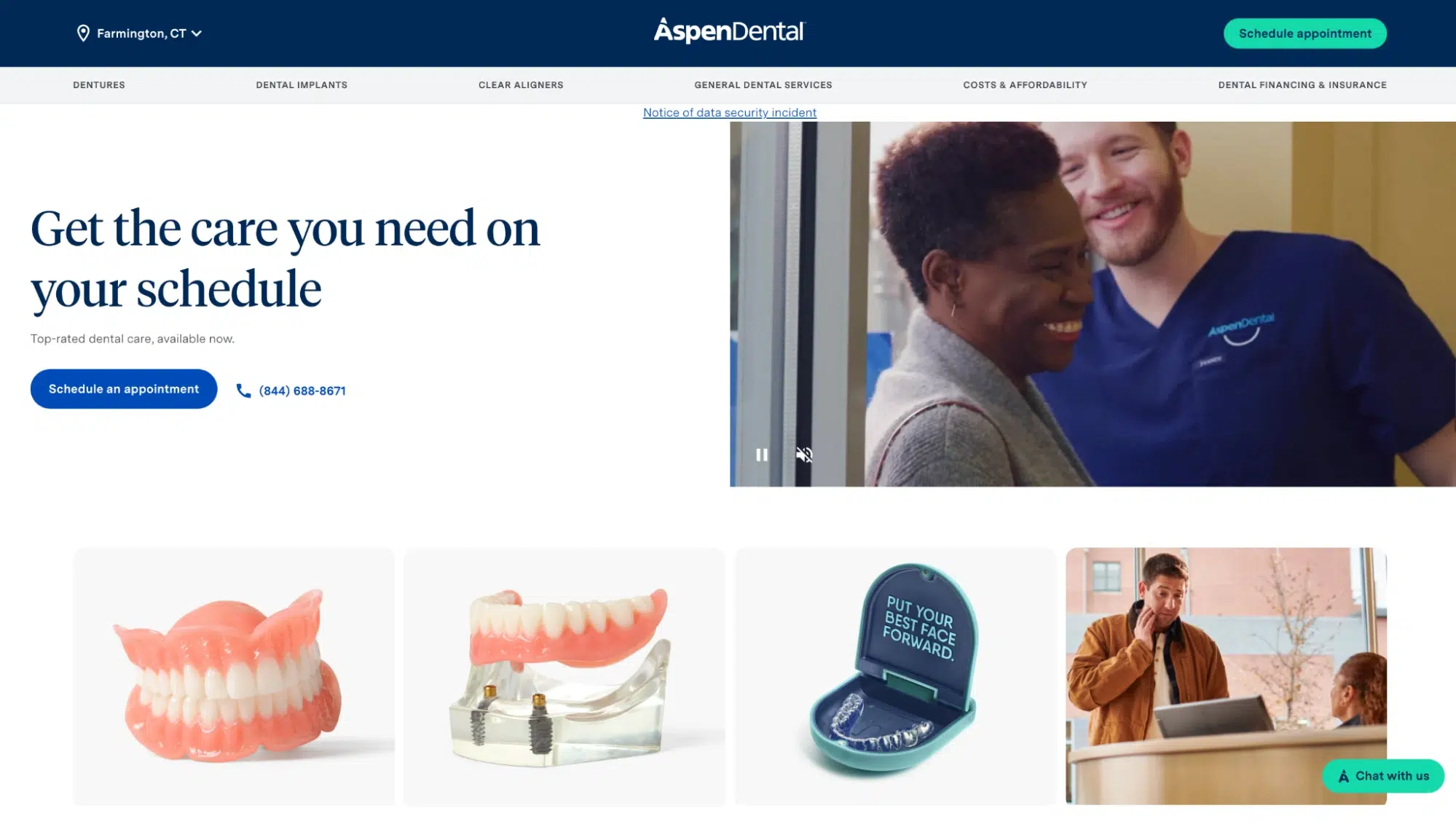
Aspen Dental’s bold blue color scheme conveys trust, accessibility, and professionalism. As a brand spread across the East Coast, its simple, clean typography makes it instantly recognizable and easy to remember.
Brand Identity: Affordable, Accessible, Nationwide
Logo Decode: The simple sans-serif typeface reflects modern accessibility, while the blue color palette evokes trust and professionalism. Moreover, the little cut on the “A” makes their logo unique yet effortless- a perfect example of minimalist dental clinic branding.
Why It Works: The branding emphasizes affordable, easy-to-access dental care, appealing to a broad, national audience.
2. Banff Dentistry
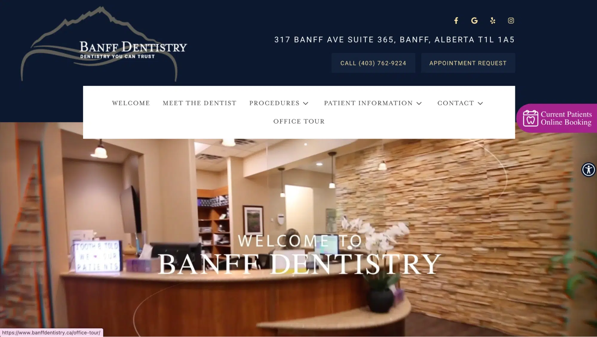
Inspired by Banff’s natural beauty, the logo’s mountain and tree imagery reflect a commitment to holistic, nature-connected dentistry. This branding creates a warm, inviting, and community-oriented feel.
Brand Identity: Local, Nature-Inspired, Warm
Logo Decode: The mountain and tree elements in the clinic’s logo reinforce its commitment to natural beauty and holistic care.
Why It Works: The branding connects the clinic to its community and environment, making it warm and inviting.
3. Beehive Dental
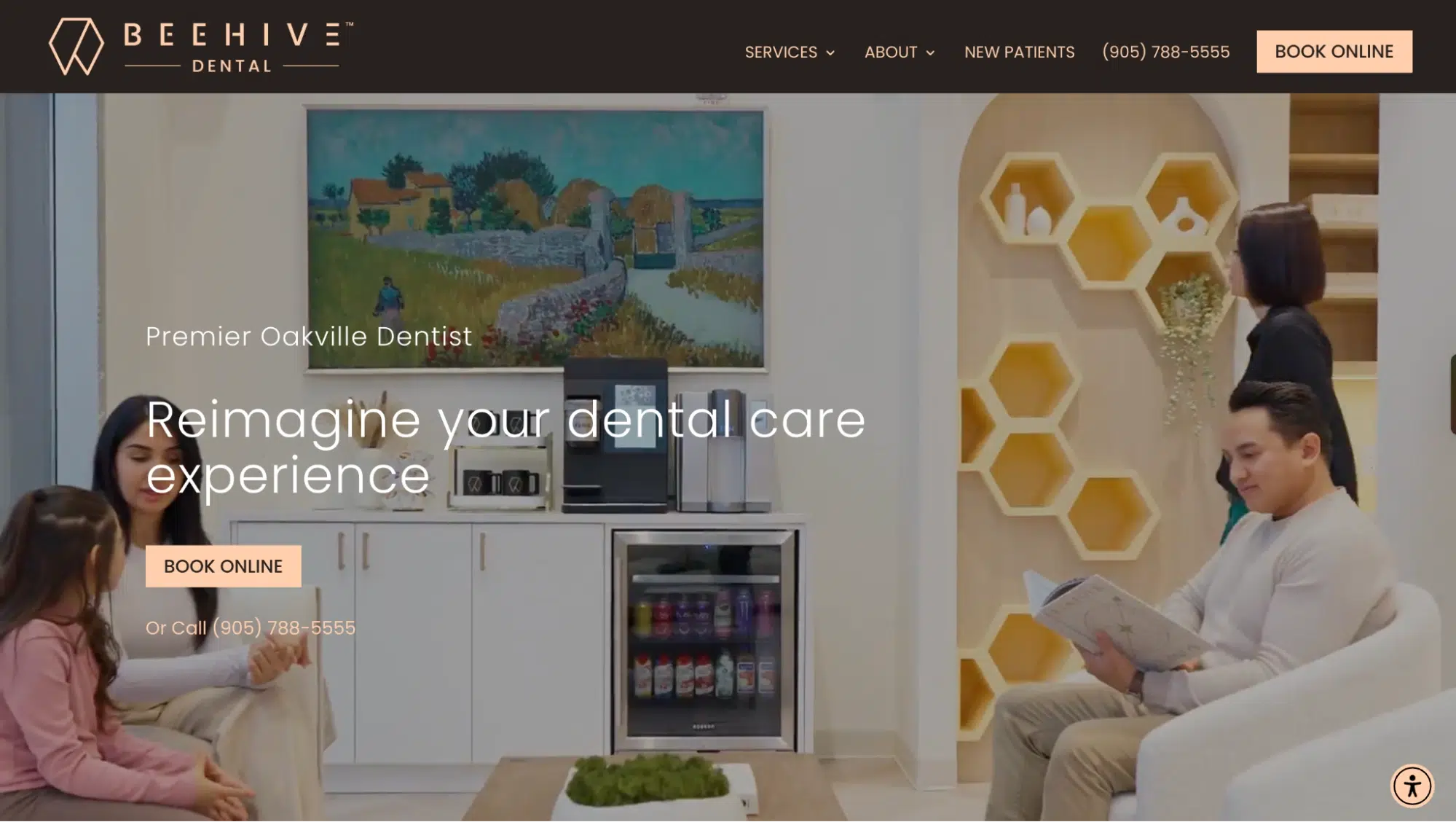
The beehive logo symbolizes a modern twist to the typical hexagonal shape! It may stand for teamwork, efficiency, and precision, which align with its contemporary yet approachable dental care. Its gold-and-black color scheme gives it a refined yet friendly vibe.
Brand Identity: Community-Centered, Precise, Modern
Logo Decode: The beehive symbol represents teamwork, efficiency, and precision, aligning with patient-centered care.
Why It Works: The branding makes the practice feel friendly and next-gen, fostering patient trust.
4. Better Living Through Dentistry
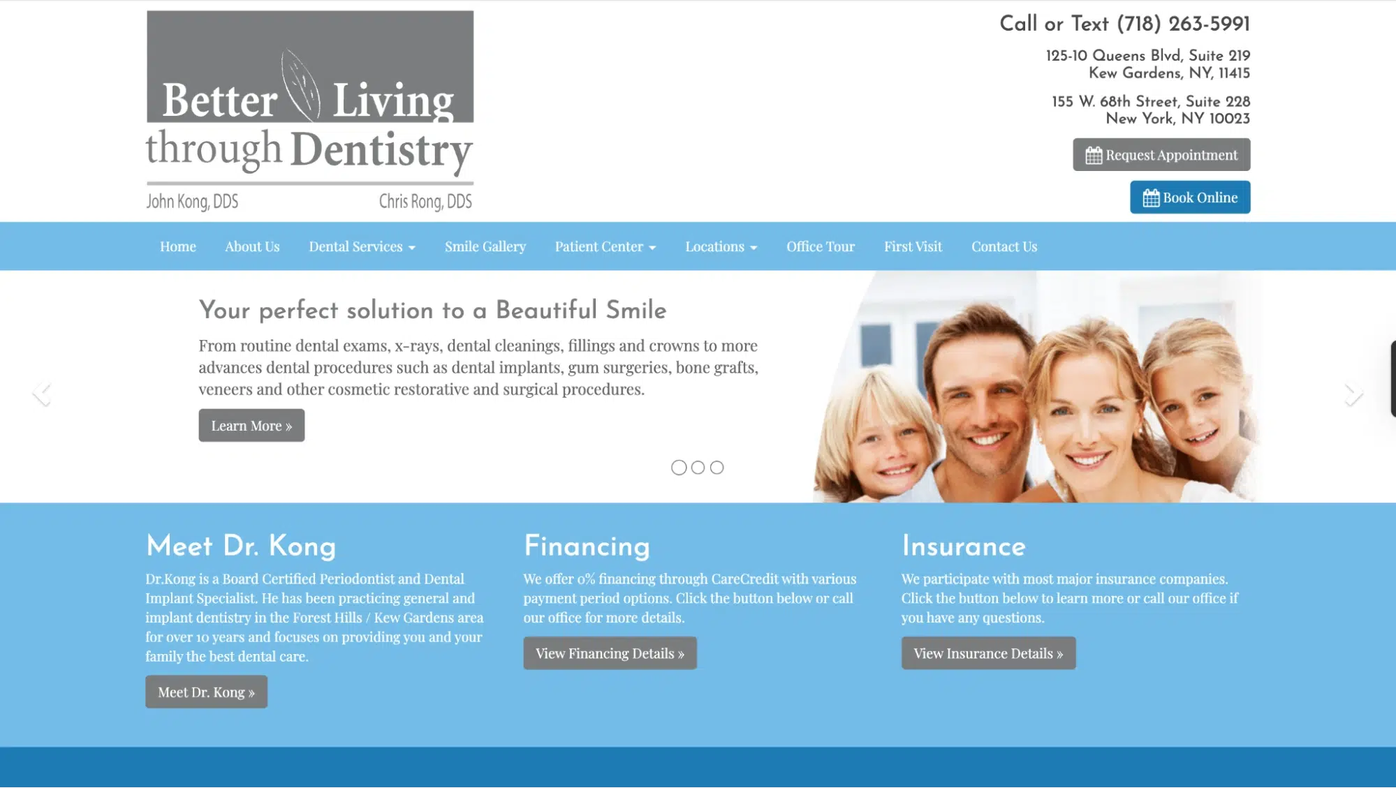
With a clean, minimalist font and calming tones, this clinic is a health-focused, patient-first practice. The branding reinforces holistic oral care beyond just aesthetics. This dental clinic branding may take you down memory lane and remind you of the early era of websites and probably Internet 1.0!
Brand Identity: Holistic, Health-First, Patient-Oriented
Logo Decode: A minimalist, clean font-based logo, with calming brand colors, reflects a wellness-based approach.
Why It Works: The branding moves beyond aesthetics, positioning oral health as part of overall well-being.
5. Bryant Dental
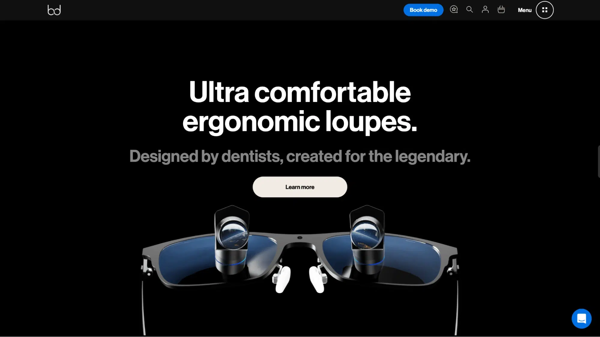
As a B2B dental gear supplier, Bryant Dental’s sleek, detailed typography and dark theme exude premium, high-tech sophistication. This branding targets dental professionals rather than patients.
Brand Identity: Premium, High-Tech, B2B
Logo Decode: Sleek, metallic-like font representing “b” & “d” looped and making an infinity symbol-emphasizing luxury yet the longevity of their dental equipment.
Why It Works: The branding differentiates it from patient-facing clinics and appeals to dental professionals.
6. Camden Dental Centre
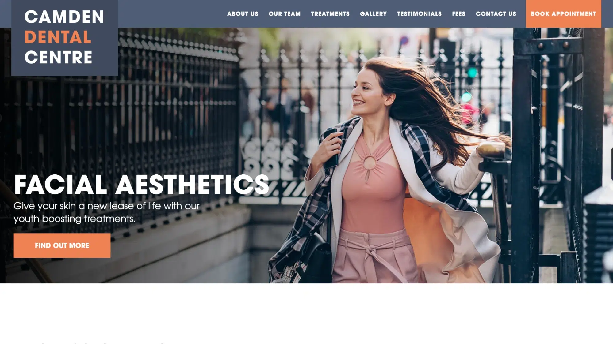
This dental clinic branding follows a monochrome palette and bold typography to establish a modern, urban feel that appeals to professionals in fast-paced urban environments. The branding feels clean, clinical, and highly professional.
Brand Identity: Modern, Urban, Professional
Logo Decode: The monochrome color scheme and bold typography of the brand’s name convey sophistication with utmost reliability.
Why It Works: The branding feels clean and clinical, appealing to urban professionals.
7. Clovis Orthodontics
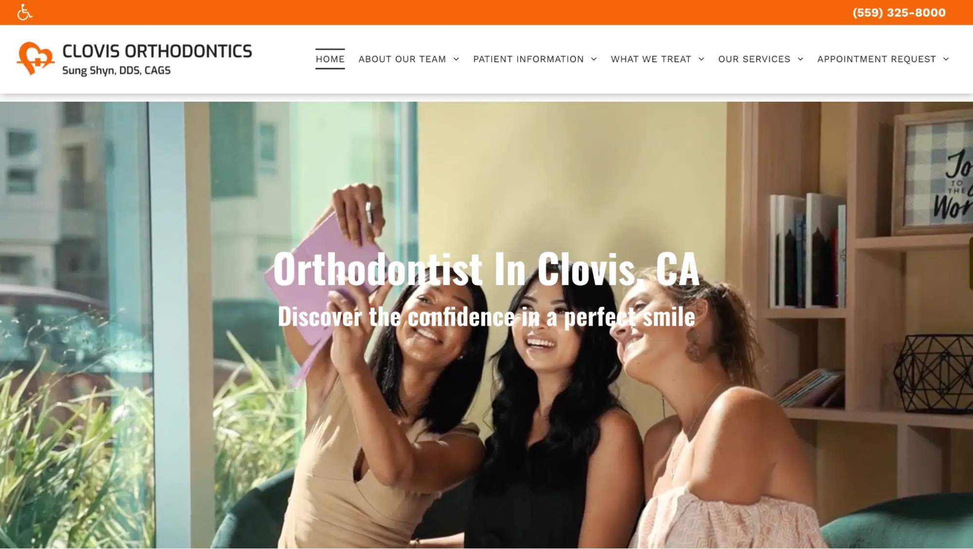
With a curved logo that mimics a smile, Clovis Orthodontics positions itself as a confidence-boosting specialist in orthodontic care. Its youthful, transformative branding attracts families and young adults.
Brand Identity: Orthodontic-Focused, Youthful, Transformative
Logo Decode: The curved design of the typography mimics a heart and perhaps a tooth’s crown.
Why It Works: The branding attracts teens, families, and adults looking for aesthetic orthodontic solutions.
8. Cumming Pediatric Dentistry & Orthodontics
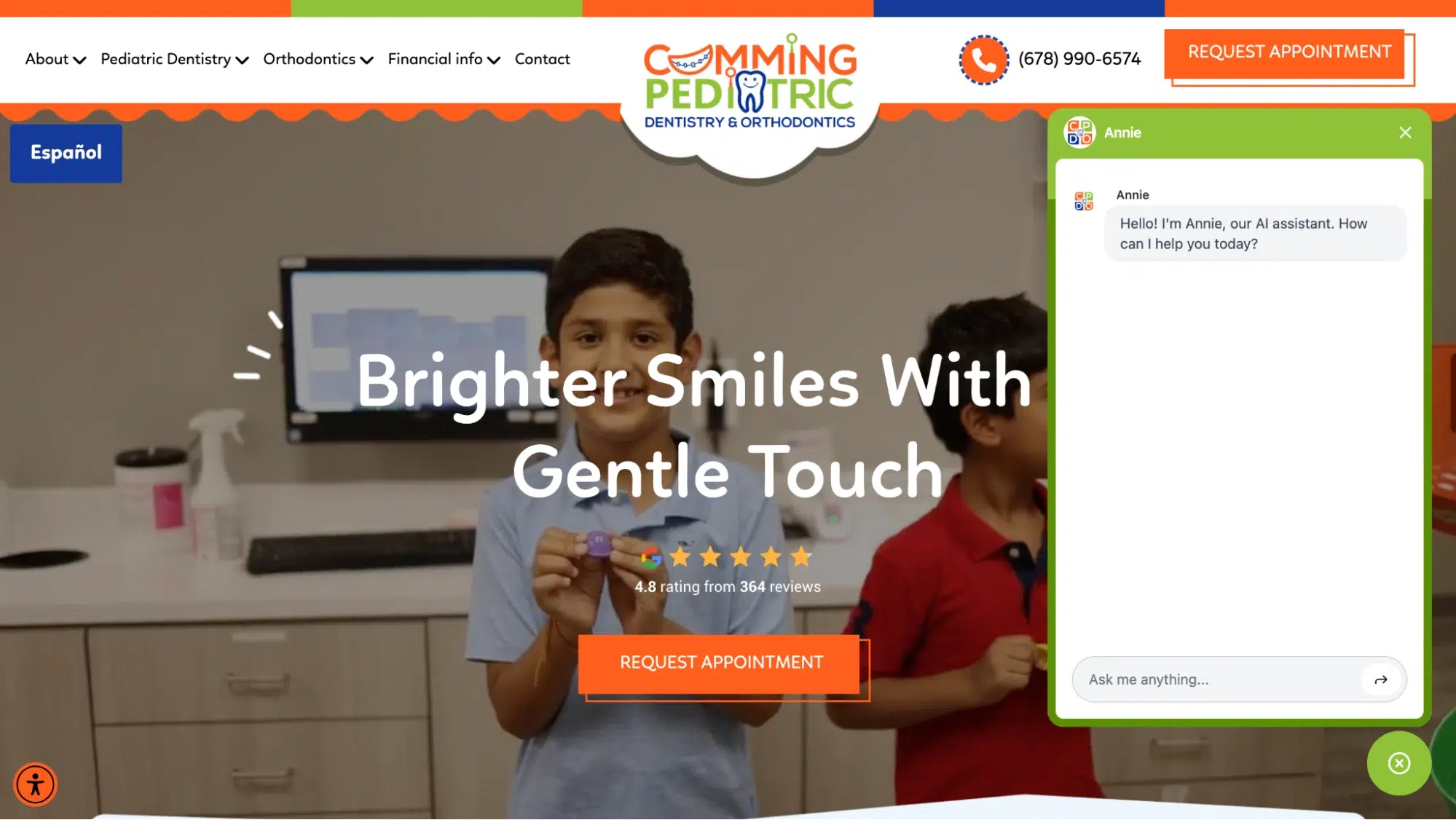
Bright, rounded fonts and pastel color palettes make this branding child-friendly and playful. The name reflects a specialized focus on pediatric dental care in a welcoming, stress-free environment.
Brand Identity: Playful, Child-Friendly, Trustworthy
Logo Decode: Cumming Pediatric Dentistry & Orthodontics creates a fun, kid-friendly vibe with bright colors and playful fonts to ease dental anxiety.
Their logo’s clever toucha braces smile, replacing “U” and “A” with teethreinforces their focus on orthodontic care in an engaging and reassuring way.
Why It Works: The branding appeals to parents and children, making dental visits less intimidating.
9. Delta Centre for Laser & Cosmetic Dentistry
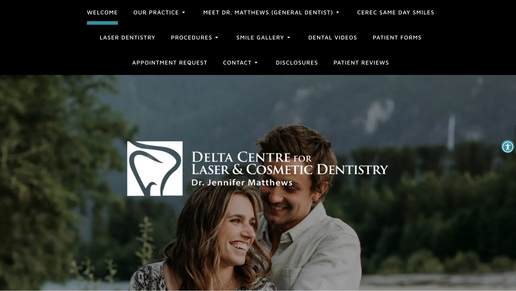
A sleek silver-blue color scheme and a futuristic font convey expertise in advanced laser and cosmetic dental treatments. The branding emphasizes high-end, technology-driven services.
Brand Identity: High-Tech, Luxury, Advanced
Logo Decode: A sleek, silverish blue tooth outline overlaid over the logo, representing state-of-the-art technology and modern cosmetic treatments.
Why It Works: The branding reinforces expertise in high-end laser dentistry.
10. Dental Care Seattle
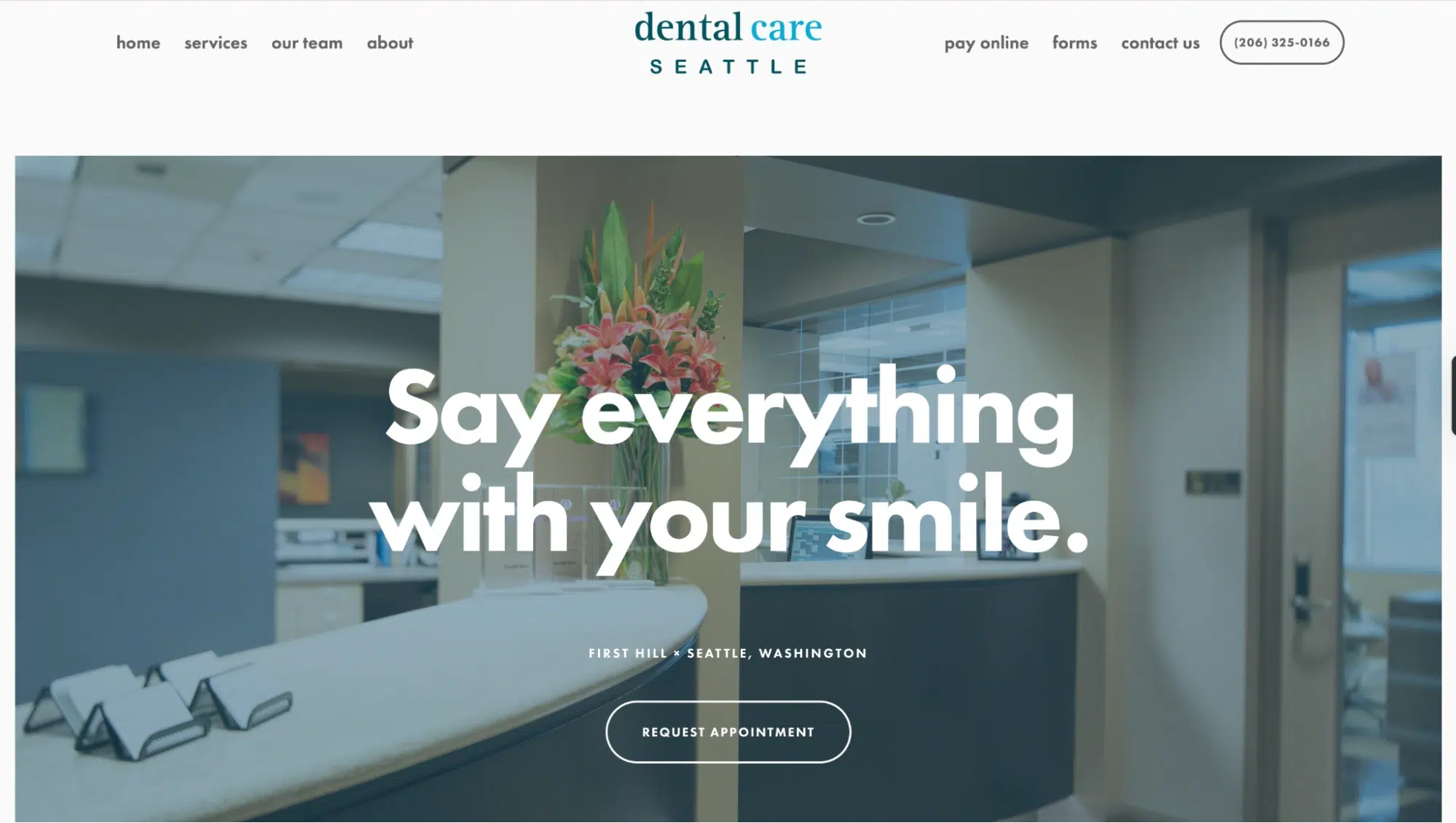
In this practice’s dental clinic branding, they’ve used a simple text-based logo to blend local trust with modern, high-quality dentistry. The branding is inviting yet polished, ideal for urban professionals.
Brand Identity: Comprehensive, Modern, Welcoming
Logo Decode: A simple text-based logo on shades of blue.
Why It Works: The branding makes the practice feel approachable yet high-end.
11. Dr. Jenny White
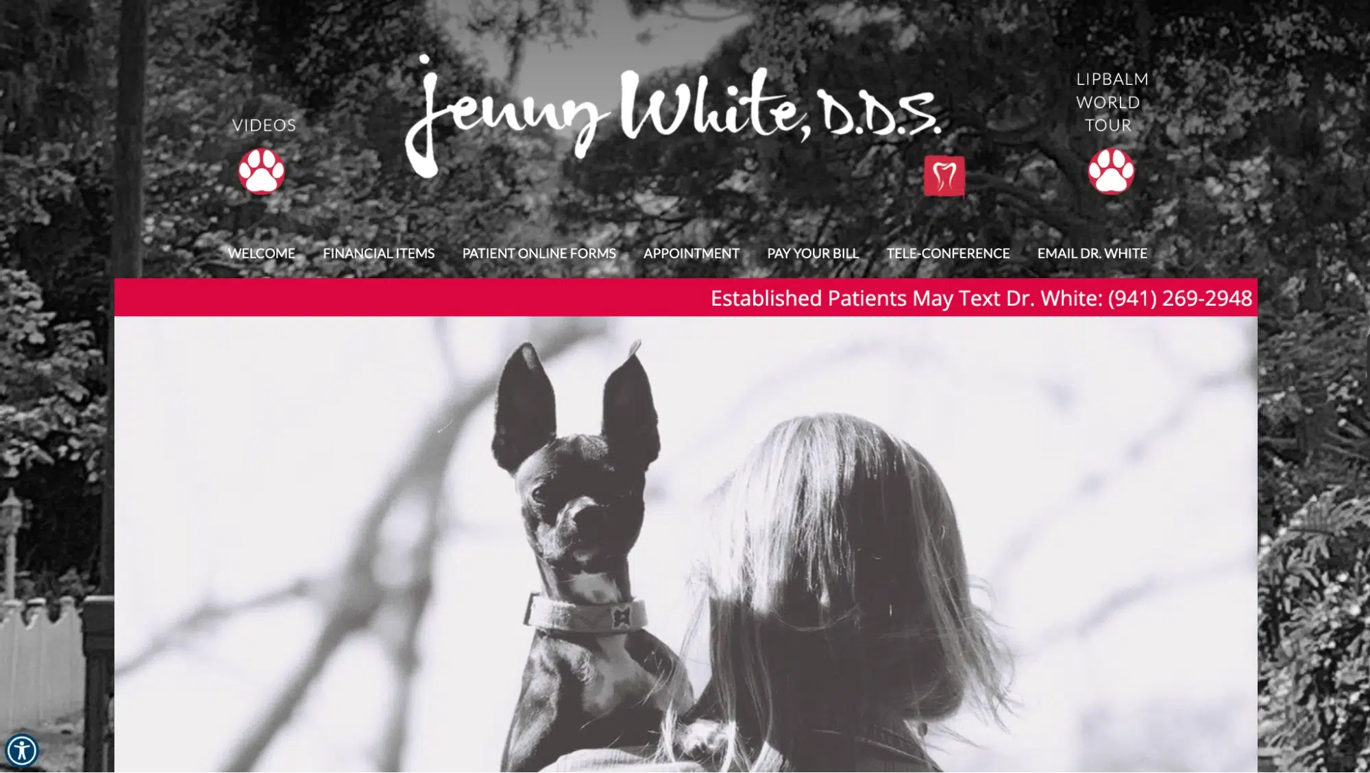
A signature-style logo and elegant typography create a personalized boutique dental experience. The branding feels exclusive, high-end, and patient-focused, attracting specialist-care seekers.
Brand Identity: Personalized, High-Expertise, Boutique
Logo Decode: A signature-style logo with a freehand-drawn tooth creates a personal, high-touch experience.
Why It Works: The branding feels professional yet exclusive, attracting patients seeking specialist care.
12. East Village Dental
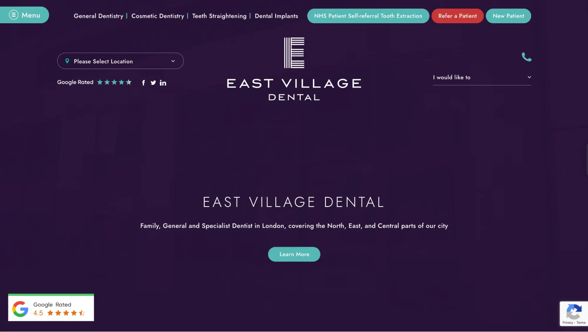
This trendy, digital-first brand features geometric typography and a modern, minimalist feel. It is perfect for young professionals and tech-savvy patients in NYC.
Brand Identity: Trendy, Digital-First, Patient-Focused
Logo Decode: A clean, sans-serif font with geometric styling creates a modern, urban appeal.
Why It Works: The branding fits the trendy, millennial-friendly vibe of East Village, NYC.
13. Frost Dental Group
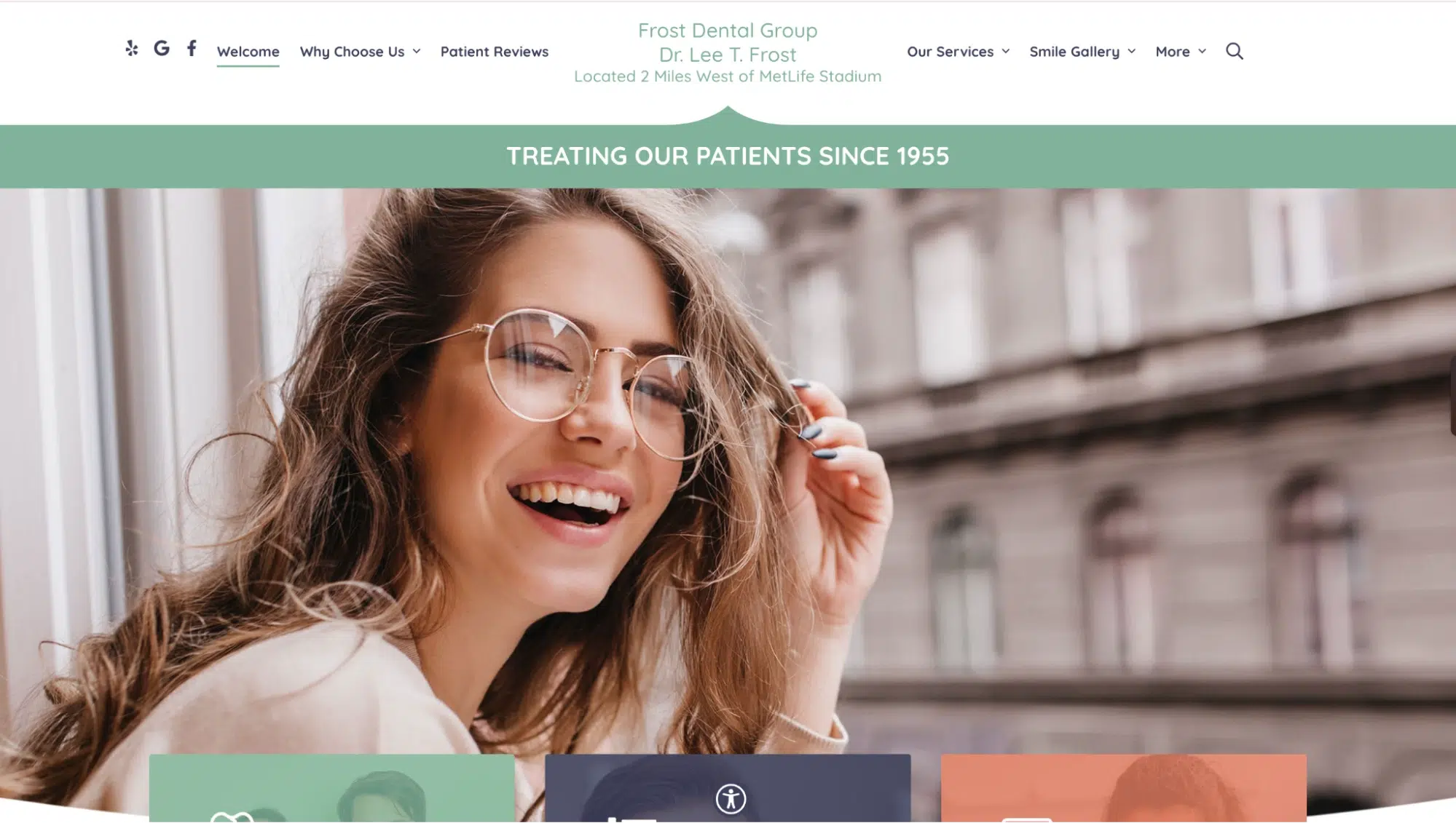
A greenish-blue color scheme with sleek typography emphasizes hygiene, sterility, and trust. The clinic’s branding is refreshing and professional, reinforcing its expertise in precise dental care.
Brand Identity: Cool, Crisp, Trustworthy
Logo Decode: A frosty blue color scheme reinforces a clean, sterile, and precise aesthetic in dentistry.
Why It Works: The branding makes the clinic feel refreshing and trustworthy.
14. Grand Street Dental
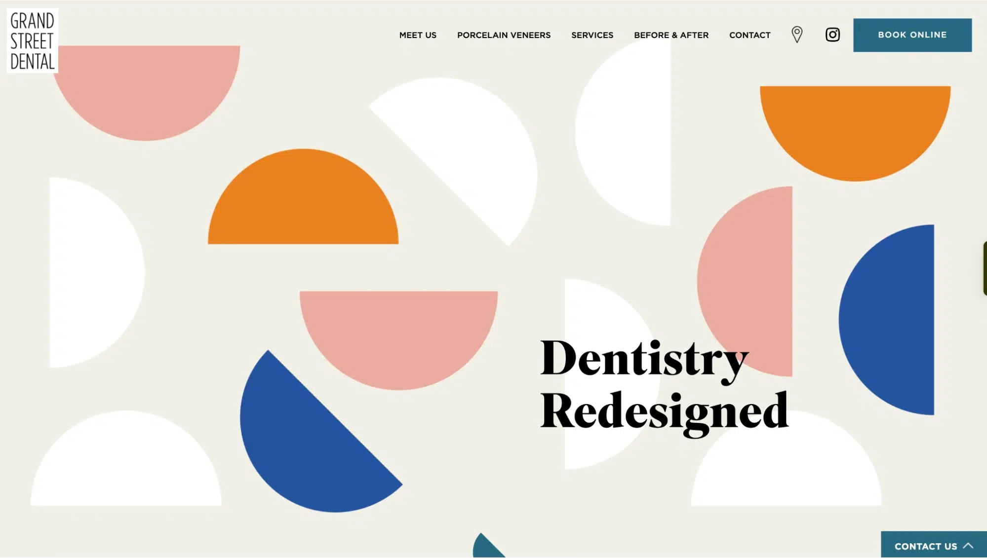
Known for its hipster, boutique-style branding, this practice embraces a minimalist, editorial aesthetic. The logo and typography feel chic, stylish, and designed for urban professionals.
Brand Identity: Hip, Artistic, Boutique-Style
Logo Decode: A minimalist, editorial-style font that reflects a lifestyle-oriented brand.
Why It Works: The branding makes dentistry feel modern and cool, perfect for urban professionals.
15. Hillcrest Dental Group
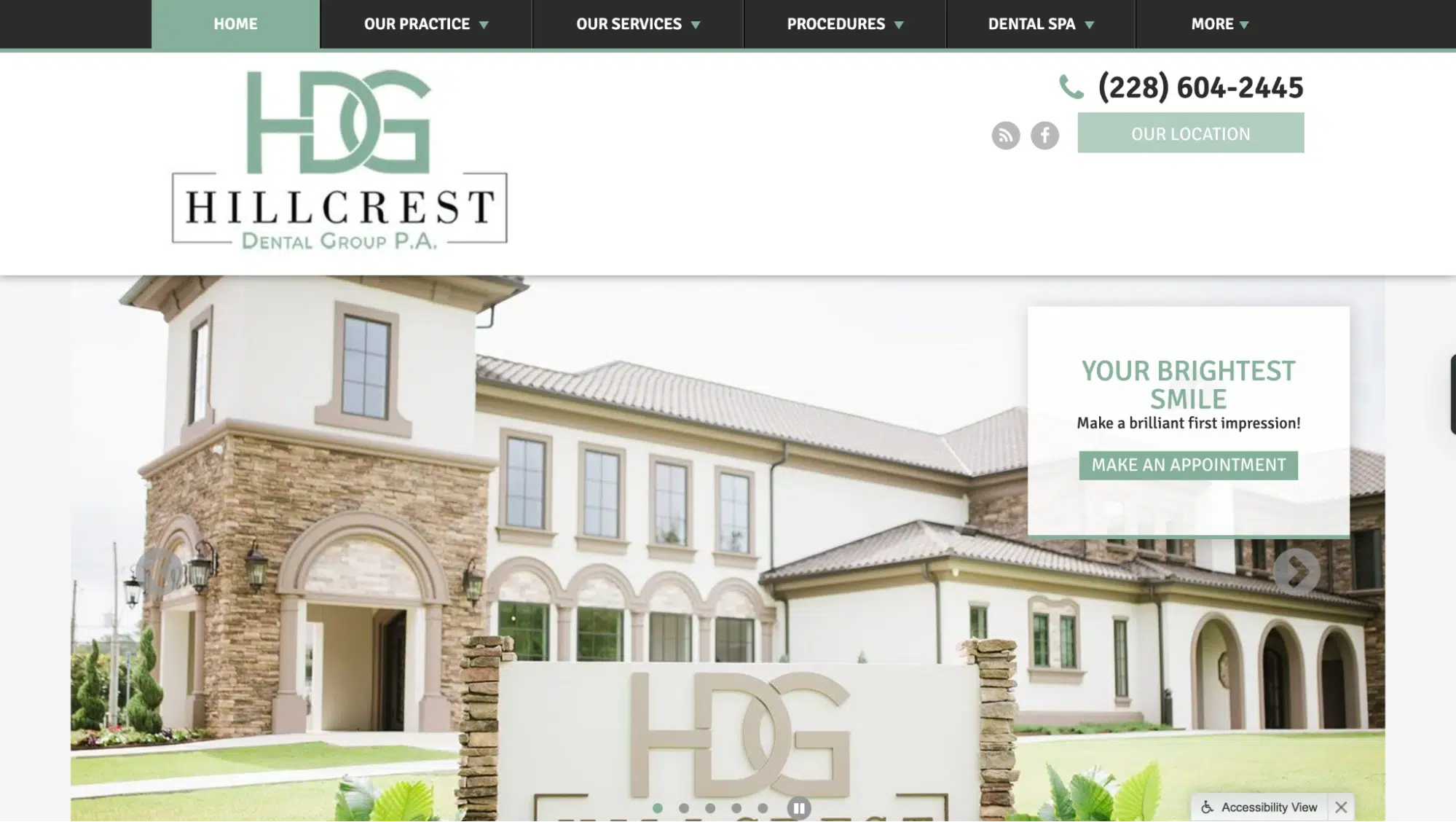
This building-inspired logo and warm tones create a homey, community-centered vibe. The branding makes the practice feel welcoming and reliable for family dental care.
Brand Identity: Family-Focused, Reliable, Community-Oriented
Logo Decode: HDG fonts are interwoven to replicate the exterior of their office. The logo design elements emphasize trust and neighborhood values.
Why It Works: The branding makes the clinic feel like home.
17. Ivory Dental Group
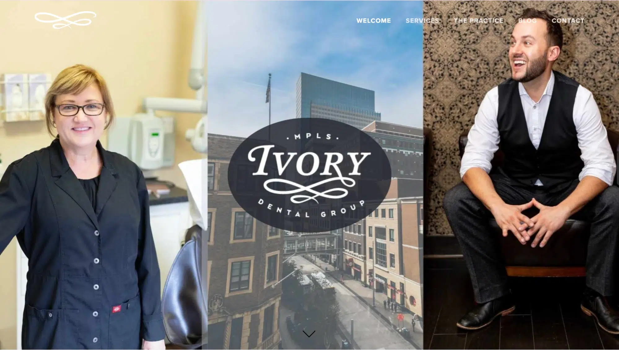
Soft ivory tones and elegant typography establish a premium, high-end brand identity. This branding appeals to luxury-seeking patients looking for top-tier aesthetic dental care.
Brand Identity: Premium, Elegant, High-End
Logo Decode: Soft ivory tones and elegant typography symbolize luxury and superior care.
Why It Works: The branding creates an upscale patient experience.
18. Jackson Family Dental
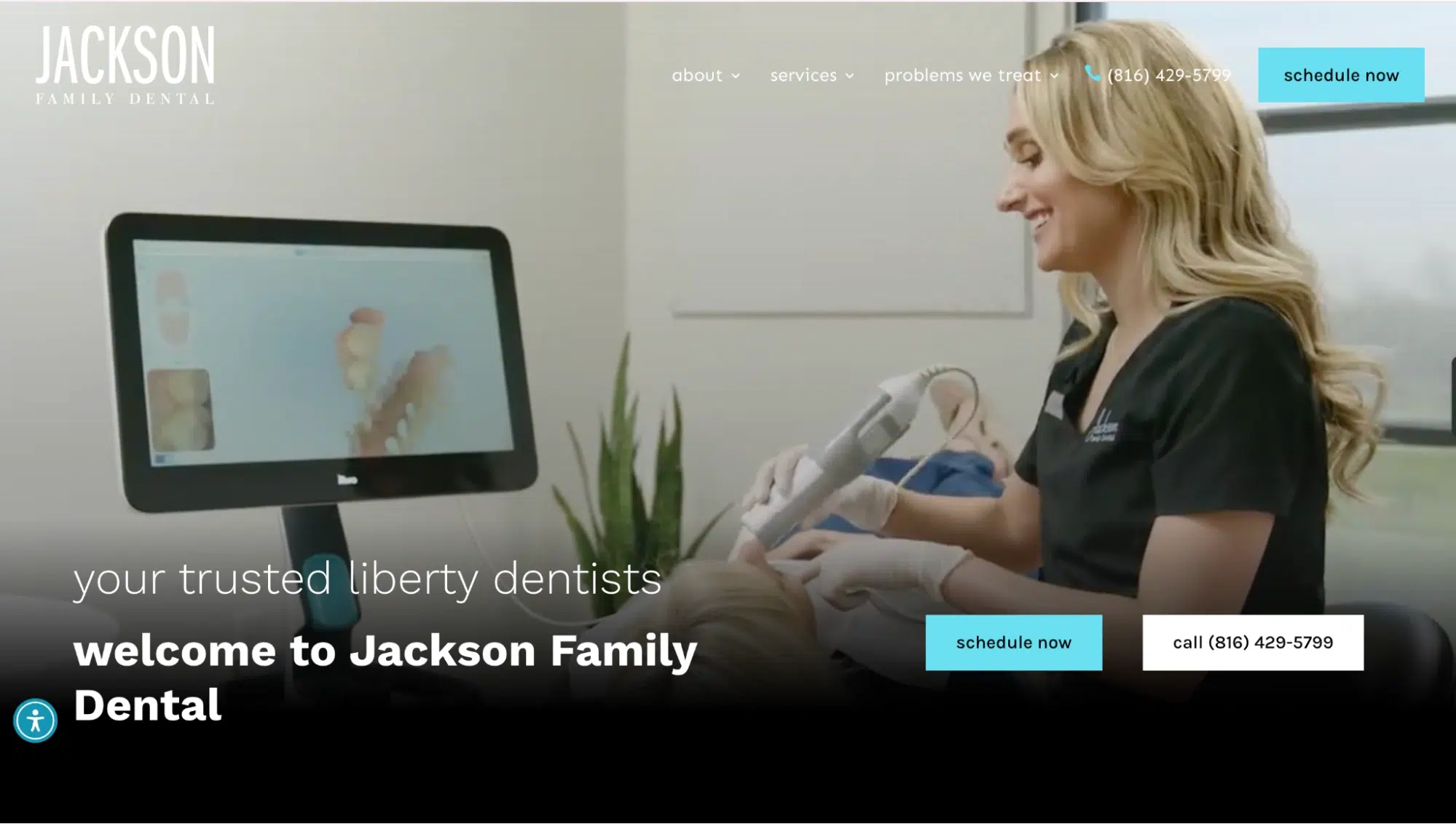
An inviting color palette and classic fonts reflect a legacy of family-centered dental care. The branding builds trust and community connections, making it a go-to for generations.
Brand Identity: Family-Centered, Welcoming, Traditional
Logo Decode: A warm color palette with classic fonts represents a legacy of dental care.
Why It Works: The branding makes the practice trustworthy and community-driven.
19. LA Dental
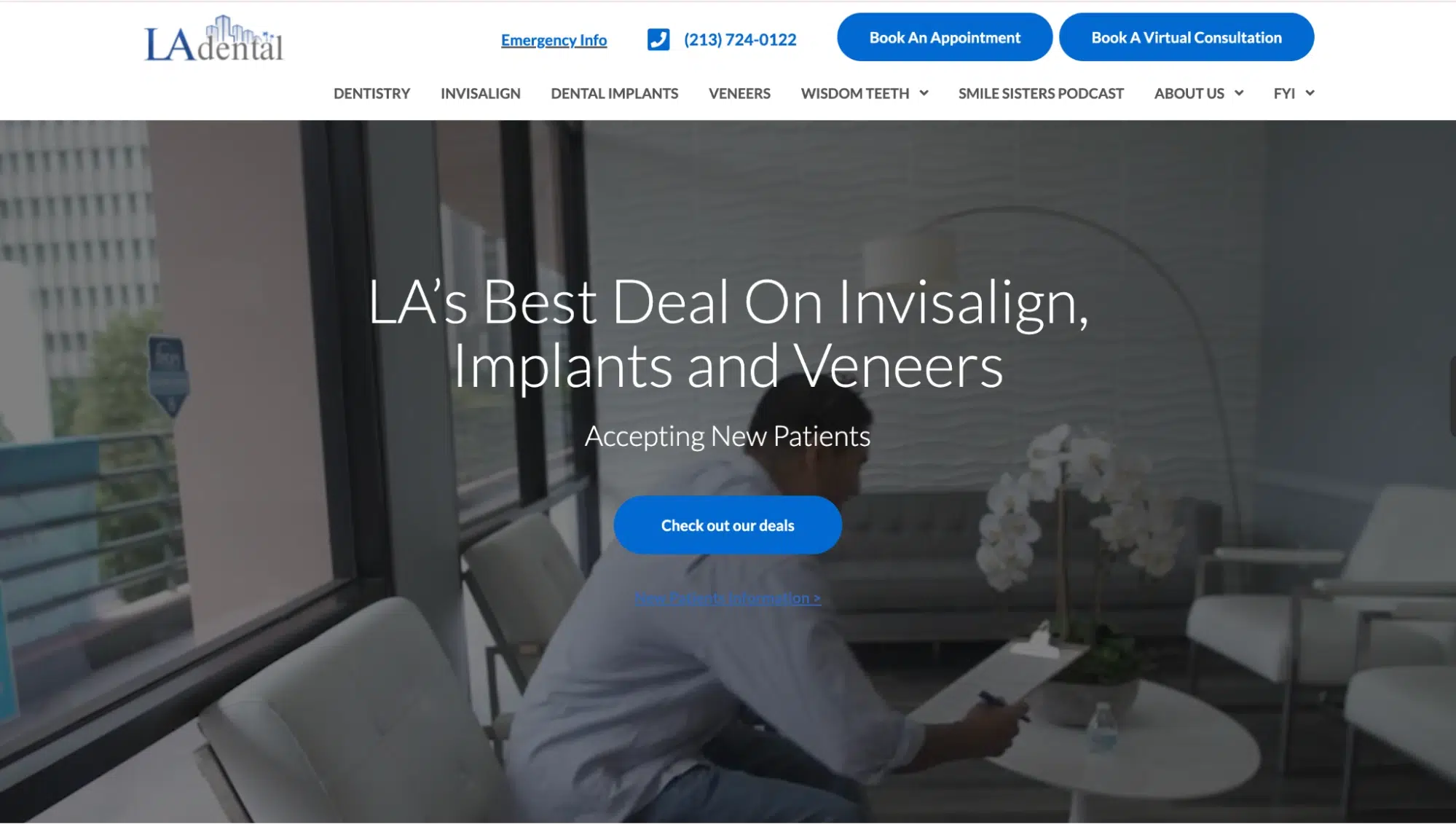
The modern typography and deep navy blue hues reinforce a metropolitan, high-tech dental experience. The branding aligns with LA’s style-conscious clientele.
Brand Identity: Metropolitan, Professional, Cutting-Edge
Logo Decode: The logo uses sleek typography, with “LA dental” at the bottom. It also features a deep navy blue skyline of tall buildings, conveying sophistication and expertise.
Why It Works: The branding aligns with LA’s fast-paced, style-conscious clientele, positioning the clinic as modern and exclusive.
20. Lake Center Dental
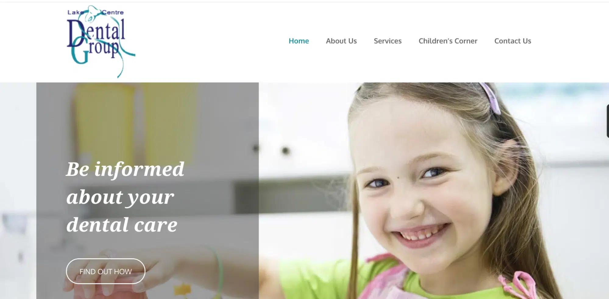
A soft blue wave motif evokes a relaxing, stress-free patient experience. This dental clinic branding makes the practice feel calm, welcoming, and professional.
Brand Identity: Refreshing, Calm, Trustworthy
Logo Decode: The logo features a soft blue wave pattern with a tooth, symbolizing relaxation and a stress-free experience, especially for kids.
Why It Works: The branding makes the practice feel welcoming and serene, perfect for anxious patients.
21. Lahair & Gallagher Pediatric Dentistry
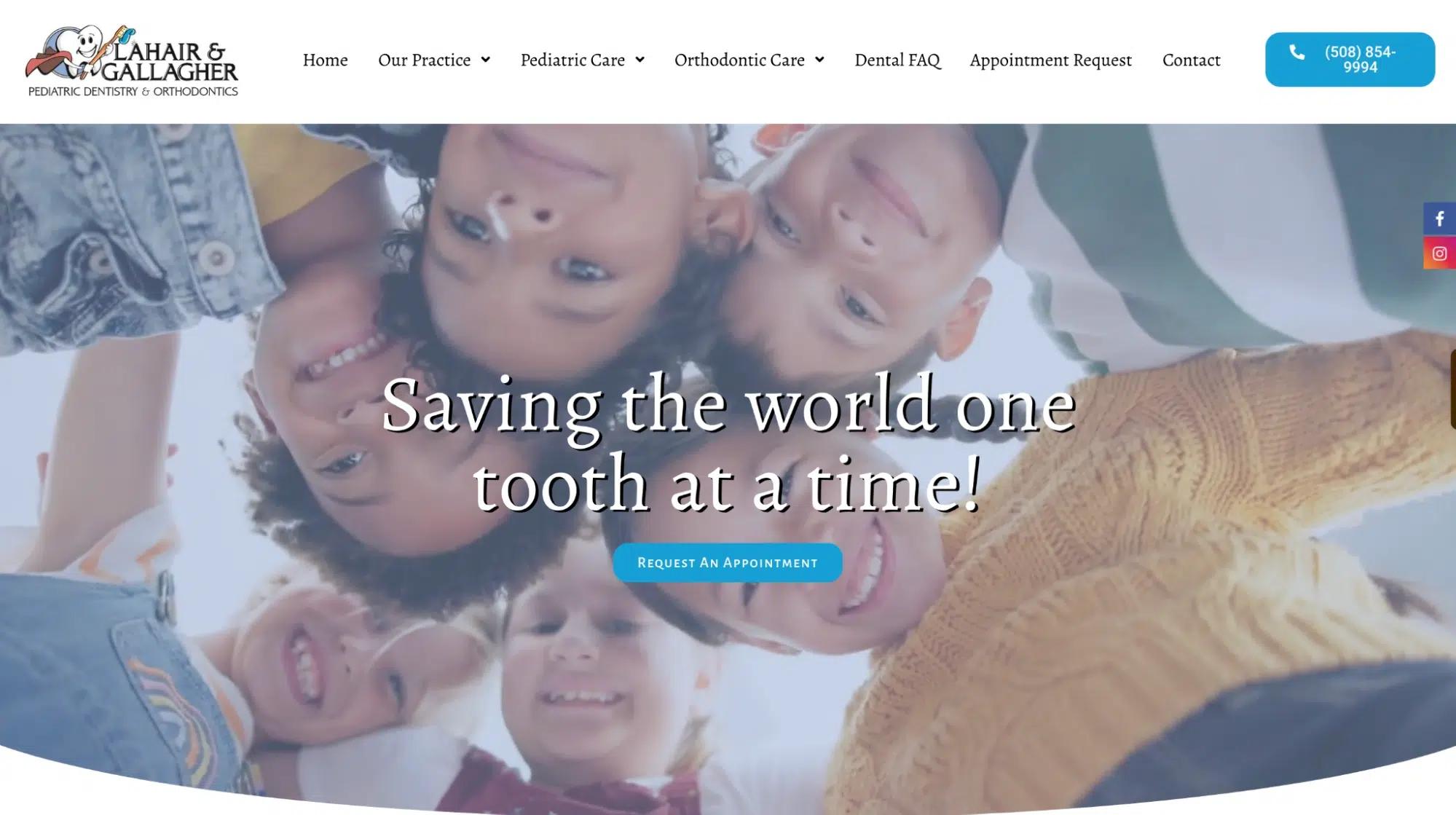
Pastel colors and rounded, playful typography make this pediatric dental brand is fun and nurturing. The branding reduces dental fear in young patients.
Brand Identity: Child-Friendly, Playful, Nurturing
Logo Decode: Uses pastel colors and rounded shapes, with an animated tooth in a superhero cape, carried by a toothbrush, creating a gentle and inviting atmosphere.
Why It Works: The branding eases dental fear in children, making their first visits positive and fun.
22. Leduc Dental Centre
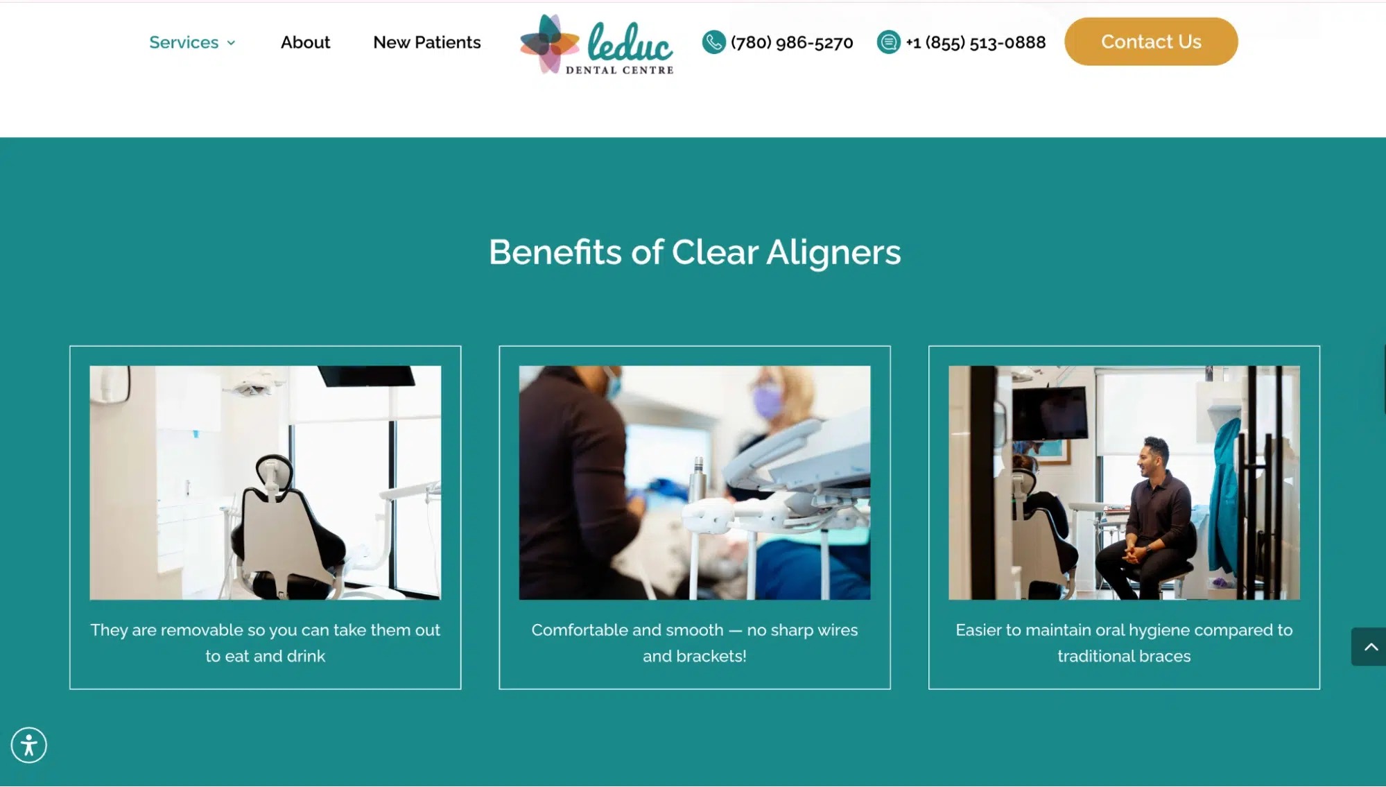
A natural, earthy green palette reflects a community-driven, patient-first approach. The branding emphasizes long-term relationships and trust.
Brand Identity: Community-Focused, Patient-Oriented, Warm
Logo Decode: The earthy green and beige palette reflects comfort and natural health.
Why It Works: The branding helps patients feel at home, reinforcing trust and long-term relationships.
23. Mentor Dental Arts
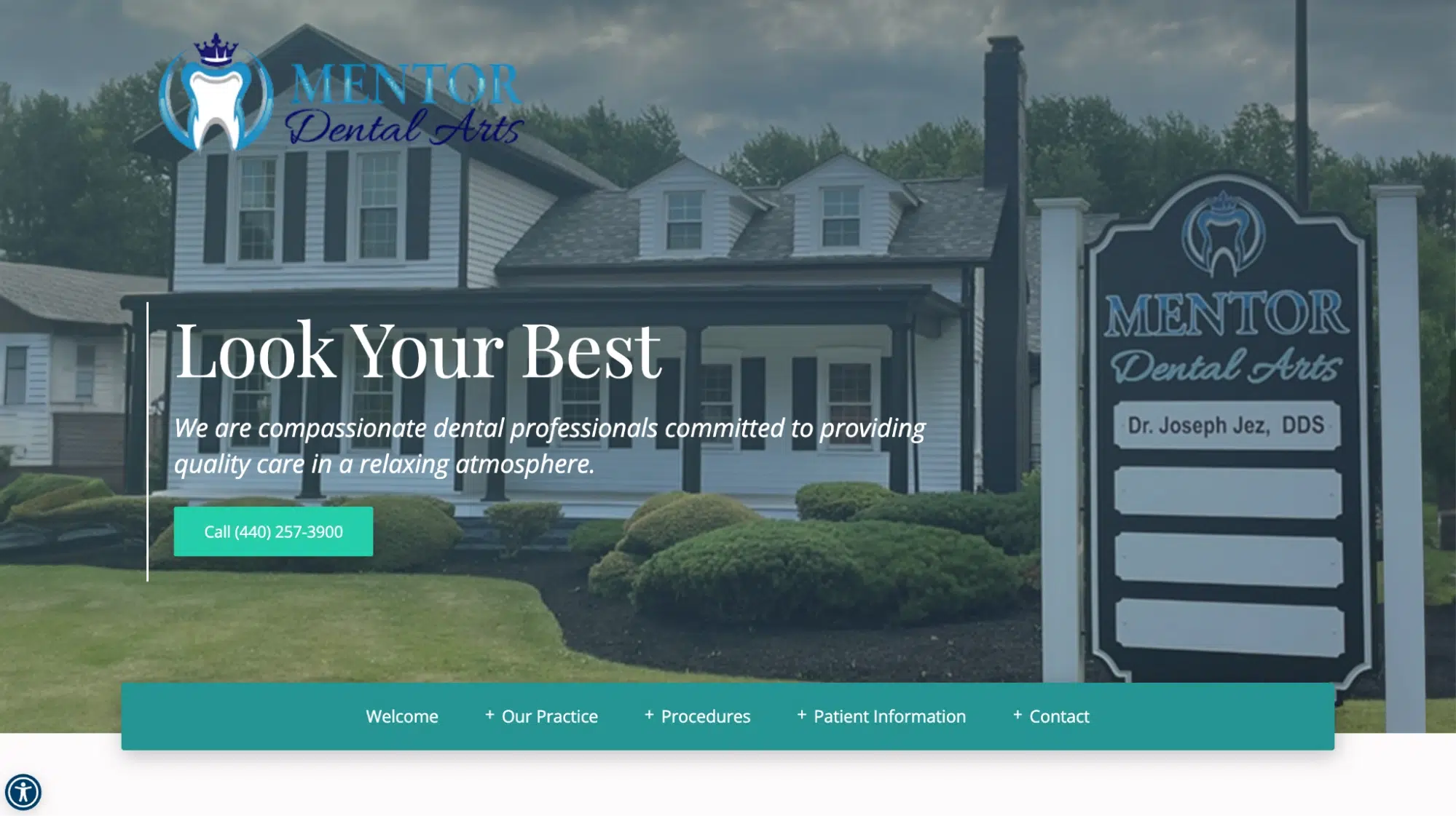
Minimalistic blue-and-green typography positions this practice as a luxury-focused, artistic dental brand. The branding appeals to high-end cosmetic dentistry patients.
Brand Identity: Artistic, Precise, High-End
Logo Decode: This logo features elegant yet stylish typography with subtle white accents and a tooth with a crown, reinforcing a premium dental care message.
Why It Works: The branding appeals to cosmetic and aesthetic dentistry clients, making it a luxury dental brand.
24. Newark Orthodontic Center
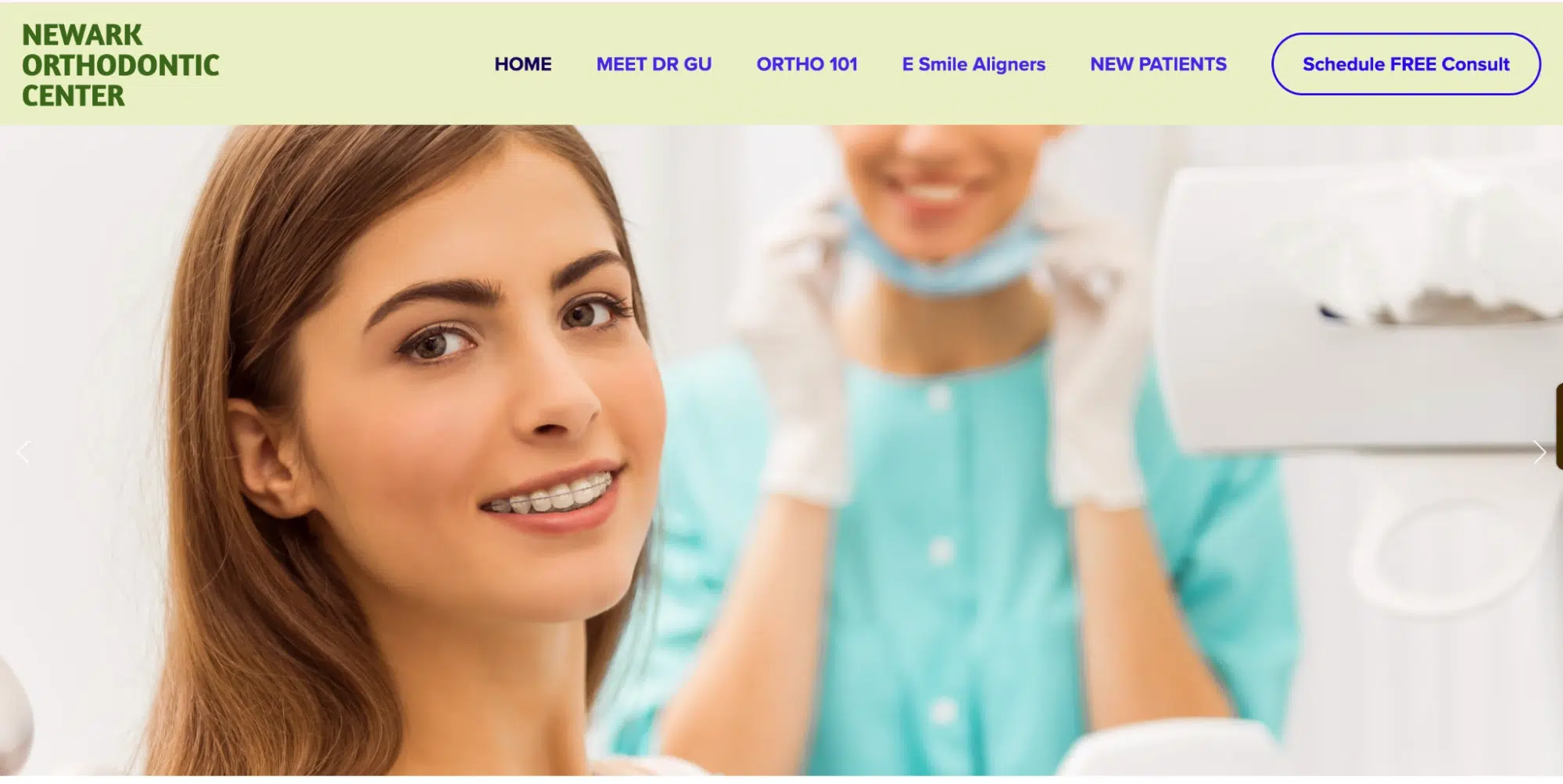
A structured, symmetrical logo conveys expertise, precision, and specialized orthodontic treatments. The branding reflects a leader in orthodontics, who is very subtle with its thematics and overall branding, exuding its prominence.
Brand Identity: Specialized, Expert-Led, Precise
Logo Decode: A structured, symmetrical logo design reinforces the precision of orthodontic care.
Why It Works: The branding reflects high-quality orthodontics, positioning it as a leading expert clinic.
25. North Beach Dental Care
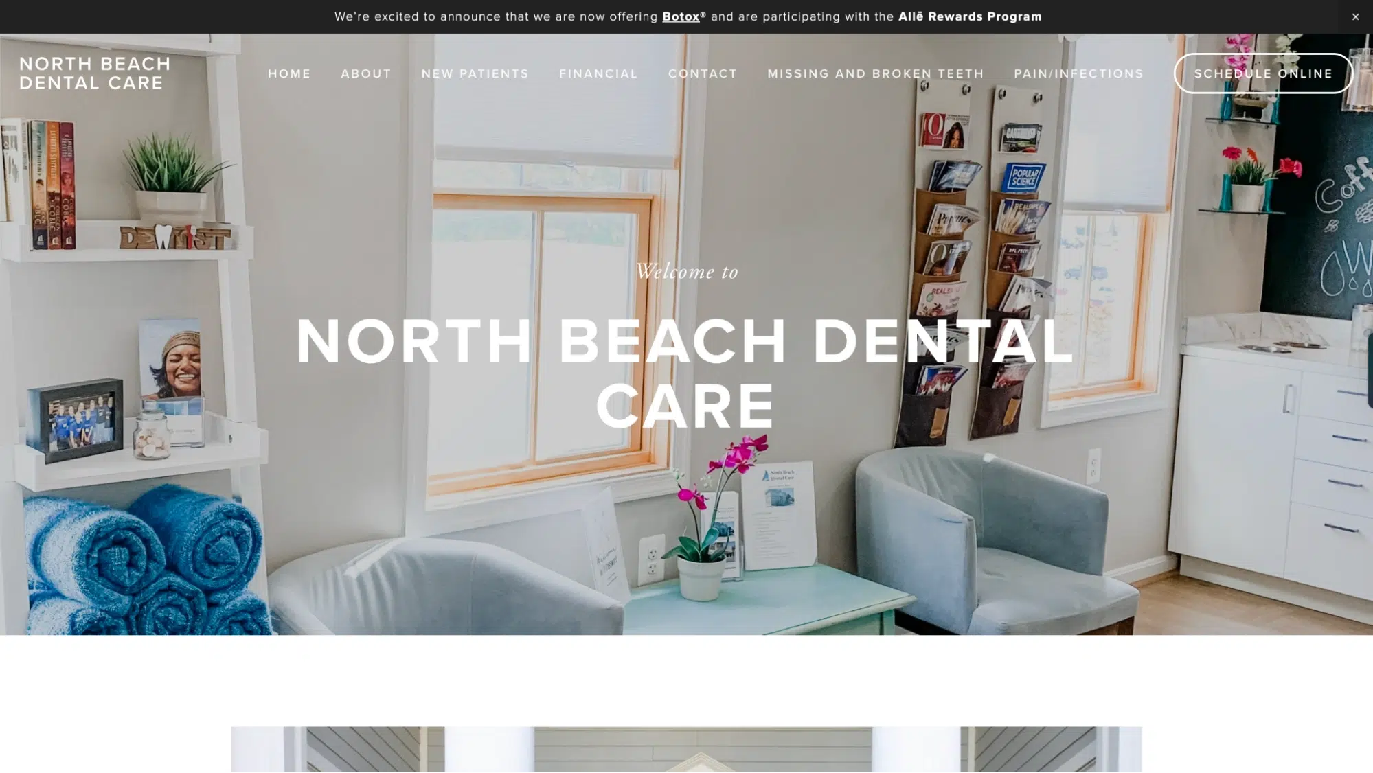
With a beach-inspired blue and sandy gold theme, this branding creates a relaxed, approachable dental experience, making it ideal for stress-free coastal dentistry.
Brand Identity: Relaxed, Beach-Themed, Gentle
Logo Decode: The coastal blue sail and gold-colored branding evoke a calm, stress-free experience.
Why It Works: The branding helps patients feel at ease, making dental visits more relaxing rather than intimidating.
26. Northern Heights Dental
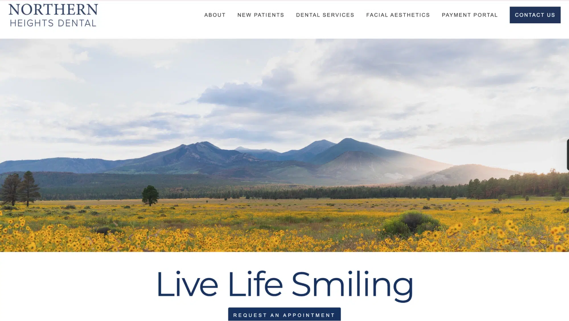
The mountain peaks in the backdrop of the hero section of their website represent durable, long-lasting smiles and a commitment to high-quality care. The branding aligns with nature-inspired branding, showcasing their mountain-surrounded origins.
Brand Identity: Nature-inspired, Holistic, Premium
Logo Decode: Features a clean font in the design, symbolizing trust.
Why It Works: The branding reinforces durability, excellence, and long-term oral health.
27. Orange County Pediatric Dental Group
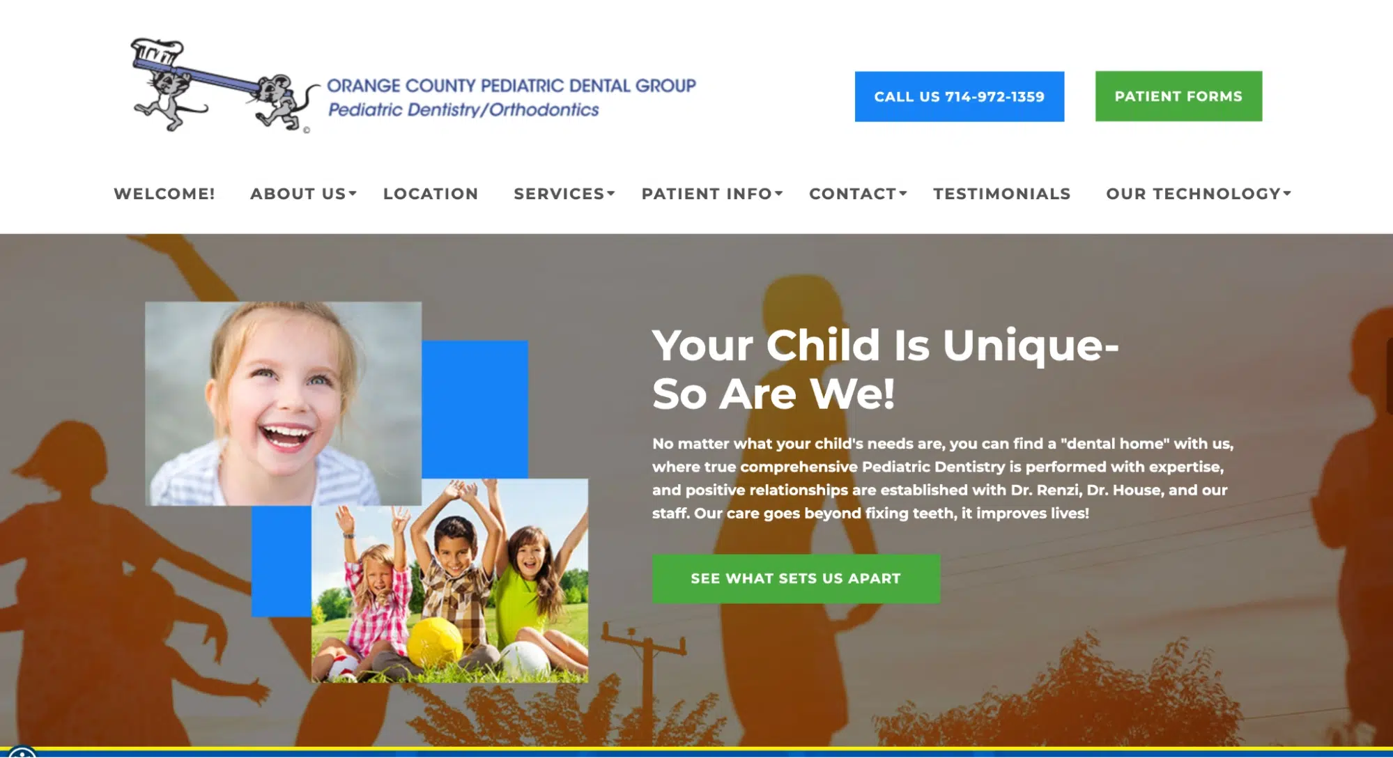
An orange-and-white theme connects the brand to its local Orange County identity while keeping a playful, family-friendly approach.
Brand Identity: Fun, Pediatric-Focused, Trustworthy
Logo Decode: The orange-and-white color scheme ties into the local Orange County theme, creating a personalized identity.
Why It Works: The branding appeals to local families, making it a go-to practice for pediatric dentistry.
28. Pearl Dental NYC
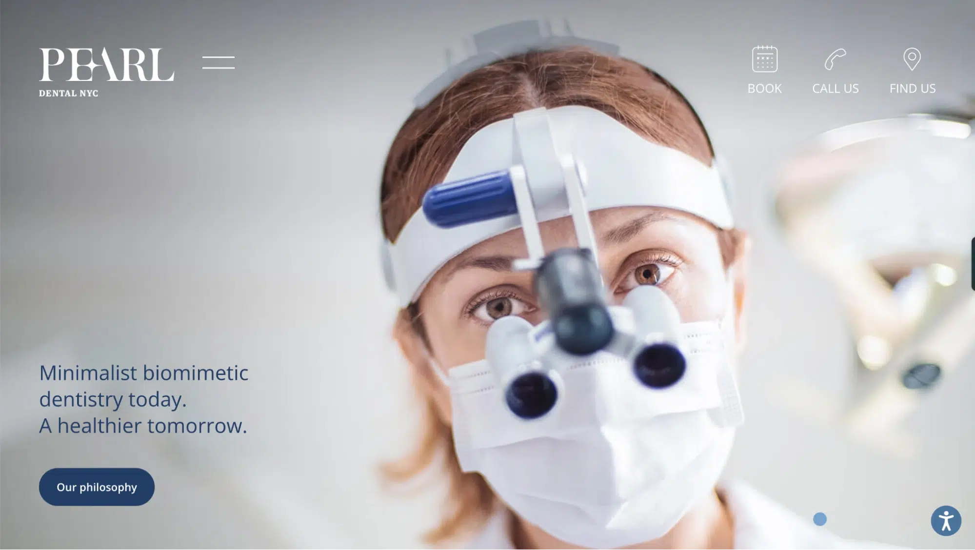
A luxurious pearl-white and soft blue theme symbolizes purity, aesthetics, and premium dental services. The branding targets high-end NYC professionals.
Brand Identity: Elegant, High-End, Boutique
Logo Decode: A white and a “gleamer/shine” is added on the “E” of PEARL, symbolizing purity and perfect smiles.
Why It Works: The branding targets upscale NYC professionals and positions the clinic as a premier cosmetic dentistry clinic.
29. Provinces Dental
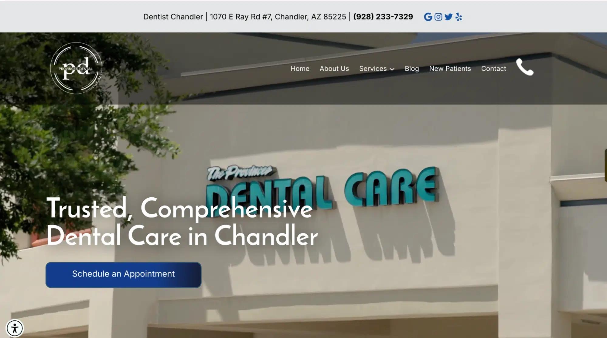
A “pd” motif conveys community-based, family-friendly dentistry. The branding fosters a sense of warmth and familiarity.
Brand Identity: Community-Oriented, Trustworthy, Comfortable
Logo Decode: The “pd” motif is simple yet elegant.
Why It Works: The branding makes the practice feel local, reliable, and welcoming.
30. Radiance Artistic Dental & Wellness
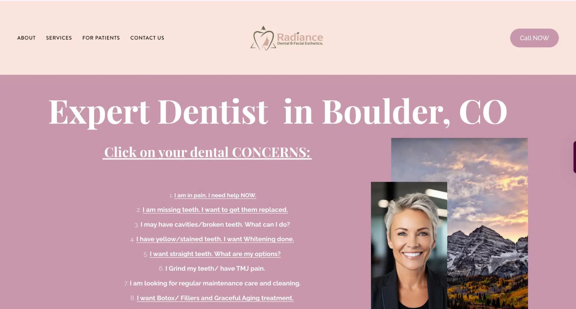
Pastel pink hues, beige, and green hues are there to give an elegant yet reinforce this luxury practice’s spa-like, high-end aesthetic. They offer more than dental services, and their dental clinic branding successfully captures that.
Brand Identity: Luxury, Spa-Like, Wellness-Focused
Logo Decode: A golden-hued tooth with a woman’s outline inside, surrounded by a faint triangle, represents their overall wellness and dental care services.
Why It Works: The branding appeals to aesthetic-conscious clients, making dental care feel luxurious and holistic.
31. Royal Dental Boston
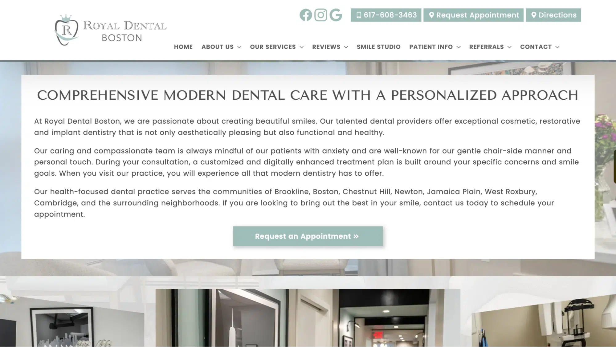
The crown logo and royal blue tones signify luxury, legacy, and exclusivity. The branding attracts VIP and premium-seeking clients.
Brand Identity: Premium, Exclusive, Legacy-Driven
Logo Decode: The crown logo emphasizes luxury and elite dental care.
Why It Works: The branding positions the clinic as a high-end practice, attracting VIP clients and professionals.
32. Blue Sky Family Dentistry

The soft blue cloud-inspired tooth logo creates a gentle, stress-free atmosphere for families and children. The branding fosters trust and calmness.
Brand Identity: Gentle, Family-Oriented, Modern
Logo Decode: The cloud-inspired tooth logo and soft blue tones create a stress-free, welcoming feel.
Why It Works: The branding reassures anxious patients, making it a trusted family dental clinic.
INSIDEA
Ready to put this into practice?
INSIDEA is an Elite HubSpot Partner rated 4.99 across 450+ verified reviews. Let's map it to your goals.